Chapter 9 Dimensionality reduction
9.1 Overview
Many scRNA-seq analysis procedures involve comparing cells based on their expression values across multiple genes. For example, clustering aims to identify cells with similar transcriptomic profiles by computing Euclidean distances across genes. In these applications, each individual gene represents a dimension of the data. More intuitively, if we had a scRNA-seq data set with two genes, we could make a two-dimensional plot where each axis represents the expression of one gene and each point in the plot represents a cell. This concept can be extended to data sets with thousands of genes where each cell’s expression profile defines its location in the high-dimensional expression space.
As the name suggests, dimensionality reduction aims to reduce the number of separate dimensions in the data. This is possible because different genes are correlated if they are affected by the same biological process. Thus, we do not need to store separate information for individual genes, but can instead compress multiple features into a single dimension, e.g., an “eigengene” (Langfelder and Horvath 2007). This reduces computational work in downstream analyses like clustering, as calculations only need to be performed for a few dimensions rather than thousands of genes; reduces noise by averaging across multiple genes to obtain a more precise representation of the patterns in the data; and enables effective plotting of the data, for those of us who are not capable of visualizing more than 3 dimensions.
We will use the Zeisel et al. (2015) dataset to demonstrate the applications of various dimensionality reduction methods in this chapter.
#--- loading ---#
library(scRNAseq)
sce.zeisel <- ZeiselBrainData()

library(scater)
sce.zeisel <- aggregateAcrossFeatures(sce.zeisel,
    id=sub("_loc[0-9]+$", "", rownames(sce.zeisel)))

#--- gene-annotation ---#
library(org.Mm.eg.db)
rowData(sce.zeisel)$Ensembl <- mapIds(org.Mm.eg.db,
    keys=rownames(sce.zeisel), keytype="SYMBOL", column="ENSEMBL")

#--- quality-control ---#
stats <- perCellQCMetrics(sce.zeisel, subsets=list(
    Mt=rowData(sce.zeisel)$featureType=="mito"))
qc <- quickPerCellQC(stats, percent_subsets=c("altexps_ERCC_percent",
    "subsets_Mt_percent"))
sce.zeisel <- sce.zeisel[,!qc$discard]

#--- normalization ---#
library(scran)
set.seed(1000)
clusters <- quickCluster(sce.zeisel)
sce.zeisel <- computeSumFactors(sce.zeisel, cluster=clusters)
sce.zeisel <- logNormCounts(sce.zeisel)

#--- variance-modelling ---#
dec.zeisel <- modelGeneVarWithSpikes(sce.zeisel, "ERCC")
top.hvgs <- getTopHVGs(dec.zeisel, prop=0.1)## class: SingleCellExperiment
## dim: 19839 2816
## metadata(0):
## assays(2): counts logcounts
## rownames(19839): 0610005C13Rik 0610007N19Rik ... mt-Tw mt-Ty
## rowData names(2): featureType Ensembl
## colnames(2816): 1772071015_C02 1772071017_G12 ... 1772063068_D01
## 1772066098_A12
## colData names(11): tissue group # ... level2class sizeFactor
## reducedDimNames(0):
## altExpNames(2): ERCC repeat9.2 Principal components analysis
Principal components analysis (PCA) discovers axes in high-dimensional space that capture the largest amount of variation. This is best understood by imagining each axis as a line. Say we draw a line anywhere, and we move all cells in our data set onto this line by the shortest path. The variance captured by this axis is defined as the variance across cells along that line. In PCA, the first axis (or “principal component”, PC) is chosen such that it captures the greatest variance across cells. The next PC is chosen such that it is orthogonal to the first and captures the greatest remaining amount of variation, and so on.
By definition, the top PCs capture the dominant factors of heterogeneity in the data set. Thus, we can perform dimensionality reduction by restricting downstream analyses to the top PCs. This strategy is simple, highly effective and widely used throughout the data sciences. It takes advantage of the well-studied theoretical properties of the PCA - namely, that a low-rank approximation formed from the top PCs is the optimal approximation of the original data for a given matrix rank. It also allows us to use a wide range of fast PCA implementations for scalable and efficient data analysis.
When applying PCA to scRNA-seq data, our assumption is that biological processes affect multiple genes in a coordinated manner. This means that the earlier PCs are likely to represent biological structure as more variation can be captured by considering the correlated behavior of many genes. By comparison, random technical or biological noise is expected to affect each gene independently. There is unlikely to be an axis that can capture random variation across many genes, meaning that noise should mostly be concentrated in the later PCs. This motivates the use of the earlier PCs in our downstream analyses, which concentrates the biological signal to simultaneously reduce computational work and remove noise.
We perform the PCA on the log-normalized expression values using the runPCA() function from scater.
By default, runPCA() will compute the first 50 PCs and store them in the reducedDims() of the output SingleCellExperiment object, as shown below.
Here, we use only the top 2000 genes with the largest biological components to reduce both computational work and high-dimensional random noise.
In particular, while PCA is robust to random noise, an excess of it may cause the earlier PCs to capture noise instead of biological structure (Johnstone and Lu 2009).
This effect can be mitigated by restricting the PCA to a subset of HVGs, for which we can use any of the strategies described in Chapter 8.
library(scran)
top.zeisel <- getTopHVGs(dec.zeisel, n=2000)

library(scater)
set.seed(100) # See below.
sce.zeisel <- runPCA(sce.zeisel, subset_row=top.zeisel)
reducedDimNames(sce.zeisel)
## [1] "PCA"## [1] 2816 50For large data sets, greater efficiency is obtained by using approximate SVD algorithms that only compute the top PCs.
By default, most PCA-related functions in scater and scran will use methods from the irlba or rsvd packages to perform the SVD.
We can explicitly specify the SVD algorithm to use by passing an BiocSingularParam object (from the BiocSingular package) to the BSPARAM= argument (see Section 23.2.2 for more details).
Many of these approximate algorithms are based on randomization and thus require set.seed() to obtain reproducible results.
library(BiocSingular)
set.seed(1000)
sce.zeisel <- runPCA(sce.zeisel, subset_row=top.zeisel,
    BSPARAM=RandomParam(), name="IRLBA")
reducedDimNames(sce.zeisel)
## [1] "PCA" "IRLBA"9.3 Choosing the number of PCs
9.3.1 Motivation
How many of the top PCs should we retain for downstream analyses? The choice of the number of PCs \(d\) is a decision that is analogous to the choice of the number of HVGs to use. Using more PCs will retain more biological signal at the cost of including more noise that might mask said signal. Much like the choice of the number of HVGs, it is hard to determine whether an “optimal” choice exists for the number of PCs. Even if we put aside the technical variation that is almost always uninteresting, there is no straightforward way to automatically determine which aspects of biological variation are relevant; one analyst’s biological signal may be irrelevant noise to another analyst with a different scientific question.
Most practitioners will simply set \(d\) to a “reasonable” but arbitrary value, typically ranging from 10 to 50. This is often satisfactory as the later PCs explain so little variance that their inclusion or omission has no major effect. For example, in the Zeisel dataset, few PCs explain more than 1% of the variance in the entire dataset (Figure 9.1) and using, say, 30 \(\pm\) 10 PCs would not even amount to four percentage points’ worth of difference in variance. In fact, the main consequence of using more PCs is simply that downstream calculations take longer as they need to compute over more dimensions, but most PC-related calculations are fast enough that this is not a practical concern.
percent.var <- attr(reducedDim(sce.zeisel), "percentVar")
plot(percent.var, log="y", xlab="PC", ylab="Variance explained (%)")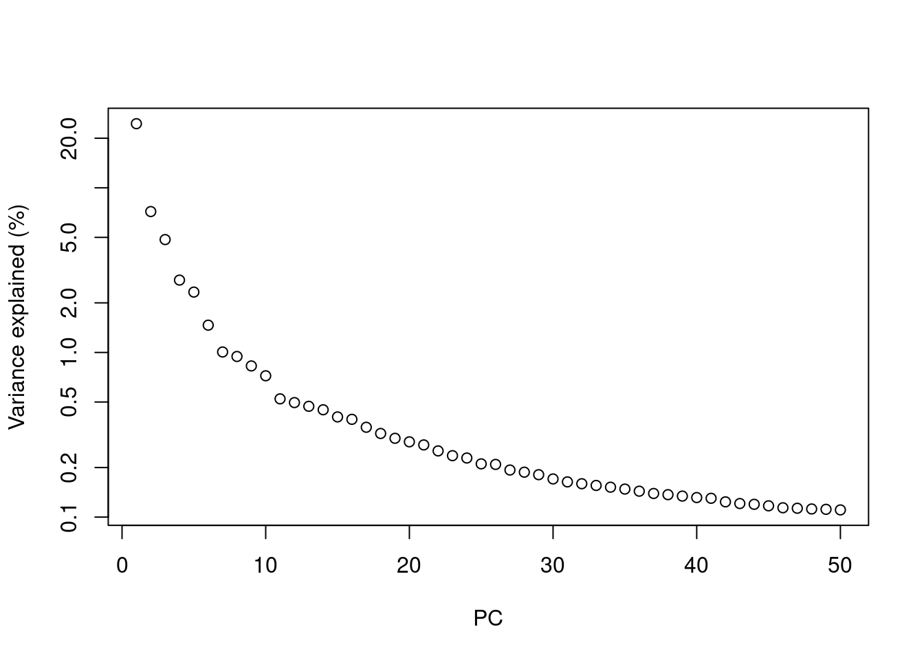
Figure 9.1: Percentage of variance explained by successive PCs in the Zeisel dataset, shown on a log-scale for visualization purposes.
Nonetheless, we will describe some more data-driven strategies to guide a suitable choice of \(d\). These automated choices are best treated as guidelines as they make some strong assumptions about what variation is “interesting”. More diligent readers may consider repeating the analysis with a variety of choices of \(d\) to explore other perspectives of the dataset at a different bias-variance trade-off, though this tends to be more work than necessary for most questions.
9.3.2 Using the elbow point
A simple heuristic for choosing \(d\) involves identifying the elbow point in the percentage of variance explained by successive PCs. This refers to the “elbow” in the curve of a scree plot as shown in Figure 9.2.
# Percentage of variance explained is tucked away in the attributes.
percent.var <- attr(reducedDim(sce.zeisel), "percentVar")
chosen.elbow <- PCAtools::findElbowPoint(percent.var)
chosen.elbow
## [1] 7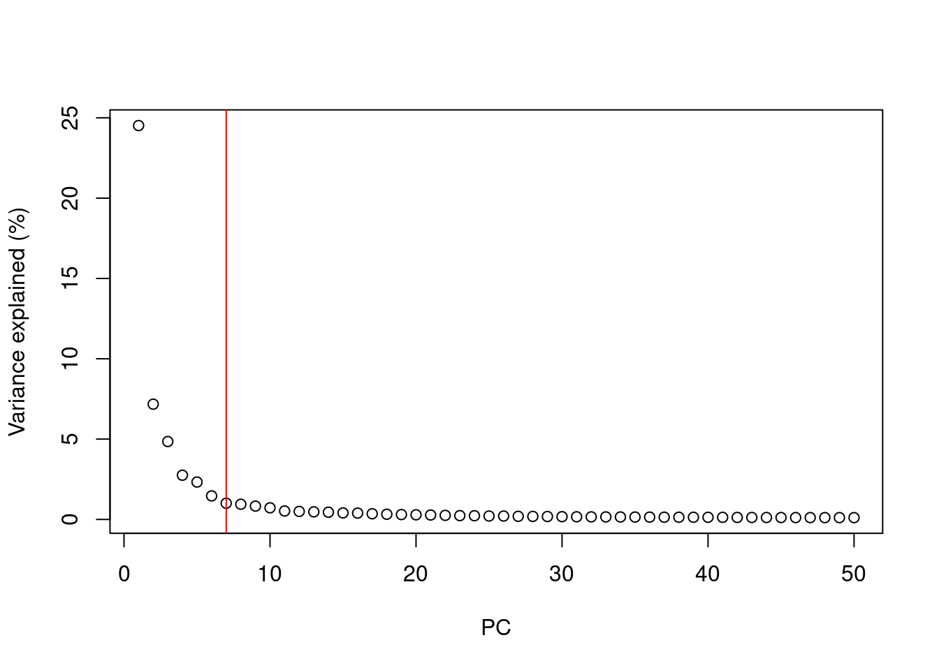
Figure 9.2: Percentage of variance explained by successive PCs in the Zeisel brain data. The identified elbow point is marked with a red line.
Our assumption is that each of the top PCs capturing biological signal should explain much more variance than the remaining PCs.
Thus, there should be a sharp drop in the percentage of variance explained when we move past the last “biological” PC.
This manifests as an elbow in the scree plot, the location of which serves as a natural choice for \(d\).
Once this is identified, we can subset the reducedDims() entry to only retain the first \(d\) PCs of interest.
# Creating a new entry with only the first 20 PCs,
# useful if we still need the full set of PCs later.
reducedDim(sce.zeisel, "PCA.elbow") <- reducedDim(sce.zeisel)[,1:chosen.elbow]
reducedDimNames(sce.zeisel)
## [1] "PCA" "IRLBA" "PCA.elbow"# Alternatively, just overwriting the original PCA entry. For demonstration
# purposes, we'll do this to a copy so that we still have full PCs later on.
sce.zeisel.copy <- sce.zeisel
reducedDim(sce.zeisel.copy) <- reducedDim(sce.zeisel.copy)[,1:chosen.elbow]
ncol(reducedDim(sce.zeisel.copy))## [1] 7From a practical perspective, the use of the elbow point tends to retain fewer PCs compared to other methods. The definition of “much more variance” is relative so, in order to be retained, later PCs must explain a amount of variance that is comparable to that explained by the first few PCs. Strong biological variation in the early PCs will shift the elbow to the left, potentially excluding weaker (but still interesting) variation in the next PCs immediately following the elbow.
9.3.3 Using the technical noise
Another strategy is to retain all PCs until the percentage of total variation explained reaches some threshold \(T\).
For example, we might retain the top set of PCs that explains 80% of the total variation in the data.
Of course, it would be pointless to swap one arbitrary parameter \(d\) for another \(T\).
Instead, we derive a suitable value for \(T\) by calculating the proportion of variance in the data that is attributed to the biological component.
This is done using the denoisePCA() function with the variance modelling results from modelGeneVarWithSpikes() or related functions, where \(T\) is defined as the ratio of the sum of the biological components to the sum of total variances.
To illustrate, we use this strategy to pick the number of PCs in the 10X PBMC dataset.
#--- loading ---#
library(DropletTestFiles)
raw.path <- getTestFile("tenx-2.1.0-pbmc4k/1.0.0/raw.tar.gz")
out.path <- file.path(tempdir(), "pbmc4k")
untar(raw.path, exdir=out.path)

library(DropletUtils)
fname <- file.path(out.path, "raw_gene_bc_matrices/GRCh38")
sce.pbmc <- read10xCounts(fname, col.names=TRUE)

#--- gene-annotation ---#
library(scater)
rownames(sce.pbmc) <- uniquifyFeatureNames(
    rowData(sce.pbmc)$ID, rowData(sce.pbmc)$Symbol)

library(EnsDb.Hsapiens.v86)
location <- mapIds(EnsDb.Hsapiens.v86, keys=rowData(sce.pbmc)$ID,
    column="SEQNAME", keytype="GENEID")

#--- cell-detection ---#
set.seed(100)
e.out <- emptyDrops(counts(sce.pbmc))
sce.pbmc <- sce.pbmc[,which(e.out$FDR <= 0.001)]

#--- quality-control ---#
stats <- perCellQCMetrics(sce.pbmc, subsets=list(Mito=which(location=="MT")))
high.mito <- isOutlier(stats$subsets_Mito_percent, type="higher")
sce.pbmc <- sce.pbmc[,!high.mito]

#--- normalization ---#
library(scran)
set.seed(1000)
clusters <- quickCluster(sce.pbmc)
sce.pbmc <- computeSumFactors(sce.pbmc, cluster=clusters)
sce.pbmc <- logNormCounts(sce.pbmc)

#--- variance-modelling ---#
set.seed(1001)
dec.pbmc <- modelGeneVarByPoisson(sce.pbmc)
top.pbmc <- getTopHVGs(dec.pbmc, prop=0.1)library(scran)
set.seed(111001001)
denoised.pbmc <- denoisePCA(sce.pbmc, technical=dec.pbmc, subset.row=top.pbmc)
ncol(reducedDim(denoised.pbmc))## [1] 9The dimensionality of the output represents the lower bound on the number of PCs required to retain all biological variation.
This choice of \(d\) is motivated by the fact that any fewer PCs will definitely discard some aspect of biological signal.
(Of course, the converse is not true; there is no guarantee that the retained PCs capture all of the signal, which is only generally possible if no dimensionality reduction is performed at all.)
From a practical perspective, the denoisePCA() approach usually retains more PCs than the elbow point method as the former does not compare PCs to each other and is less likely to discard PCs corresponding to secondary factors of variation.
The downside is that many minor aspects of variation may not be interesting (e.g., transcriptional bursting) and their retention would only add irrelevant noise.
Note that denoisePCA() imposes internal caps on the number of PCs that can be chosen in this manner.
By default, the number is bounded within the “reasonable” limits of 5 and 50 to avoid selection of too few PCs (when technical noise is high relative to biological variation) or too many PCs (when technical noise is very low).
For example, applying this function to the Zeisel brain data hits the upper limit:
set.seed(001001001)
denoised.zeisel <- denoisePCA(sce.zeisel, technical=dec.zeisel,
    subset.row=top.zeisel)
ncol(reducedDim(denoised.zeisel))
## [1] 50This method also tends to perform best when the mean-variance trend reflects the actual technical noise, i.e., estimated by modelGeneVarByPoisson() or modelGeneVarWithSpikes() instead of modelGeneVar() (Chapter 8).
Variance modelling results from modelGeneVar() tend to understate the actual biological variation, especially in highly heterogeneous datasets where secondary factors of variation inflate the fitted values of the trend.
Fewer PCs are subsequently retained because \(T\) is artificially lowered, as evidenced by denoisePCA() returning the lower limit of 5 PCs for the PBMC dataset:
dec.pbmc2 <- modelGeneVar(sce.pbmc)
denoised.pbmc2 <- denoisePCA(sce.pbmc, technical=dec.pbmc2, subset.row=top.pbmc)
ncol(reducedDim(denoised.pbmc2))
## [1] 59.3.4 Based on population structure
Yet another method to choose \(d\) uses information about the number of subpopulations in the data. Consider a situation where each subpopulation differs from the others along a different axis in the high-dimensional space (e.g., because it is defined by a unique set of marker genes). This suggests that we should set \(d\) to the number of unique subpopulations minus 1, which guarantees separation of all subpopulations while retaining as few dimensions (and noise) as possible. We can use this reasoning to loosely motivate an a priori choice for \(d\) - for example, if we expect around 10 different cell types in our population, we would set \(d \approx 10\).
In practice, the number of subpopulations is usually not known in advance. Rather, we use a heuristic approach that uses the number of clusters as a proxy for the number of subpopulations. We perform clustering (graph-based by default, see Chapter 10) on the first \(d^*\) PCs and only consider the values of \(d^*\) that yield no more than \(d^*+1\) clusters. If we detect more clusters with fewer dimensions, we consider this to represent overclustering rather than distinct subpopulations, assuming that multiple subpopulations should not be distinguishable on the same axes. We test a range of \(d^*\) and set \(d\) to the value that maximizes the number of clusters while satisfying the above condition. This attempts to capture as many distinct (putative) subpopulations as possible by retaining biological signal in later PCs, up until the point that the additional noise reduces resolution.
pcs <- reducedDim(sce.zeisel)
choices <- getClusteredPCs(pcs)
val <- metadata(choices)$chosen

plot(choices$n.pcs, choices$n.clusters,
    xlab="Number of PCs", ylab="Number of clusters")
abline(a=1, b=1, col="red")
abline(v=val, col="grey80", lty=2)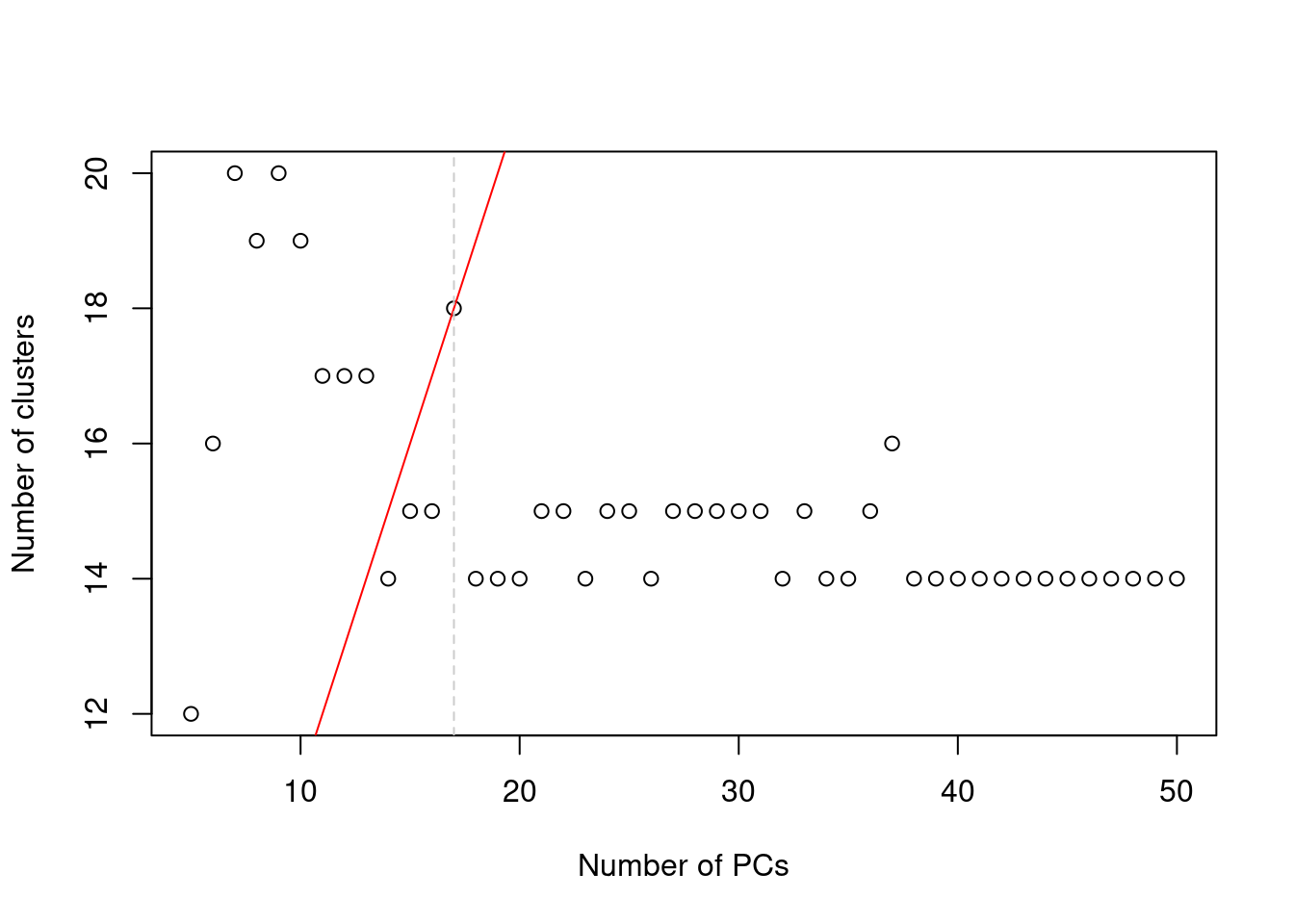
Figure 9.3: Number of clusters detected in the Zeisel brain dataset as a function of the number of PCs. The red unbroken line represents the theoretical upper constraint on the number of clusters, while the grey dashed line is the number of PCs suggested by getClusteredPCs().
We subset the PC matrix by column to retain the first \(d\) PCs
and assign the subsetted matrix back into our SingleCellExperiment object.
Downstream applications that use the "PCA.clust" results in sce.zeisel will subsequently operate on the chosen PCs only.
This strategy is the most pragmatic as it directly addresses the role of the bias-variance trade-off in downstream analyses, specifically clustering. There is no need to preserve biological signal beyond what is distinguishable in later steps. However, it involves strong assumptions about the nature of the biological differences between subpopulations - and indeed, discrete subpopulations may not even exist in studies of continuous processes like differentiation. It also requires repeated applications of the clustering procedure on increasing number of PCs, which may be computational expensive.
9.3.5 Using random matrix theory
We consider the observed (log-)expression matrix to be the sum of (i) a low-rank matrix containing the true biological signal for each cell and (ii) a random matrix representing the technical noise in the data. Under this interpretation, we can use random matrix theory to guide the choice of the number of PCs based on the properties of the noise matrix.
The Marchenko-Pastur (MP) distribution defines an upper bound on the singular values of a matrix with random i.i.d. entries.
Thus, all PCs associated with larger singular values are likely to contain real biological structure -
or at least, signal beyond that expected by noise - and should be retained (Shekhar et al. 2016).
We can implement this scheme using the chooseMarchenkoPastur() function from the PCAtools package,
given the dimensionality of the matrix used for the PCA (noting that we only used the HVG subset);
the variance explained by each PC (not the percentage);
and the variance of the noise matrix derived from our previous variance decomposition results.
# Generating more PCs for demonstration purposes:
set.seed(10100101)
sce.zeisel2 <- runPCA(sce.zeisel, subset_row=top.hvgs, ncomponents=200)

mp.choice <- PCAtools::chooseMarchenkoPastur(
    .dim=c(length(top.hvgs), ncol(sce.zeisel2)),
    var.explained=attr(reducedDim(sce.zeisel2), "varExplained"),
    noise=median(dec.zeisel[top.hvgs,"tech"]))

mp.choice
## [1] 142
## attr(,"limit")
## [1] 2.236We can then subset the PC coordinate matrix by the first mp.choice columns as previously demonstrated.
It is best to treat this as a guideline only; PCs below the MP limit are not necessarily uninteresting, especially in noisy datasets where the higher noise drives a more aggressive choice of \(d\).
Conversely, many PCs above the limit may not be relevant if they are driven by uninteresting biological processes like transcriptional bursting, cell cycle or metabolic variation.
Morever, the use of the MP distribution is not entirely justified here as the noise distribution differs by abundance for each gene and by sequencing depth for each cell.
In a similar vein, Horn’s parallel analysis is commonly used to pick the number of PCs to retain in factor analysis. This involves randomizing the input matrix, repeating the PCA and creating a scree plot of the PCs of the randomized matrix. The desired number of PCs is then chosen based on the intersection of the randomized scree plot with that of the original matrix (Figure 9.4). Here, the reasoning is that PCs are unlikely to be interesting if they explain less variance that that of the corresponding PC of a random matrix. Note that this differs from the MP approach as we are not using the upper bound of randomized singular values to threshold the original PCs.
set.seed(100010)
horn <- PCAtools::parallelPCA(logcounts(sce.zeisel)[top.hvgs,],
    BSPARAM=BiocSingular::IrlbaParam(), niters=10)
horn$n
## [1] 24plot(horn$original$variance, type="b", log="y", pch=16)
permuted <- horn$permuted
for (i in seq_len(ncol(permuted))) {
points(permuted[,i], col="grey80", pch=16)
lines(permuted[,i], col="grey80", pch=16)
}
abline(v=horn$n, col="red")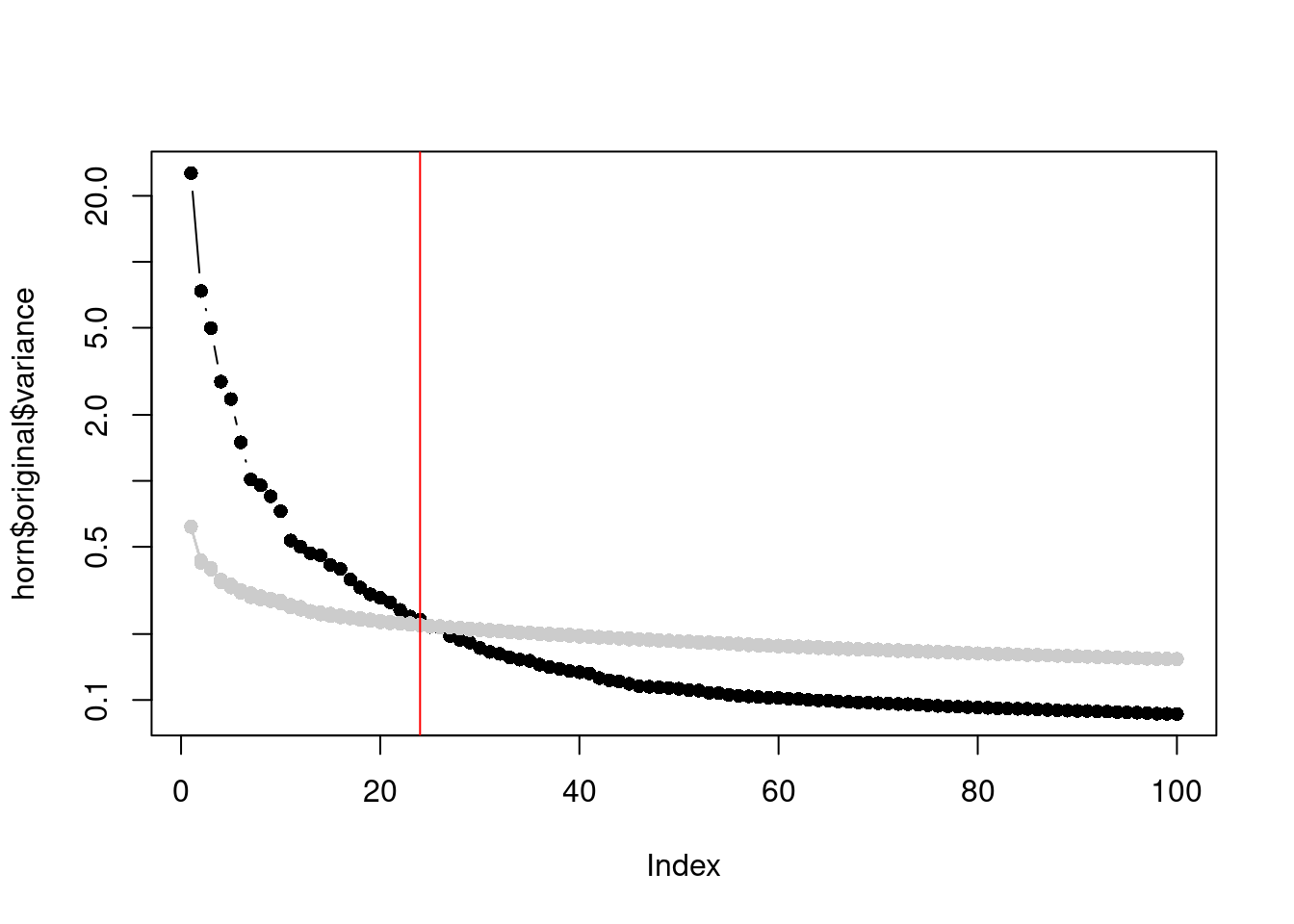
Figure 9.4: Percentage of variance explained by each PC in the original matrix (black) and the PCs in the randomized matrix (grey) across several randomization iterations. The red line marks the chosen number of PCs.
The parallelPCA() function helpfully emits the PC coordinates in horn$original$rotated,
which we can subset by horn$n and add to the reducedDims() of our SingleCellExperiment.
Parallel analysis is reasonably intuitive (as random matrix methods go) and avoids any i.i.d. assumption across genes.
However, its obvious disadvantage is the not-insignificant computational cost of randomizing and repeating the PCA.
One can also debate whether the scree plot of the randomized matrix is even comparable to that of the original,
given that the former includes biological variation and thus cannot be interpreted as purely technical noise.
This manifests in Figure 9.4 as a consistently higher curve for the randomized matrix due to the redistribution of biological variation to the later PCs.
Another approach is based on optimizing the reconstruction error of the low-rank representation (???).
Recall that PCA produces both the matrix of per-cell coordinates and a rotation matrix of per-gene loadings,
the product of which recovers the original log-expression matrix.
If we subset these two matrices to the first \(d\) dimensions, the product of the resulting submatrices serves as an approximation of the original matrix.
Under certain conditions, the difference between this approximation and the true low-rank signal (i.e., sans the noise matrix) has a defined mininum at a certain number of dimensions.
This minimum can be defined using the chooseGavishDonoho() function from PCAtools as shown below.
gv.choice <- PCAtools::chooseGavishDonoho(
    .dim=c(length(top.hvgs), ncol(sce.zeisel2)),
    var.explained=attr(reducedDim(sce.zeisel2), "varExplained"),
    noise=median(dec.zeisel[top.hvgs,"tech"]))

gv.choice
## [1] 59
## attr(,"limit")
## [1] 2.992The Gavish-Donoho method is appealing as, unlike the other approaches for choosing \(d\), the concept of the optimum is rigorously defined. By minimizing the reconstruction error, we can most accurately represent the true biological variation in terms of the distances between cells in PC space. However, there remains some room for difference between “optimal” and “useful”; for example, noisy datasets may find themselves with very low \(d\) as including more PCs will only ever increase reconstruction error, regardless of whether they contain relevant biological variation. This approach is also dependent on some strong i.i.d. assumptions about the noise matrix.
9.4 Count-based dimensionality reduction
For count matrices, correspondence analysis (CA) is a natural approach to dimensionality reduction. In this procedure, we compute an expected value for each entry in the matrix based on the per-gene abundance and size factors. Each count is converted into a standardized residual in a manner analogous to the calculation of the statistic in Pearson’s chi-squared tests, i.e., subtraction of the expected value and division by its square root. An SVD is then applied on this matrix of residuals to obtain the necessary low-dimensional coordinates for each cell. To demonstrate, we use the corral package to compute CA factors for the Zeisel dataset.
library(corral)
sce.corral <- corral_sce(sce.zeisel, subset_row=top.hvgs,
   col.w=sizeFactors(sce.zeisel))
dim(reducedDim(sce.corral, "corral"))
## [1] 2816 30The major advantage of CA is that it avoids difficulties with the mean-variance relationship upon transformation (Section 7.5.1). If two cells have the same expression profile but differences in their total counts, CA will return the same expected location for both cells; this avoids artifacts observed in PCA on log-transformed counts (Figure 9.5). However, CA is more sensitive to overdispersion in the random noise due to the nature of its standardization. This may cause some problems in some datasets where the CA factors may be driven by a few genes with random expression rather than the underlying biological structure.
# TODO: move to scRNAseq.
library(BiocFileCache)
bfc <- BiocFileCache(ask=FALSE)
qcdata <- bfcrpath(bfc, "https://github.com/LuyiTian/CellBench_data/blob/master/data/mRNAmix_qc.RData?raw=true")

env <- new.env()
load(qcdata, envir=env)
sce.8qc <- env$sce8_qc
sce.8qc$mix <- factor(sce.8qc$mix)

# Choosing some HVGs for PCA:
sce.8qc <- logNormCounts(sce.8qc)
dec.8qc <- modelGeneVar(sce.8qc)
hvgs.8qc <- getTopHVGs(dec.8qc, n=1000)
sce.8qc <- runPCA(sce.8qc, subset_row=hvgs.8qc)

# By comparison, corral operates on the raw counts:
sce.8qc <- corral_sce(sce.8qc, subset_row=hvgs.8qc, col.w=sizeFactors(sce.8qc))

gridExtra::grid.arrange(
    plotPCA(sce.8qc, colour_by="mix") + ggtitle("PCA"),
    plotReducedDim(sce.8qc, "corral", colour_by="mix") + ggtitle("corral"),
    ncol=2
)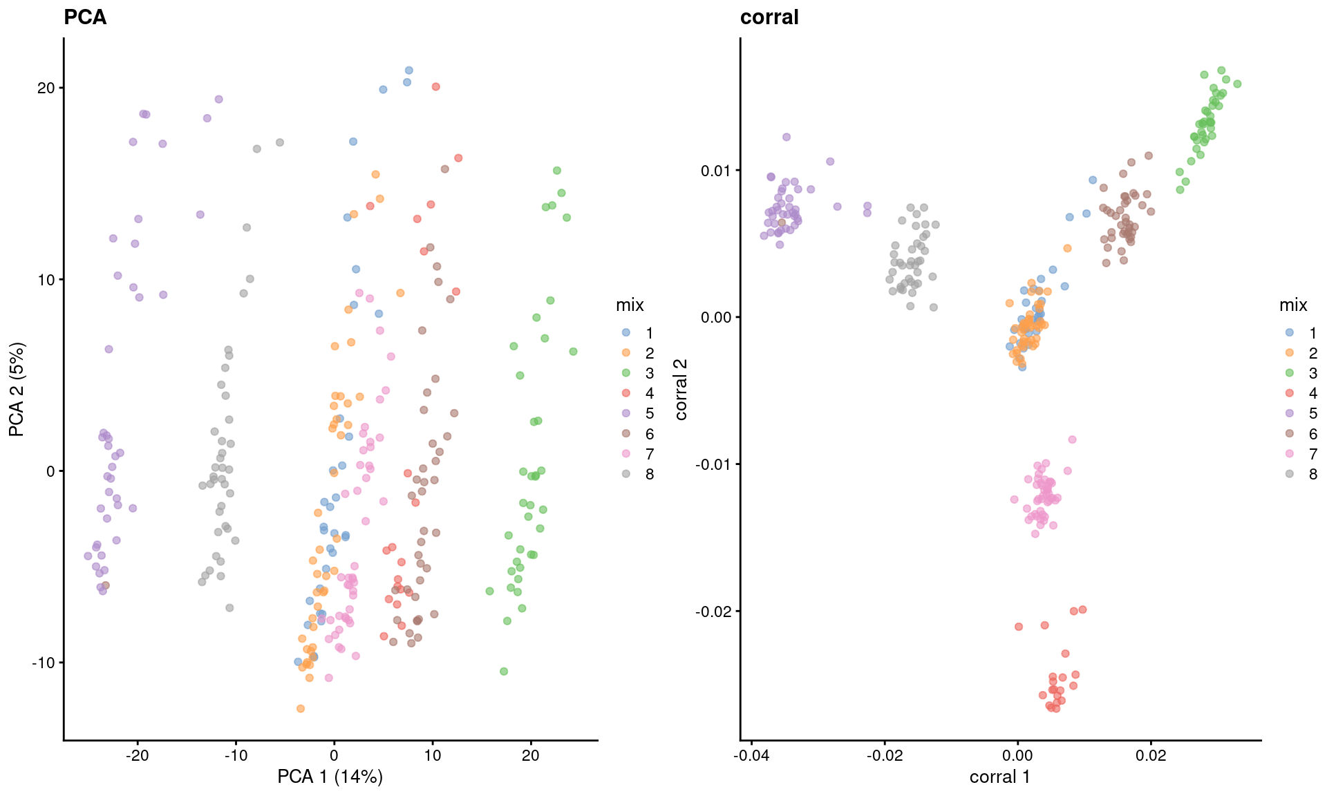
Figure 9.5: Dimensionality reduction results of all pool-and-split libraries in the SORT-seq CellBench data, computed by a PCA on the log-normalized expression values (left) or using the corral package (right). Each point represents a library and is colored by the mixing ratio used to construct it.
9.5 Dimensionality reduction for visualization
9.5.1 Motivation
Another application of dimensionality reduction is to compress the data into 2 (sometimes 3) dimensions for plotting. This serves a separate purpose to the PCA-based dimensionality reduction described above. Algorithms are more than happy to operate on 10-50 PCs, but these are still too many dimensions for human comprehension. Further dimensionality reduction strategies are required to pack the most salient features of the data into 2 or 3 dimensions, which we will discuss below.
9.5.2 Visualizing with PCA
The simplest visualization approach is to plot the top 2 PCs (Figure 9.6):
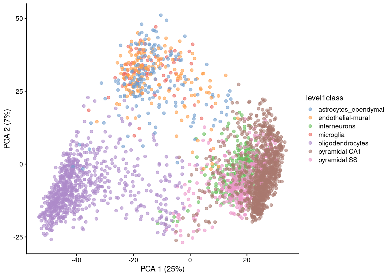
Figure 9.6: PCA plot of the first two PCs in the Zeisel brain data. Each point is a cell, coloured according to the annotation provided by the original authors.
The problem is that PCA is a linear technique, i.e., only variation along a line in high-dimensional space is captured by each PC. As such, it cannot efficiently pack differences in \(d\) dimensions into the first 2 PCs. This is demonstrated in Figure 9.6 where the top two PCs fail to resolve some subpopulations identified by Zeisel et al. (2015). If the first PC is devoted to resolving the biggest difference between subpopulations, and the second PC is devoted to resolving the next biggest difference, then the remaining differences will not be visible in the plot.
One workaround is to plot several of the top PCs against each other in pairwise plots (Figure 9.7). However, it is difficult to interpret multiple plots simultaneously, and even this approach is not sufficient to separate some of the annotated subpopulations.
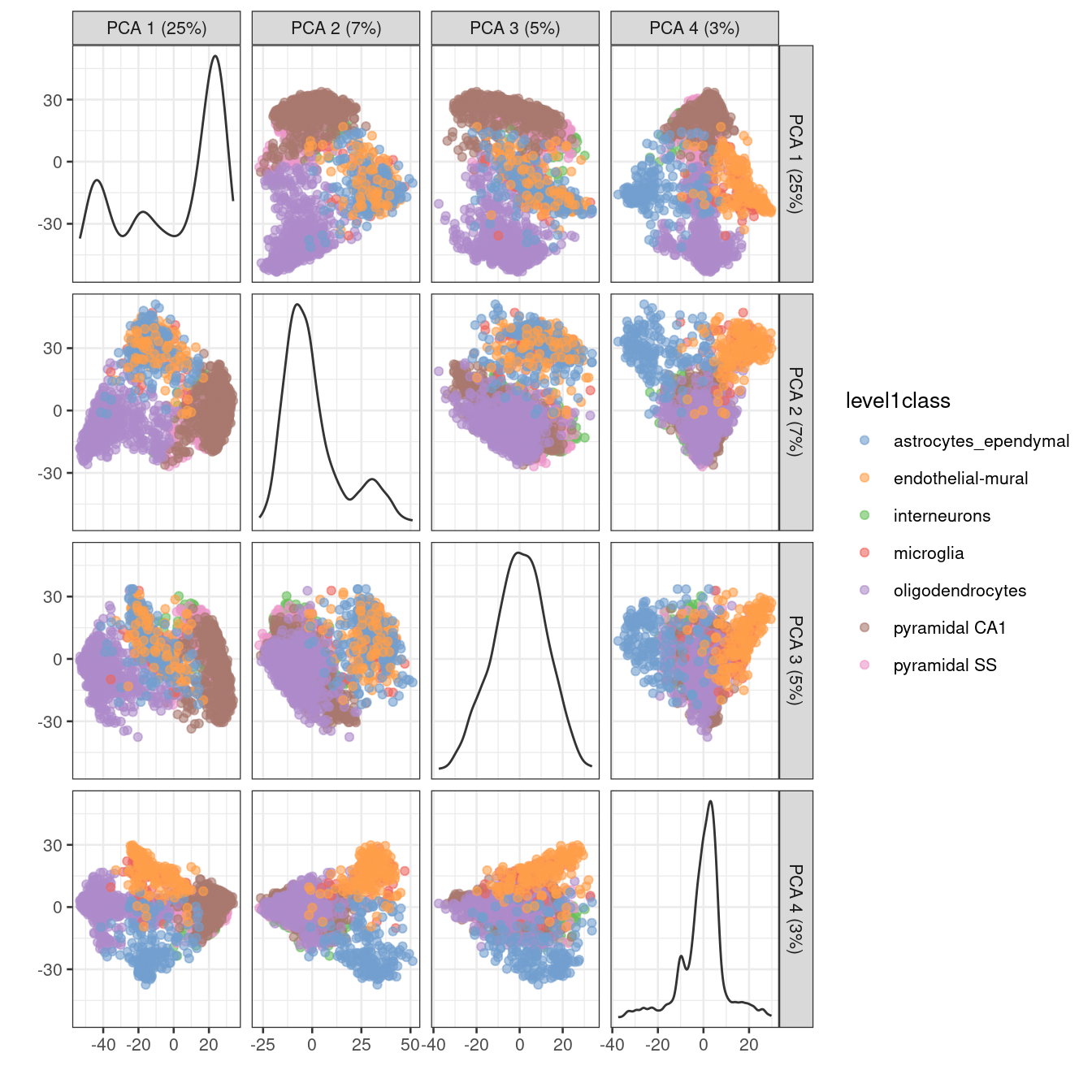
Figure 9.7: PCA plot of the first two PCs in the Zeisel brain data. Each point is a cell, coloured according to the annotation provided by the original authors.
There are some advantages to the PCA for visualization. It is predictable and will not introduce artificial structure in the visualization. It is also deterministic and robust to small changes in the input values. However, as shown above, PCA is usually not satisfactory for visualization of complex populations.
9.5.3 \(t\)-stochastic neighbor embedding
The de facto standard for visualization of scRNA-seq data is the \(t\)-stochastic neighbor embedding (\(t\)-SNE) method (Van der Maaten and Hinton 2008). This attempts to find a low-dimensional representation of the data that preserves the distances between each point and its neighbors in the high-dimensional space. Unlike PCA, it is not restricted to linear transformations, nor is it obliged to accurately represent distances between distant populations. This means that it has much more freedom in how it arranges cells in low-dimensional space, enabling it to separate many distinct clusters in a complex population (Figure 9.8).
set.seed(00101001101)

# runTSNE() stores the t-SNE coordinates in the reducedDims
# for re-use across multiple plotReducedDim() calls.
sce.zeisel <- runTSNE(sce.zeisel, dimred="PCA")
plotReducedDim(sce.zeisel, dimred="TSNE", colour_by="level1class")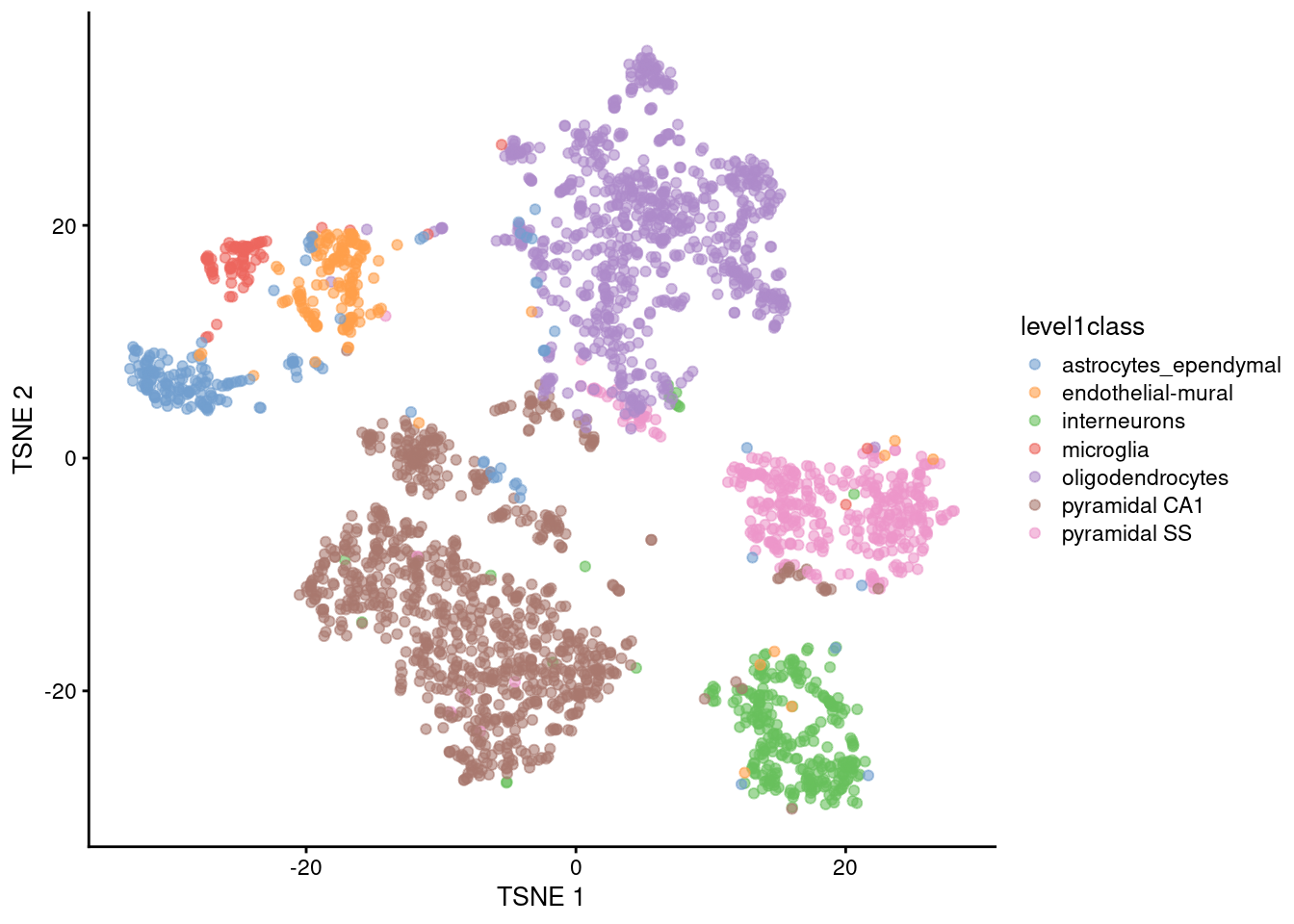
Figure 9.8: \(t\)-SNE plots constructed from the top PCs in the Zeisel brain dataset. Each point represents a cell, coloured according to the published annotation.
One of the main disadvantages of \(t\)-SNE is that it is much more computationally intensive than other visualization methods.
We mitigate this effect by setting dimred="PCA" in runtTSNE(), which instructs the function to perform the \(t\)-SNE calculations on the top PCs to exploit the data compaction and noise removal provided by the PCA.
It is possible to run \(t\)-SNE on the original expression matrix but this is less efficient.
Another issue with \(t\)-SNE is that it requires the user to be aware of additional parameters (discussed here in some depth). It involves a random initialization so we need to (i) repeat the visualization several times to ensure that the results are representative and (ii) set the seed to ensure that the chosen results are reproducible. The “perplexity” is another important parameter that determines the granularity of the visualization (Figure 9.9). Low perplexities will favor resolution of finer structure, possibly to the point that the visualization is compromised by random noise. Thus, it is advisable to test different perplexity values to ensure that the choice of perplexity does not drive the interpretation of the plot.
set.seed(100)
sce.zeisel <- runTSNE(sce.zeisel, dimred="PCA", perplexity=5)
out5 <- plotReducedDim(sce.zeisel, dimred="TSNE",
    colour_by="level1class") + ggtitle("perplexity = 5")

set.seed(100)
sce.zeisel <- runTSNE(sce.zeisel, dimred="PCA", perplexity=20)
out20 <- plotReducedDim(sce.zeisel, dimred="TSNE",
    colour_by="level1class") + ggtitle("perplexity = 20")

set.seed(100)
sce.zeisel <- runTSNE(sce.zeisel, dimred="PCA", perplexity=80)
out80 <- plotReducedDim(sce.zeisel, dimred="TSNE",
    colour_by="level1class") + ggtitle("perplexity = 80")

gridExtra::grid.arrange(out5, out20, out80, ncol=3)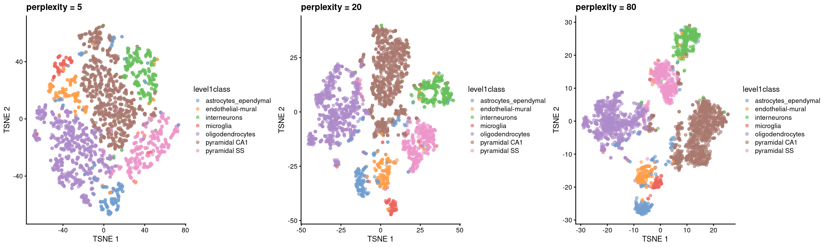
Figure 9.9: \(t\)-SNE plots constructed from the top PCs in the Zeisel brain dataset, using a range of perplexity values. Each point represents a cell, coloured according to its annotation.
Finally, it is tempting to interpret the \(t\)-SNE results as a “map” of single-cell identities. This is generally unwise as any such interpretation is easily misled by the size and positions of the visual clusters. Specifically, \(t\)-SNE will inflate dense clusters and compress sparse ones, such that we cannot use the size as a measure of subpopulation heterogeneity. Similarly, \(t\)-SNE is not obliged to preserve the relative locations of non-neighboring clusters, such that we cannot use their positions to determine relationships between distant clusters. We provide some suggestions on how to interpret these plots in Section 9.5.5.
Despite its shortcomings, \(t\)-SNE is proven tool for general-purpose visualization of scRNA-seq data and remains a popular choice in many analysis pipelines.
9.5.4 Uniform manifold approximation and projection
The uniform manifold approximation and projection (UMAP) method (McInnes, Healy, and Melville 2018) is an alternative to \(t\)-SNE for non-linear dimensionality reduction. It is roughly similar to \(t\)-SNE in that it also tries to find a low-dimensional representation that preserves relationships between neighbors in high-dimensional space. However, the two methods are based on different theory, represented by differences in the various graph weighting equations. This manifests as a different visualization as shown in Figure 9.10.
set.seed(1100101001)
sce.zeisel <- runUMAP(sce.zeisel, dimred="PCA")
plotReducedDim(sce.zeisel, dimred="UMAP", colour_by="level1class")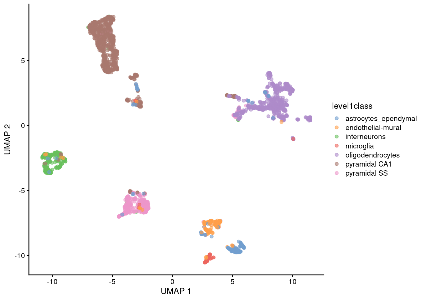
Figure 9.10: UMAP plots constructed from the top PCs in the Zeisel brain dataset. Each point represents a cell, coloured according to the published annotation.
Compared to \(t\)-SNE, the UMAP visualization tends to have more compact visual clusters with more empty space between them. It also attempts to preserve more of the global structure than \(t\)-SNE. From a practical perspective, UMAP is much faster than \(t\)-SNE, which may be an important consideration for large datasets. (Nonetheless, we have still run UMAP on the top PCs here for consistency.) UMAP also involves a series of randomization steps so setting the seed is critical.
Like \(t\)-SNE, UMAP has its own suite of hyperparameters that affect the visualization.
Of these, the number of neighbors (n_neighbors) and the minimum distance between embedded points (min_dist) have the greatest effect on the granularity of the output.
If these values are too low, random noise will be incorrectly treated as high-resolution structure, while values that are too high will discard fine structure altogether in favor of obtaining an accurate overview of the entire dataset.
Again, it is a good idea to test a range of values for these parameters to ensure that they do not compromise any conclusions drawn from a UMAP plot.
It is arguable whether the UMAP or \(t\)-SNE visualizations are more useful or aesthetically pleasing. UMAP aims to preserve more global structure but this necessarily reduces resolution within each visual cluster. However, UMAP is unarguably much faster, and for that reason alone, it is increasingly displacing \(t\)-SNE as the method of choice for visualizing large scRNA-seq data sets.
9.5.5 Interpreting the plots
Dimensionality reduction for visualization necessarily involves discarding information and distorting the distances between cells in order to fit high-dimensional data into a 2-dimensional space. One might wonder whether the results of such extreme data compression can be trusted. Indeed, some of our more quantitative colleagues consider such visualizations to be more artistic than scientific, fit for little but impressing collaborators and reviewers! Perhaps this perspective is not entirely invalid, but we suggest that there is some value to be extracted from them provided that they are accompanied by an analysis of a higher-rank representation.
As a general rule, focusing on local neighborhoods provides the safest interpretation of \(t\)-SNE and UMAP plots. These methods spend considerable effort to ensure that each cell’s nearest neighbors in high-dimensional space are still its neighbors in the two-dimensional embedding. Thus, if we see multiple cell types or clusters in a single unbroken “island” in the embedding, we could infer that those populations were also close neighbors in higher-dimensional space. However, less can be said about the distances between non-neighboring cells; there is no guarantee that large distances are faithfully recapitulated in the embedding, given the distortions necessary for this type of dimensionality reduction. It would be courageous to use the distances between islands (measured, on occasion, with a ruler!) to make statements about the relative similarity of distinct cell types.
On a related note, we prefer to restrict the \(t\)-SNE/UMAP coordinates for visualization and use the higher-rank representation for any quantitative analyses. To illustrate, consider the interaction between clustering and \(t\)-SNE. We do not perform clustering on the \(t\)-SNE coordinates, but rather, we cluster on the first 10-50 PCs (Chapter (clustering)) and then visualize the cluster identities on \(t\)-SNE plots like that in Figure 9.8. This ensures that clustering makes use of the information that was lost during compression into two dimensions for visualization. The plot can then be used for a diagnostic inspection of the clustering output, e.g., to check which clusters are close neighbors or whether a cluster can be split into further subclusters; this follows the aforementioned theme of focusing on local structure.
From a naive perspective, using the \(t\)-SNE coordinates directly for clustering is tempting as it ensures that any results are immediately consistent with the visualization. Given that clustering is rather arbitrary anyway, there is nothing inherently wrong with this strategy - in fact, it can be treated as a rather circuitous implementation of graph-based clustering (Section 10.3). However, the enforced consistency can actually be considered a disservice as it masks the ambiguity of the conclusions, either due to the loss of information from dimensionality reduction or the uncertainty of the clustering. Rather than being errors, major discrepancies can instead be useful for motivating further investigation into the less obvious aspects of the dataset; conversely, the lack of discrepancies increases trust in the conclusions.
Or perhaps more bluntly: do not let the tail (of visualization) wag the dog (of quantitative analysis).
Session Info
R version 4.0.4 (2021-02-15)
Platform: x86_64-pc-linux-gnu (64-bit)
Running under: Ubuntu 20.04.2 LTS

Matrix products: default
BLAS:   /home/biocbuild/bbs-3.12-books/R/lib/libRblas.so
LAPACK: /home/biocbuild/bbs-3.12-books/R/lib/libRlapack.so

locale:
 [1] LC_CTYPE=en_US.UTF-8       LC_NUMERIC=C
 [3] LC_TIME=en_US.UTF-8        LC_COLLATE=C
 [5] LC_MONETARY=en_US.UTF-8    LC_MESSAGES=en_US.UTF-8
 [7] LC_PAPER=en_US.UTF-8       LC_NAME=C
 [9] LC_ADDRESS=C               LC_TELEPHONE=C
[11] LC_MEASUREMENT=en_US.UTF-8 LC_IDENTIFICATION=C

attached base packages:
[1] parallel  stats4    stats     graphics  grDevices utils     datasets
[8] methods   base

other attached packages:
 [1] BiocFileCache_1.14.0        dbplyr_2.1.0
 [3] corral_1.0.0                BiocSingular_1.6.0
 [5] scater_1.18.6               ggplot2_3.3.3
 [7] scran_1.18.5                SingleCellExperiment_1.12.0
 [9] SummarizedExperiment_1.20.0 Biobase_2.50.0
[11] GenomicRanges_1.42.0        GenomeInfoDb_1.26.4
[13] IRanges_2.24.1              S4Vectors_0.28.1
[15] BiocGenerics_0.36.0         MatrixGenerics_1.2.1
[17] matrixStats_0.58.0          BiocStyle_2.18.1
[19] rebook_1.0.0

loaded via a namespace (and not attached):
  [1] Rtsne_0.15                  ggbeeswarm_0.6.0
  [3] colorspace_2.0-0            ellipsis_0.3.1
  [5] scuttle_1.0.4               bluster_1.0.0
  [7] XVector_0.30.0              BiocNeighbors_1.8.2
  [9] dichromat_2.0-0             farver_2.1.0
 [11] bit64_4.0.5                 MultiAssayExperiment_1.16.0
 [13] ggrepel_0.9.1               RSpectra_0.16-0
 [15] fansi_0.4.2                 codetools_0.2-18
 [17] sparseMatrixStats_1.2.1     cachem_1.0.4
 [19] knitr_1.31                  jsonlite_1.7.2
 [21] uwot_0.1.10                 graph_1.68.0
 [23] httr_1.4.2                  BiocManager_1.30.10
 [25] mapproj_1.2.7               compiler_4.0.4
 [27] dqrng_0.2.1                 fastmap_1.1.0
 [29] assertthat_0.2.1            Matrix_1.3-2
 [31] limma_3.46.0                htmltools_0.5.1.1
 [33] tools_4.0.4                 rsvd_1.0.3
 [35] igraph_1.2.6                gtable_0.3.0
 [37] glue_1.4.2                  GenomeInfoDbData_1.2.4
 [39] reshape2_1.4.4              dplyr_1.0.5
 [41] rappdirs_0.3.3              ggthemes_4.2.4
 [43] maps_3.3.0                  Rcpp_1.0.6
 [45] jquerylib_0.1.3             vctrs_0.3.6
 [47] DelayedMatrixStats_1.12.3   xfun_0.22
 [49] stringr_1.4.0               ps_1.6.0
 [51] beachmat_2.6.4              lifecycle_1.0.0
 [53] irlba_2.3.3                 PCAtools_2.2.0
 [55] statmod_1.4.35              XML_3.99-0.6
 [57] edgeR_3.32.1                zlibbioc_1.36.0
 [59] scales_1.1.1                curl_4.3
 [61] yaml_2.2.1                  memoise_2.0.0
 [63] gridExtra_2.3               sass_0.3.1
 [65] RSQLite_2.2.4               stringi_1.5.3
 [67] highr_0.8                   BiocParallel_1.24.1
 [69] pals_1.6                    rlang_0.4.10
 [71] pkgconfig_2.0.3             bitops_1.0-6
 [73] RMTstat_0.3                 evaluate_0.14
 [75] lattice_0.20-41             purrr_0.3.4
 [77] labeling_0.4.2              CodeDepends_0.6.5
 [79] bit_4.0.4                   cowplot_1.1.1
 [81] transport_0.12-2            processx_3.4.5
 [83] tidyselect_1.1.0            plyr_1.8.6
 [85] magrittr_2.0.1              bookdown_0.21
 [87] R6_2.5.0                    generics_0.1.0
 [89] DelayedArray_0.16.2         DBI_1.1.1
 [91] pillar_1.5.1                withr_2.4.1
 [93] RCurl_1.98-1.3              tibble_3.1.0
 [95] crayon_1.4.1                utf8_1.2.1
 [97] rmarkdown_2.7               viridis_0.5.1
 [99] locfit_1.5-9.4              grid_4.0.4
[101] data.table_1.14.0           FNN_1.1.3
[103] blob_1.2.1                  callr_3.5.1
[105] digest_0.6.27               munsell_0.5.0
[107] beeswarm_0.3.1              viridisLite_0.3.0
[109] vipor_0.4.5                 bslib_0.2.4
Bibliography
Johnstone, I. M., and A. Y. Lu. 2009. “On Consistency and Sparsity for Principal Components Analysis in High Dimensions.” J Am Stat Assoc 104 (486): 682–93.
Langfelder, P., and S. Horvath. 2007. “Eigengene networks for studying the relationships between co-expression modules.” BMC Syst Biol 1 (November): 54.
McInnes, Leland, John Healy, and James Melville. 2018. “UMAP: Uniform Manifold Approximation and Projection for Dimension Reduction.” arXiv E-Prints, February, arXiv:1802.03426. http://arxiv.org/abs/1802.03426.
Shekhar, K., S. W. Lapan, I. E. Whitney, N. M. Tran, E. Z. Macosko, M. Kowalczyk, X. Adiconis, et al. 2016. “Comprehensive Classification of Retinal Bipolar Neurons by Single-Cell Transcriptomics.” Cell 166 (5): 1308–23.
Van der Maaten, L., and G. Hinton. 2008. “Visualizing Data Using T-SNE.” J. Mach. Learn. Res. 9 (2579-2605): 85.
Zeisel, A., A. B. Munoz-Manchado, S. Codeluppi, P. Lonnerberg, G. La Manno, A. Jureus, S. Marques, et al. 2015. “Brain structure. Cell types in the mouse cortex and hippocampus revealed by single-cell RNA-seq.” Science 347 (6226): 1138–42.