Chapter 4 DE analyses between conditions
4.1 Motivation
A powerful use of scRNA-seq technology lies in the design of replicated multi-condition experiments to detect population-specific changes in expression between conditions. For example, a researcher could use this strategy to detect gene expression changes for each cell type after drug treatment (Richard et al. 2018) or genetic modifications (Scialdone et al. 2016). This provides more biological insight than conventional scRNA-seq experiments involving only one biological condition, especially if we can relate population changes to specific experimental perturbations. Here, we will focus on differential expression analyses of replicated multi-condition scRNA-seq experiments. Our aim is to find significant changes in expression between conditions for cells of the same type that are present in both conditions.
4.2 Setting up the data
Our demonstration scRNA-seq dataset was generated from chimeric mouse embryos at the E8.5 developmental stage (Pijuan-Sala et al. 2019). Each chimeric embryo was generated by injecting td-Tomato-positive embryonic stem cells (ESCs) into a wild-type (WT) blastocyst. Unlike in previous experiments (Scialdone et al. 2016), there is no genetic difference between the injected and background cells other than the expression of td-Tomato in the former. Instead, the aim of this “wild-type chimera” study is to determine whether the injection procedure itself introduces differences in lineage commitment compared to the background cells.
The experiment used a paired design with three replicate batches of two samples each. Specifically, each batch contains one sample consisting of td-Tomato positive cells and another consisting of negative cells, obtained by fluorescence-activated cell sorting from a single pool of dissociated cells from 6-7 chimeric embryos. For each sample, scRNA-seq data was generated using the 10X Genomics protocol (Zheng et al. 2017) to obtain 2000-7000 cells.
#--- loading ---#
library(MouseGastrulationData)
sce.chimera <- WTChimeraData(samples=5:10)
sce.chimera

#--- feature-annotation ---#
library(scater)
rownames(sce.chimera) <- uniquifyFeatureNames(
    rowData(sce.chimera)$ENSEMBL, rowData(sce.chimera)$SYMBOL)

#--- quality-control ---#
drop <- sce.chimera$celltype.mapped %in% c("stripped", "Doublet")
sce.chimera <- sce.chimera[,!drop]

#--- normalization ---#
sce.chimera <- logNormCounts(sce.chimera)

#--- variance-modelling ---#
library(scran)
dec.chimera <- modelGeneVar(sce.chimera, block=sce.chimera$sample)
chosen.hvgs <- dec.chimera$bio > 0

#--- merging ---#
library(batchelor)
set.seed(01001001)
merged <- correctExperiments(sce.chimera,
    batch=sce.chimera$sample,
    subset.row=chosen.hvgs,
    PARAM=FastMnnParam(
        merge.order=list(
            list(1,3,5), # WT (3 replicates)
            list(2,4,6)  # td-Tomato (3 replicates)
        )
    )
)

#--- clustering ---#
g <- buildSNNGraph(merged, use.dimred="corrected")
clusters <- igraph::cluster_louvain(g)
colLabels(merged) <- factor(clusters$membership)

#--- dimensionality-reduction ---#
merged <- runTSNE(merged, dimred="corrected", external_neighbors=TRUE)
merged <- runUMAP(merged, dimred="corrected", external_neighbors=TRUE)## class: SingleCellExperiment
## dim: 14699 19426
## metadata(2): merge.info pca.info
## assays(3): reconstructed counts logcounts
## rownames(14699): Xkr4 Rp1 ... Vmn2r122 CAAA01147332.1
## rowData names(3): rotation ENSEMBL SYMBOL
## colnames(19426): cell_9769 cell_9770 ... cell_30701 cell_30702
## colData names(13): batch cell ... sizeFactor label
## reducedDimNames(5): corrected pca.corrected.E7.5 pca.corrected.E8.5
## TSNE UMAP
## mainExpName: NULL
## altExpNames(0):The differential analyses in this chapter will be predicated on many of the pre-processing steps covered previously. For brevity, we will not explicitly repeat them here, only noting that we have already merged cells from all samples into the same coordinate system (Chapter 1) and clustered the merged dataset to obtain a common partitioning across all samples (Basic Chapter 5). A brief inspection of the results indicates that clusters contain similar contributions from all batches with only modest differences associated with td-Tomato expression (Figure 4.1).
##
##      FALSE TRUE
##   1    546  401
##   2     60   52
##   3    470  398
##   4    469  211
##   5    335  271
##   6    258  249
##   7   1241  967
##   8    203  221
##   9    630  629
##   10    71  181
##   11   417  310
##   12    47   57
##   13    58    0
##   14   209  214
##   15   414  630
##   16   363  509
##   17   234  198
##   18   657  607
##   19   151  303
##   20   579  443
##   21   137   74
##   22    82   78
##   23   155    1
##   24   762  878
##   25   363  497
## 26 1420 716##
## 3 4 5
## 1 224 173 550
## 2 26 30 56
## 3 226 172 470
## 4 78 162 440
## 5 99 227 280
## 6 187 116 204
## 7 300 909 999
## 8 69 134 221
## 9 229 423 607
## 10 114 54 84
## 11 179 169 379
## 12 16 31 57
## 13 2 51 5
## 14 77 97 249
## 15 114 289 641
## 16 183 242 447
## 17 157 81 194
## 18 123 308 833
## 19 106 118 230
## 20 236 238 548
## 21 3 10 198
## 22 27 29 104
## 23 6 84 66
## 24 217 455 968
## 25 132 172 556
## 26 194 870 1072gridExtra::grid.arrange(
plotTSNE(merged, colour_by="tomato", text_by="label"),
plotTSNE(merged, colour_by=data.frame(pool=factor(merged$pool))),
ncol=2
)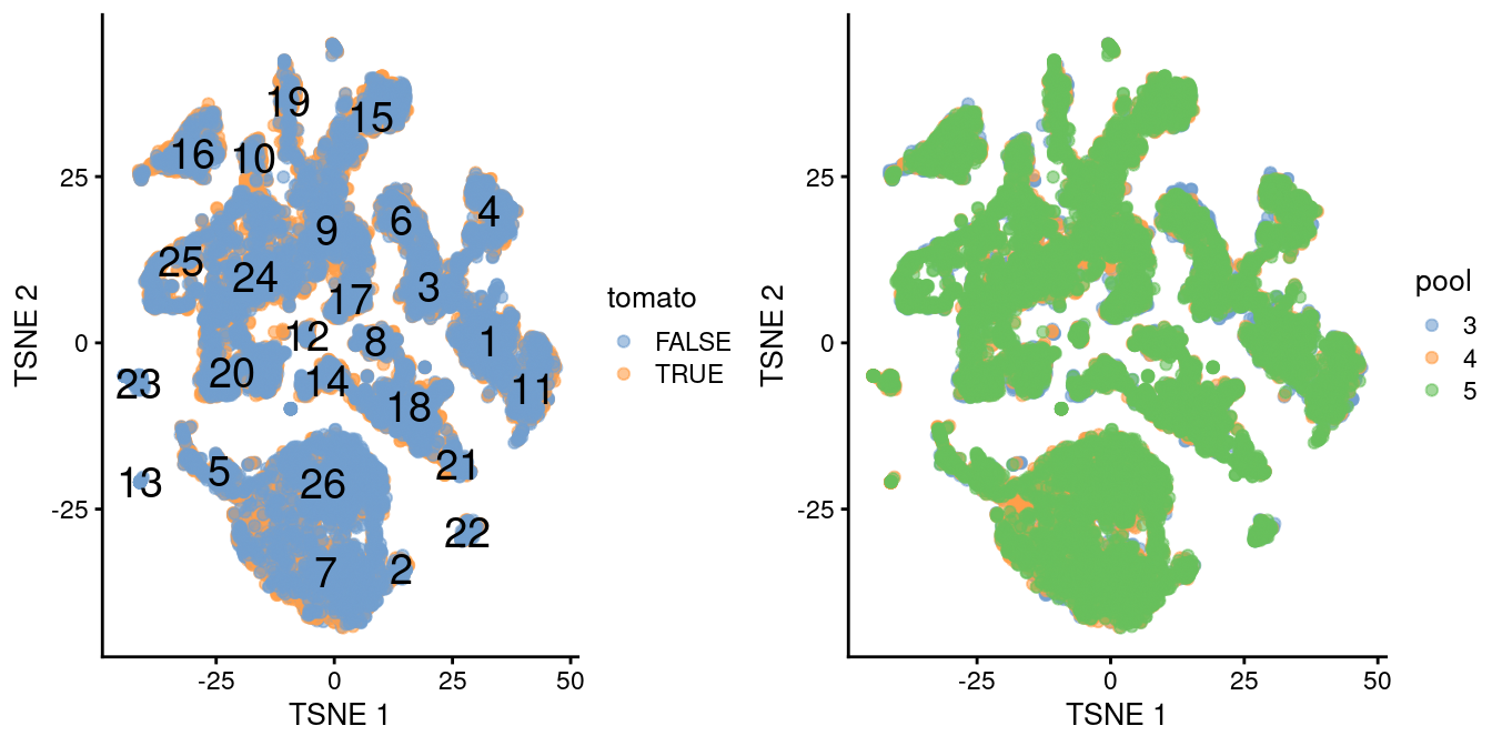
Figure 4.1: \(t\)-SNE plot of the WT chimeric dataset, where each point represents a cell and is colored according to td-Tomato expression (left) or batch of origin (right). Cluster numbers are superimposed based on the median coordinate of cells assigned to that cluster.
Ordinarily, we would be obliged to perform marker detection to assign biological meaning to these clusters. For simplicity, we will skip this step by directly using the existing cell type labels provided by Pijuan-Sala et al. (2019). These were obtained by mapping the cells in this dataset to a larger, pre-annotated “atlas” of mouse early embryonic development. While there are obvious similarities, we see that many of our clusters map to multiple labels and vice versa (Figure 4.2), which reflects the difficulties in unambiguously resolving cell types undergoing differentiation.
## [1] 0.5514by.label <- table(colLabels(merged), merged$celltype.mapped)
pheatmap::pheatmap(log2(by.label+1), color=viridis::viridis(101))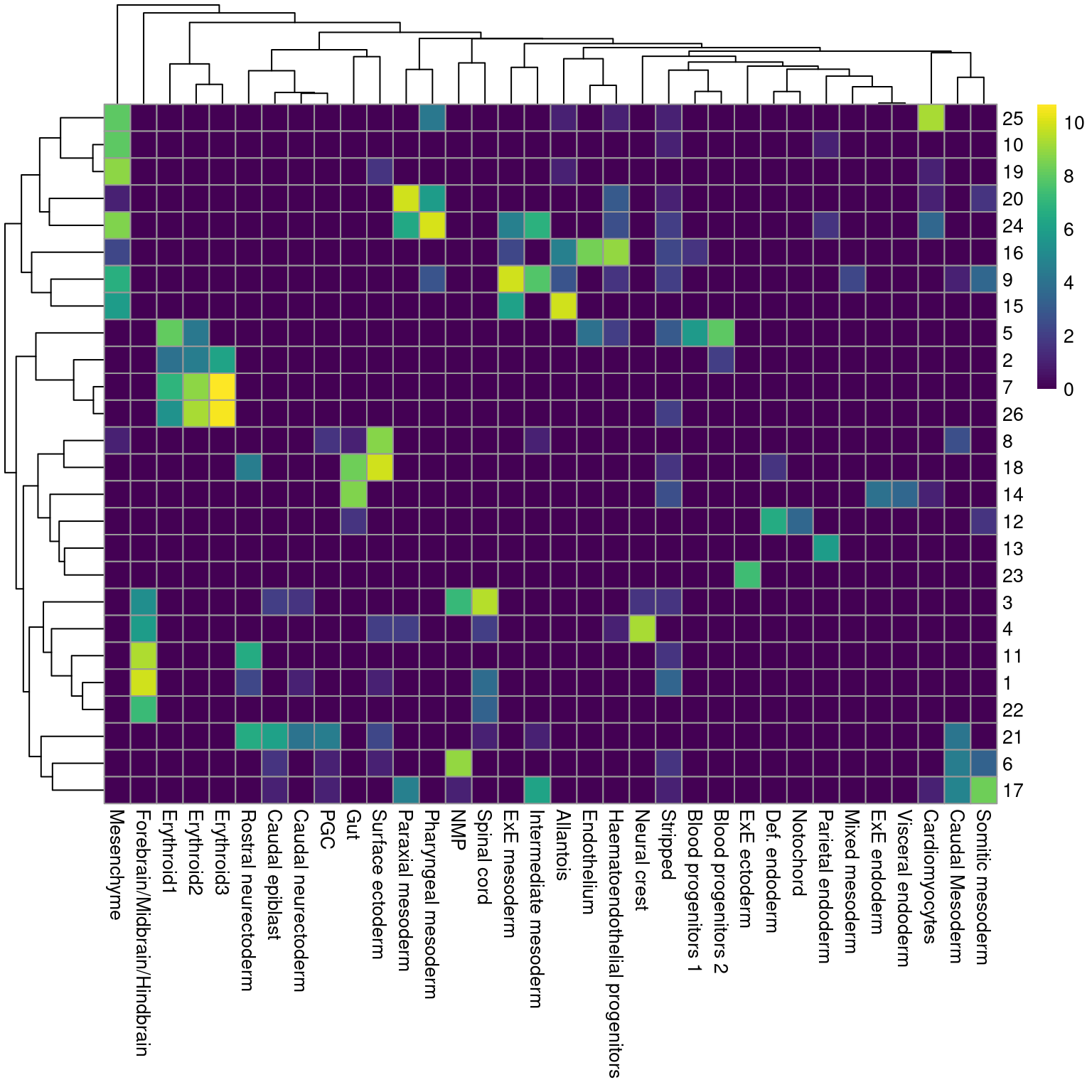
Figure 4.2: Heatmap showing the abundance of cells with each combination of cluster (row) and cell type label (column). The color scale represents the log2-count for each combination.
4.3 Creating pseudo-bulk samples
The most obvious differential analysis is to look for changes in expression between conditions. We perform the DE analysis separately for each label to identify cell type-specific transcriptional effects of injection. The actual DE testing is performed on “pseudo-bulk” expression profiles (Tung et al. 2017), generated by summing counts together for all cells with the same combination of label and sample. This leverages the resolution offered by single-cell technologies to define the labels, and combines it with the statistical rigor of existing methods for DE analyses involving a small number of samples.
# Using 'label' and 'sample' as our two factors; each column of the output
# corresponds to one unique combination of these two factors.
summed <- aggregateAcrossCells(merged,
    id=colData(merged)[,c("celltype.mapped", "sample")])
summed
## class: SingleCellExperiment
## dim: 14699 186
## metadata(2): merge.info pca.info
## assays(1): counts
## rownames(14699): Xkr4 Rp1 ... Vmn2r122 CAAA01147332.1
## rowData names(3): rotation ENSEMBL SYMBOL
## colnames: NULL
## colData names(16): batch cell ... sample ncells
## reducedDimNames(5): corrected pca.corrected.E7.5 pca.corrected.E8.5
## TSNE UMAP
## mainExpName: NULL
## altExpNames(0):At this point, it is worth reflecting on the motivations behind the use of pseudo-bulking:
- Larger counts are more amenable to standard DE analysis pipelines designed for bulk RNA-seq data. Normalization is more straightforward and certain statistical approximations are more accurate e.g., the saddlepoint approximation for quasi-likelihood methods or normality for linear models.
- Collapsing cells into samples reflects the fact that our biological replication occurs at the sample level (Lun and Marioni 2017). Each sample is represented no more than once for each condition, avoiding problems from unmodelled correlations between samples. Supplying the per-cell counts directly to a DE analysis pipeline would imply that each cell is an independent biological replicate, which is not true from an experimental perspective. (A mixed effects model can handle this variance structure but involves extra statistical and computational complexity for little benefit, see Crowell et al. (2019).)
- Variance between cells within each sample is masked, provided it does not affect variance across (replicate) samples. This avoids penalizing DEGs that are not uniformly up- or down-regulated for all cells in all samples of one condition. Masking is generally desirable as DEGs - unlike marker genes - do not need to have low within-sample variance to be interesting, e.g., if the treatment effect is consistent across replicate populations but heterogeneous on a per-cell basis. Of course, high per-cell variability will still result in weaker DE if it affects the variability across populations, while homogeneous per-cell responses will result in stronger DE due to a larger population-level log-fold change. These effects are also largely desirable.
4.4 Performing the DE analysis
Our DE analysis will be performed using quasi-likelihood (QL) methods from the edgeR package (Robinson, McCarthy, and Smyth 2010; Chen, Lun, and Smyth 2016). This uses a negative binomial generalized linear model (NB GLM) to handle overdispersed count data in experiments with limited replication. In our case, we have biological variation with three paired replicates per condition, so edgeR or its contemporaries is a natural choice for the analysis.
We do not use all labels for GLM fitting as the strong DE between labels makes it difficult to compute a sensible average abundance to model the mean-dispersion trend. Moreover, label-specific batch effects would not be easily handled with a single additive term in the design matrix for the batch. Instead, we arbitrarily pick one of the labels to use for this demonstration.
label <- "Mesenchyme"
current <- summed[,label==summed$celltype.mapped]

# Creating up a DGEList object for use in edgeR:
library(edgeR)
y <- DGEList(counts(current), samples=colData(current))
y
## An object of class "DGEList"
## $counts
## Sample1 Sample2 Sample3 Sample4 Sample5 Sample6
## Xkr4 2 0 0 0 3 0
## Rp1 0 0 1 0 0 0
## Sox17 7 0 3 0 14 9
## Mrpl15 1420 271 1009 379 1578 749
## Rgs20 3 0 1 1 0 0
## 14694 more rows ...
##
## $samples
## group lib.size norm.factors batch cell barcode sample stage tomato pool
## Sample1 1 4607053 1 5 <NA> <NA> 5 E8.5 TRUE 3
## Sample2 1 1064970 1 6 <NA> <NA> 6 E8.5 FALSE 3
## Sample3 1 2494010 1 7 <NA> <NA> 7 E8.5 TRUE 4
## Sample4 1 1028668 1 8 <NA> <NA> 8 E8.5 FALSE 4
## Sample5 1 4290221 1 9 <NA> <NA> 9 E8.5 TRUE 5
## Sample6 1 1950840 1 10 <NA> <NA> 10 E8.5 FALSE 5
## stage.mapped celltype.mapped closest.cell doub.density sizeFactor label
## Sample1 <NA> Mesenchyme <NA> NA NA <NA>
## Sample2 <NA> Mesenchyme <NA> NA NA <NA>
## Sample3 <NA> Mesenchyme <NA> NA NA <NA>
## Sample4 <NA> Mesenchyme <NA> NA NA <NA>
## Sample5 <NA> Mesenchyme <NA> NA NA <NA>
## Sample6 <NA> Mesenchyme <NA> NA NA <NA>
## celltype.mapped.1 sample.1 ncells
## Sample1 Mesenchyme 5 286
## Sample2 Mesenchyme 6 55
## Sample3 Mesenchyme 7 243
## Sample4 Mesenchyme 8 134
## Sample5 Mesenchyme 9 478
## Sample6 Mesenchyme 10 299A typical step in bulk RNA-seq data analyses is to remove samples with very low library sizes due to failed library preparation or sequencing. The very low counts in these samples can be troublesome in downstream steps such as normalization (Basic Chapter 2) or for some statistical approximations used in the DE analysis. In our situation, this is equivalent to removing label-sample combinations that have very few or lowly-sequenced cells. The exact definition of “very low” will vary, but in this case, we remove combinations containing fewer than 10 cells (Crowell et al. 2019). Alternatively, we could apply the outlier-based strategy described in Basic Chapter 1, but this makes the strong assumption that all label-sample combinations have similar numbers of cells that are sequenced to similar depth. We defer to the usual diagnostics for bulk DE analyses to decide whether a particular pseudo-bulk profile should be removed.
##    Mode   FALSE
## logical       6
Another typical step in bulk RNA-seq analyses is to remove genes that are lowly expressed.
This reduces computational work, improves the accuracy of mean-variance trend modelling and decreases the severity of the multiple testing correction.
Here, we use the filterByExpr() function from edgeR to remove genes that are not expressed above a log-CPM threshold in a minimum number of samples (determined from the size of the smallest treatment group in the experimental design).
##    Mode   FALSE    TRUE
## logical    9011    5688
Finally, we correct for composition biases by computing normalization factors with the trimmed mean of M-values method (Robinson and Oshlack 2010). We do not need the bespoke single-cell methods described in Basic Chapter 2, as the counts for our pseudo-bulk samples are large enough to apply bulk normalization methods. (Note that edgeR normalization factors are closely related but not the same as the size factors described elsewhere in this book. Size factors are proportional to the product of the normalization factors and the library sizes.)
##         group lib.size norm.factors batch cell barcode sample stage tomato pool
## Sample1     1  4607053       1.0683     5 <NA>    <NA>      5  E8.5   TRUE    3
## Sample2     1  1064970       1.0487     6 <NA>    <NA>      6  E8.5  FALSE    3
## Sample3     1  2494010       0.9582     7 <NA>    <NA>      7  E8.5   TRUE    4
## Sample4     1  1028668       0.9774     8 <NA>    <NA>      8  E8.5  FALSE    4
## Sample5     1  4290221       0.9707     9 <NA>    <NA>      9  E8.5   TRUE    5
## Sample6     1  1950840       0.9817    10 <NA>    <NA>     10  E8.5  FALSE    5
##         stage.mapped celltype.mapped closest.cell doub.density sizeFactor label
## Sample1         <NA>      Mesenchyme         <NA>           NA         NA  <NA>
## Sample2         <NA>      Mesenchyme         <NA>           NA         NA  <NA>
## Sample3         <NA>      Mesenchyme         <NA>           NA         NA  <NA>
## Sample4         <NA>      Mesenchyme         <NA>           NA         NA  <NA>
## Sample5         <NA>      Mesenchyme         <NA>           NA         NA  <NA>
## Sample6         <NA>      Mesenchyme         <NA>           NA         NA  <NA>
##         celltype.mapped.1 sample.1 ncells
## Sample1        Mesenchyme        5    286
## Sample2        Mesenchyme        6     55
## Sample3        Mesenchyme        7    243
## Sample4        Mesenchyme        8    134
## Sample5        Mesenchyme        9    478
## Sample6        Mesenchyme       10    299
As part of the usual diagnostics for a bulk RNA-seq DE analysis, we generate a mean-difference (MD) plot for each normalized pseudo-bulk profile (Figure 4.3). This should exhibit a trumpet shape centered at zero indicating that the normalization successfully removed systematic bias between profiles. Lack of zero-centering or dominant discrete patterns at low abundances may be symptomatic of deeper problems with normalization, possibly due to insufficient cells/reads/UMIs composing a particular pseudo-bulk profile.
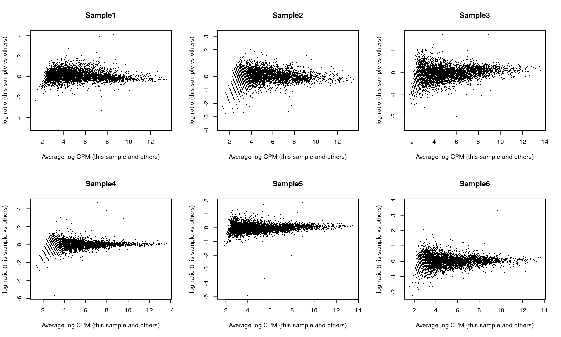
Figure 4.3: Mean-difference plots of the normalized expression values for each pseudo-bulk sample against the average of all other samples.
We also generate a multi-dimensional scaling (MDS) plot for the pseudo-bulk profiles (Figure 4.4). This is closely related to PCA and allows us to visualize the structure of the data in a manner similar to that described in Basic Chapter 4 (though we rarely have enough pseudo-bulk profiles to make use of techniques like \(t\)-SNE). Here, the aim is to check whether samples separate by our known factors of interest - in this case, injection status. Strong separation foreshadows a large number of DEGs in the subsequent analysis.
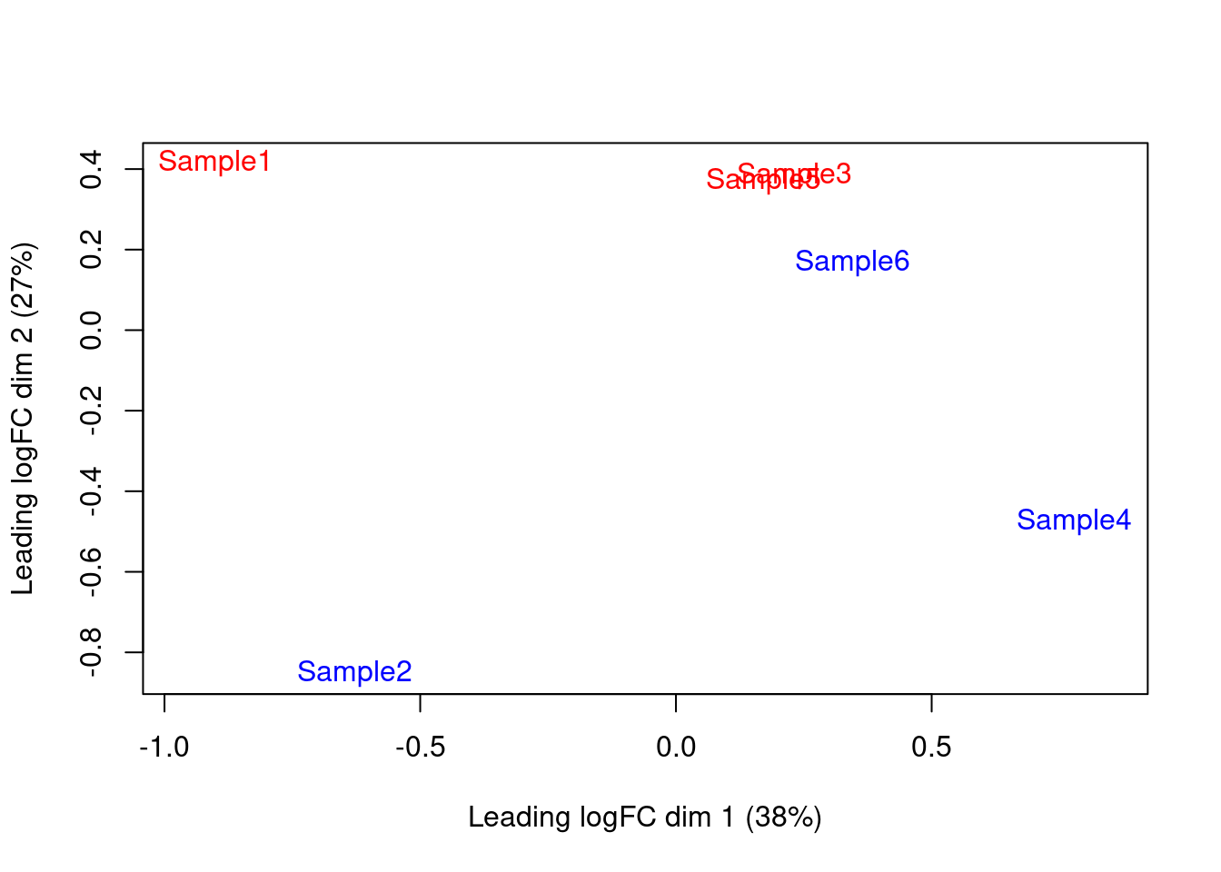
Figure 4.4: MDS plot of the pseudo-bulk log-normalized CPMs, where each point represents a sample and is colored by the tomato status.
We set up the design matrix to block on the batch-to-batch differences across different embryo pools, while retaining an additive term that represents the effect of injection. The latter is represented in our model as the log-fold change in gene expression in td-Tomato-positive cells over their negative counterparts within the same label. Our aim is to test whether this log-fold change is significantly different from zero.
##         (Intercept) factor(pool)4 factor(pool)5 factor(tomato)TRUE
## Sample1           1             0             0                  1
## Sample2           1             0             0                  0
## Sample3           1             1             0                  1
## Sample4           1             1             0                  0
## Sample5           1             0             1                  1
## Sample6           1             0             1                  0
## attr(,"assign")
## [1] 0 1 1 2
## attr(,"contrasts")
## attr(,"contrasts")$`factor(pool)`
## [1] "contr.treatment"
##
## attr(,"contrasts")$`factor(tomato)`
## [1] "contr.treatment"
We estimate the negative binomial (NB) dispersions with estimateDisp().
The role of the NB dispersion is to model the mean-variance trend (Figure 4.5),
which is not easily accommodated by QL dispersions alone due to the quadratic nature of the NB mean-variance trend.
##    Min. 1st Qu.  Median    Mean 3rd Qu.    Max.
##  0.0103  0.0167  0.0213  0.0202  0.0235  0.0266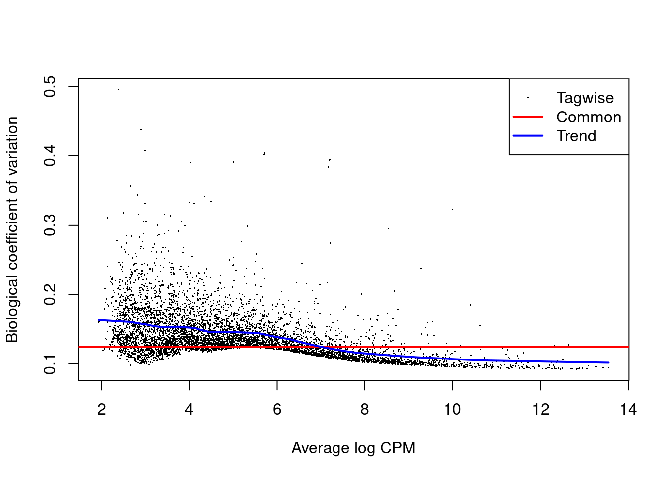
Figure 4.5: Biological coefficient of variation (BCV) for each gene as a function of the average abundance. The BCV is computed as the square root of the NB dispersion after empirical Bayes shrinkage towards the trend. Trended and common BCV estimates are shown in blue and red, respectively.
We also estimate the quasi-likelihood dispersions with glmQLFit() (Chen, Lun, and Smyth 2016).
This fits a GLM to the counts for each gene and estimates the QL dispersion from the GLM deviance.
We set robust=TRUE to avoid distortions from highly variable clusters (Phipson et al. 2016).
The QL dispersion models the uncertainty and variability of the per-gene variance (Figure 4.6) - which is not well handled by the NB dispersions, so the two dispersion types complement each other in the final analysis.
##    Min. 1st Qu.  Median    Mean 3rd Qu.    Max.
## 0.318 0.714 0.854 0.804 0.913 1.067## Min. 1st Qu. Median Mean 3rd Qu. Max.
## 0.227 12.675 12.675 12.339 12.675 12.675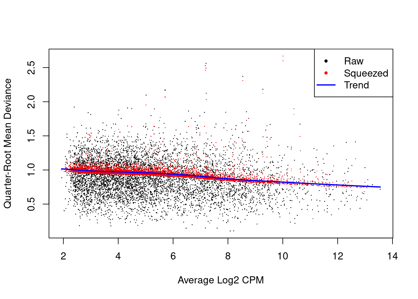
Figure 4.6: QL dispersion estimates for each gene as a function of abundance. Raw estimates (black) are shrunk towards the trend (blue) to yield squeezed estimates (red).
We test for differences in expression due to injection using glmQLFTest().
DEGs are defined as those with non-zero log-fold changes at a false discovery rate of 5%.
Very few genes are significantly DE, indicating that injection has little effect on the transcriptome of mesenchyme cells.
(Note that this logic is somewhat circular,
as a large transcriptional effect may have caused cells of this type to be re-assigned to a different label.
We discuss this in more detail in Section 6.4.1 below.)
##        factor(tomato)TRUE
## Down                    8
## NotSig               5672
## Up 8## Coefficient: factor(tomato)TRUE
## logFC logCPM F PValue FDR
## Phlda2 -4.3874 9.934 1638.59 1.812e-16 1.031e-12
## Erdr1 2.0691 8.833 356.37 1.061e-11 3.017e-08
## Mid1 1.5191 6.931 120.15 1.844e-08 3.497e-05
## H13 -1.0596 7.540 80.80 2.373e-07 2.527e-04
## Kcnq1ot1 1.3763 7.242 83.31 2.392e-07 2.527e-04
## Akr1e1 -1.7206 5.128 79.31 2.665e-07 2.527e-04
## Zdbf2 1.8008 6.797 83.66 6.809e-07 5.533e-04
## Asb4 -0.9235 7.341 53.45 2.918e-06 2.075e-03
## Impact 0.8516 7.353 50.31 4.145e-06 2.620e-03
## Lum -0.6031 9.275 41.67 1.205e-05 6.851e-034.5 Putting it all together
4.5.1 Looping across labels
Now that we have laid out the theory underlying the DE analysis,
we repeat this process for each of the labels to identify injection-induced DE in each cell type.
This is conveniently done using the pseudoBulkDGE() function from scran,
which will loop over all labels and apply the exact analysis described above to each label.
Users can also set method="voom" to perform an equivalent analysis using the voom() pipeline from limma -
see Workflow Section 8.9 for the full set of function calls.
# Removing all pseudo-bulk samples with 'insufficient' cells.
summed.filt <- summed[,summed$ncells >= 10]

library(scran)
de.results <- pseudoBulkDGE(summed.filt,
    label=summed.filt$celltype.mapped,
    design=~factor(pool) + tomato,
    coef="tomatoTRUE",
    condition=summed.filt$tomato
)
The function returns a list of DataFrames containing the DE results for each label.
Each DataFrame also contains the intermediate edgeR objects used in the DE analyses,
which can be used to generate any of previously described diagnostic plots (Figure 4.7).
It is often wise to generate these plots to ensure that any interesting results are not compromised by technical issues.
## DataFrame with 14699 rows and 5 columns
##                               logFC    logCPM         F      PValue         FDR
##                           <numeric> <numeric> <numeric>   <numeric>   <numeric>
## Phlda2                    -2.489508  12.58150  1207.016 3.33486e-21 1.60507e-17
## Xist                      -7.978532   8.00166  1092.831 1.27783e-17 3.07510e-14
## Erdr1                      1.947170   9.07321   296.937 1.58009e-14 2.53500e-11
## Slc22a18                  -4.347153   4.04380   117.389 1.92517e-10 2.31647e-07
## Slc38a4                    0.891849  10.24094   113.899 2.52208e-10 2.42776e-07
## ...                             ...       ...       ...         ...         ...
## Ccl27a_ENSMUSG00000095247        NA        NA        NA          NA          NA
## CR974586.5                       NA        NA        NA          NA          NA
## AC132444.6                       NA        NA        NA          NA          NA
## Vmn2r122                         NA        NA        NA          NA          NA
## CAAA01147332.1                   NA        NA        NA          NA          NA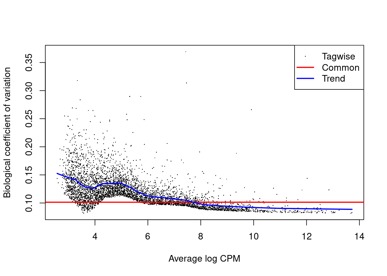
Figure 4.7: Biological coefficient of variation (BCV) for each gene as a function of the average abundance for the allantois pseudo-bulk analysis. Trended and common BCV estimates are shown in blue and red, respectively.
We list the labels that were skipped due to the absence of replicates or contrasts. If it is necessary to extract statistics in the absence of replicates, several strategies can be applied such as reducing the complexity of the model or using a predefined value for the NB dispersion. We refer readers to the edgeR user’s guide for more details.
## [1] "Blood progenitors 1" "Caudal epiblast"     "Caudal neurectoderm"
## [4] "ExE ectoderm"        "Parietal endoderm"   "Stripped"
4.5.2 Cross-label meta-analyses
We examine the numbers of DEGs at a FDR of 5% for each label using the decideTestsPerLabel() function.
In general, there seems to be very little differential expression that is introduced by injection.
Note that genes listed as NA were either filtered out as low-abundance genes for a given label’s analysis,
or the comparison of interest was not possible for a particular label,
e.g., due to lack of residual degrees of freedom or an absence of samples from both conditions.
##                                -1    0  1    NA
## Allantois                      23 4766 24  9886
## Blood progenitors 2             1 2472  2 12224
## Cardiomyocytes                  6 4361  5 10327
## Caudal Mesoderm                 2 1742  0 12955
## Def. endoderm                   7 1392  2 13298
## Endothelium                     3 3222  6 11468
## Erythroid1                     12 2777 15 11895
## Erythroid2                      5 3389  8 11297
## Erythroid3                     13 5048 16  9622
## ExE mesoderm                    2 5097 10  9590
## Forebrain/Midbrain/Hindbrain    8 6226 11  8454
## Gut                             5 4482  6 10206
## Haematoendothelial progenitors  4 4103 10 10582
## Intermediate mesoderm           4 3072  4 11619
## Mesenchyme                      8 5672  8  9011
## NMP                             6 4107 10 10576
## Neural crest                    6 3311  8 11374
## Paraxial mesoderm               4 4756  5  9934
## Pharyngeal mesoderm             2 5082  9  9606
## Rostral neurectoderm            5 3334  4 11356
## Somitic mesoderm                7 2948 13 11731
## Spinal cord                     7 4591  7 10094
## Surface ectoderm                9 5556  8  9126
For each gene, we compute the percentage of cell types in which that gene is upregulated or downregulated upon injection. Here, we consider a gene to be non-DE if it is not retained after filtering. We see that Xist is consistently downregulated in the injected cells; this is consistent with the fact that the injected cells are male while the background cells are derived from pools of male and female embryos, due to experimental difficulties with resolving sex at this stage. The consistent downregulation of Phlda2 and Cdkn1c in the injected cells is also interesting given that both are imprinted genes. However, some of these commonalities may be driven by shared contamination from ambient RNA - we discuss this further in Section 5.
# Upregulated across most cell types.
up.de <- is.de > 0 & !is.na(is.de)
head(sort(rowMeans(up.de), decreasing=TRUE), 10)
## Mid1 Erdr1 Impact Mcts2 Kcnq1ot1 Nnat Slc38a4 Zdbf2
## 0.9130 0.7391 0.6087 0.5652 0.5652 0.5217 0.4348 0.3913
## Hopx Peg3
## 0.3913 0.2609# Downregulated across cell types.
down.de <- is.de < 0 & !is.na(is.de)
head(sort(rowMeans(down.de), decreasing=TRUE), 10)## Xist Phlda2 Akr1e1 Cdkn1c H13
## 0.73913 0.73913 0.73913 0.69565 0.52174
## Wfdc2 B930036N10Rik B230312C02Rik Pink1 Mfap2
## 0.21739 0.08696 0.08696 0.08696 0.08696To identify label-specific DE, we use the pseudoBulkSpecific() function to test for significant differences from the average log-fold change over all other labels.
More specifically, the null hypothesis for each label and gene is that the log-fold change lies between zero and the average log-fold change of the other labels.
If a gene rejects this null for our label of interest, we can conclude that it exhibits DE that is more extreme or of the opposite sign compared to that in the majority of other labels (Figure 4.8).
This approach is effectively a poor man’s interaction model that sacrifices the uncertainty of the average for an easier compute.
We note that, while the difference from the average is a good heuristic, there is no guarantee that the top genes are truly label-specific; comparable DE in a subset of the other labels may be offset by weaker effects when computing the average.
de.specific <- pseudoBulkSpecific(summed.filt,
    label=summed.filt$celltype.mapped,
    design=~factor(pool) + tomato,
    coef="tomatoTRUE",
    condition=summed.filt$tomato
)

cur.specific <- de.specific[["Allantois"]]
cur.specific <- cur.specific[order(cur.specific$PValue),]
cur.specific
## DataFrame with 14699 rows and 6 columns
## logFC logCPM F PValue FDR
## <numeric> <numeric> <numeric> <numeric> <numeric>
## Slc22a18 -4.347153 4.04380 117.3889 1.92517e-10 9.26587e-07
## Acta2 -0.829713 9.12472 55.6350 4.67332e-07 1.12463e-03
## Mxd4 -1.421473 5.64606 50.2112 2.03567e-06 3.26589e-03
## Rbp4 1.874290 4.35449 29.8731 1.53998e-05 1.85298e-02
## Myl9 -0.985541 6.24833 30.6689 5.54072e-05 4.62274e-02
## ... ... ... ... ... ...
## Ccl27a_ENSMUSG00000095247 NA NA NA NA NA
## CR974586.5 NA NA NA NA NA
## AC132444.6 NA NA NA NA NA
## Vmn2r122 NA NA NA NA NA
## CAAA01147332.1 NA NA NA NA NA
## OtherAverage
## <numeric>
## Slc22a18 NA
## Acta2 -0.0267428
## Mxd4 -0.1565876
## Rbp4 -0.1052237
## Myl9 -0.1068453
## ... ...
## Ccl27a_ENSMUSG00000095247 NA
## CR974586.5 NA
## AC132444.6 NA
## Vmn2r122 NA
## CAAA01147332.1 NAsizeFactors(summed.filt) <- NULL
plotExpression(logNormCounts(summed.filt),
features="Rbp4",
x="tomato", colour_by="tomato",
other_fields="celltype.mapped") +
facet_wrap(~celltype.mapped)
Figure 4.8: Distribution of summed log-expression values for Rbp4 in each label of the chimeric embryo dataset. Each facet represents a label with distributions stratified by injection status.
For greater control over the identification of label-specific DE, we can use the output of decideTestsPerLabel() to identify genes that are significant in our label of interest yet not DE in any other label.
As hypothesis tests are not typically geared towards identifying genes that are not DE, we use an ad hoc approach where we consider a gene to be consistent with the null hypothesis for a label if it fails to be detected at a generous FDR threshold of 50%.
We demonstrate this approach below by identifying injection-induced DE genes that are unique to the allantois.
It is straightforward to tune the selection, e.g., to genes that are DE in no more than 90% of other labels by simply relaxing the threshold used to construct not.de.other, or to genes that are DE across multiple labels of interest but not in the rest, and so on.
# Finding all genes that are not remotely DE in all other labels.
remotely.de <- decideTestsPerLabel(de.results, threshold=0.5)
not.de <- remotely.de==0 | is.na(remotely.de)
not.de.other <- rowMeans(not.de[,colnames(not.de)!="Allantois"])==1

# Intersecting with genes that are DE inthe allantois.
unique.degs <- is.de[,"Allantois"]!=0 & not.de.other
unique.degs <- names(which(unique.degs))

# Inspecting the results.
de.allantois <- de.results$Allantois
de.allantois <- de.allantois[unique.degs,]
de.allantois <- de.allantois[order(de.allantois$PValue),]
de.allantois
## DataFrame with 5 rows and 5 columns
## logFC logCPM F PValue FDR
## <numeric> <numeric> <numeric> <numeric> <numeric>
## Slc22a18 -4.347153 4.04380 117.3889 1.92517e-10 2.31647e-07
## Rbp4 1.874290 4.35449 29.8731 1.53998e-05 3.36906e-03
## Cfc1 -0.950562 5.74762 23.1430 7.68376e-05 1.23215e-02
## H3f3b 0.321634 12.04012 21.2710 1.25666e-04 1.63468e-02
## Cryab -0.995629 5.28422 19.5921 1.99204e-04 2.45838e-02The main caveat is that differences in power between labels require some caution when interpreting label specificity. For example, Figure 4.9 shows that the top-ranked allantois-specific gene exhibits some evidence of DE in other labels but was not detected for various reasons like low abundance or insufficient replicates. A more correct but complex approach would be to fit a interaction model to the pseudo-bulk profiles for each pair of labels, where the interaction is between the coefficient of interest and the label identity; this is left as an exercise for the reader.
plotExpression(logNormCounts(summed.filt),
    features="Slc22a18",
    x="tomato", colour_by="tomato",
    other_fields="celltype.mapped") +
    facet_wrap(~celltype.mapped)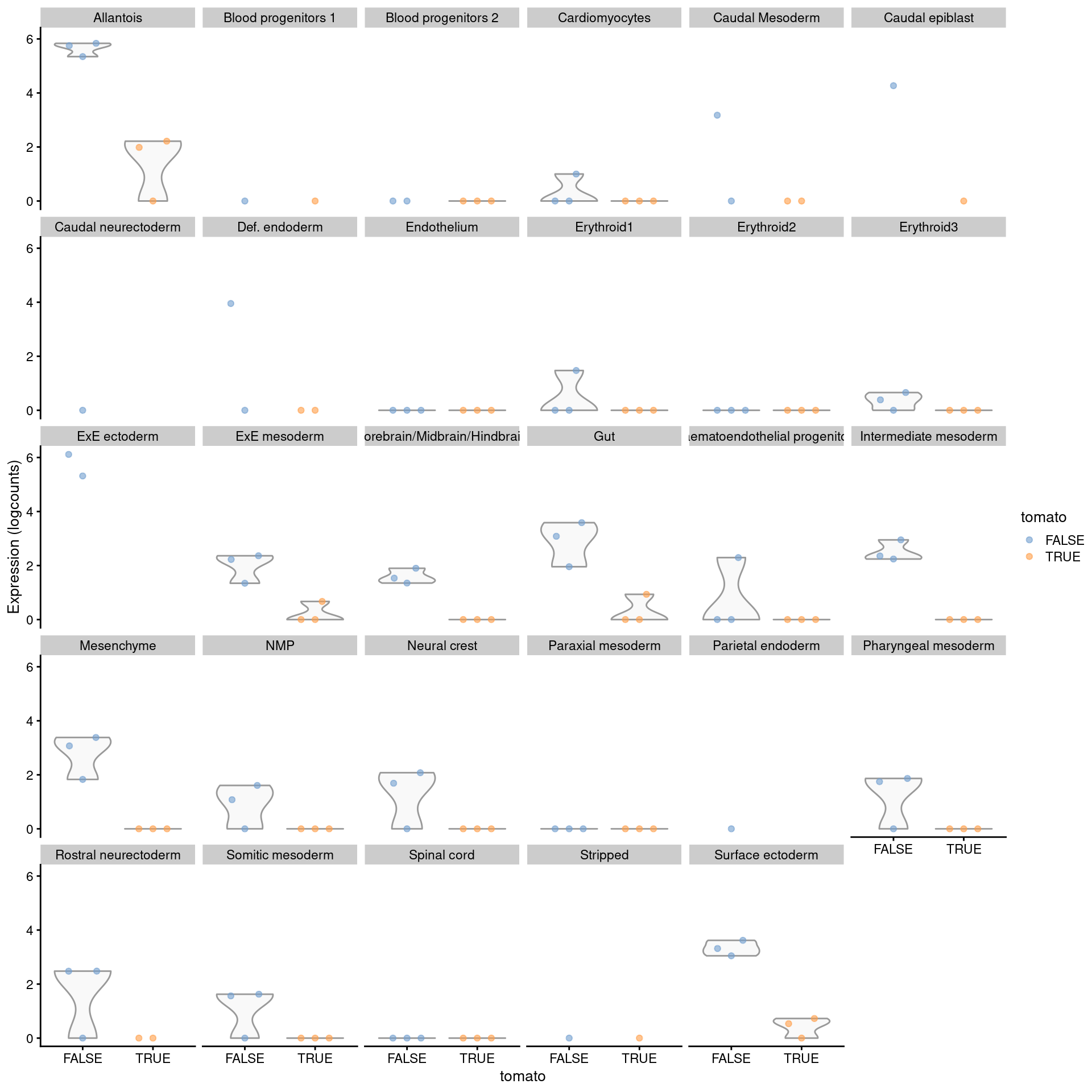
Figure 4.9: Distribution of summed log-expression values for each label in the chimeric embryo dataset. Each facet represents a label with distributions stratified by injection status.
4.6 Testing for between-label differences
The above examples focus on testing for differences in expression between conditions for the same cell type or label.
However, the same methodology can be applied to test for differences between cell types across samples.
This kind of DE analysis overcomes the lack of suitable replication discussed in Advanced Section 6.4.2.
To demonstrate, say we want to test for DEGs between the neural crest and notochord samples.
We subset our summed counts to those two cell types and we run the edgeR workflow via pseudoBulkDGE().
summed.sub <- summed[,summed$celltype.mapped %in% c("Neural crest", "Notochord")]

# Using a dummy value for the label to allow us to include multiple cell types
# in the fitted model; otherwise, each cell type will be processed separately.
between.res <- pseudoBulkDGE(summed.sub,
    label=rep("dummy", ncol(summed.sub)),
    design=~factor(sample) + celltype.mapped,
    coef="celltype.mappedNotochord")[[1]]

table(Sig=between.res$FDR <= 0.05, Sign=sign(between.res$logFC))
## Sign
## Sig -1 1
## FALSE 2235 1614
## TRUE 683 228## DataFrame with 14699 rows and 5 columns
## logFC logCPM F PValue FDR
## <numeric> <numeric> <numeric> <numeric> <numeric>
## T 10.86559 7.08020 386.650 2.06989e-84 9.85269e-81
## Krt19 8.14164 6.16734 264.874 9.19802e-59 2.18913e-55
## Krt8 4.39442 8.43458 228.663 4.56130e-51 7.23726e-48
## Mest -4.86549 11.98755 215.417 3.03569e-48 3.61247e-45
## Krt18 4.71055 7.65385 183.064 2.49978e-41 2.37979e-38
## ... ... ... ... ... ...
## Ccl27a_ENSMUSG00000095247 NA NA NA NA NA
## CR974586.5 NA NA NA NA NA
## AC132444.6 NA NA NA NA NA
## Vmn2r122 NA NA NA NA NA
## CAAA01147332.1 NA NA NA NA NAWe inspect some of the top hits in more detail (Figure 4.10). As one might expect, these two cell types are quite different.
summed.sub <- logNormCounts(summed.sub, size.factors=NULL)
plotExpression(summed.sub,
    features=head(rownames(between.res)[order(between.res$PValue)]),
    x="celltype.mapped",
    colour_by=I(factor(summed.sub$sample)))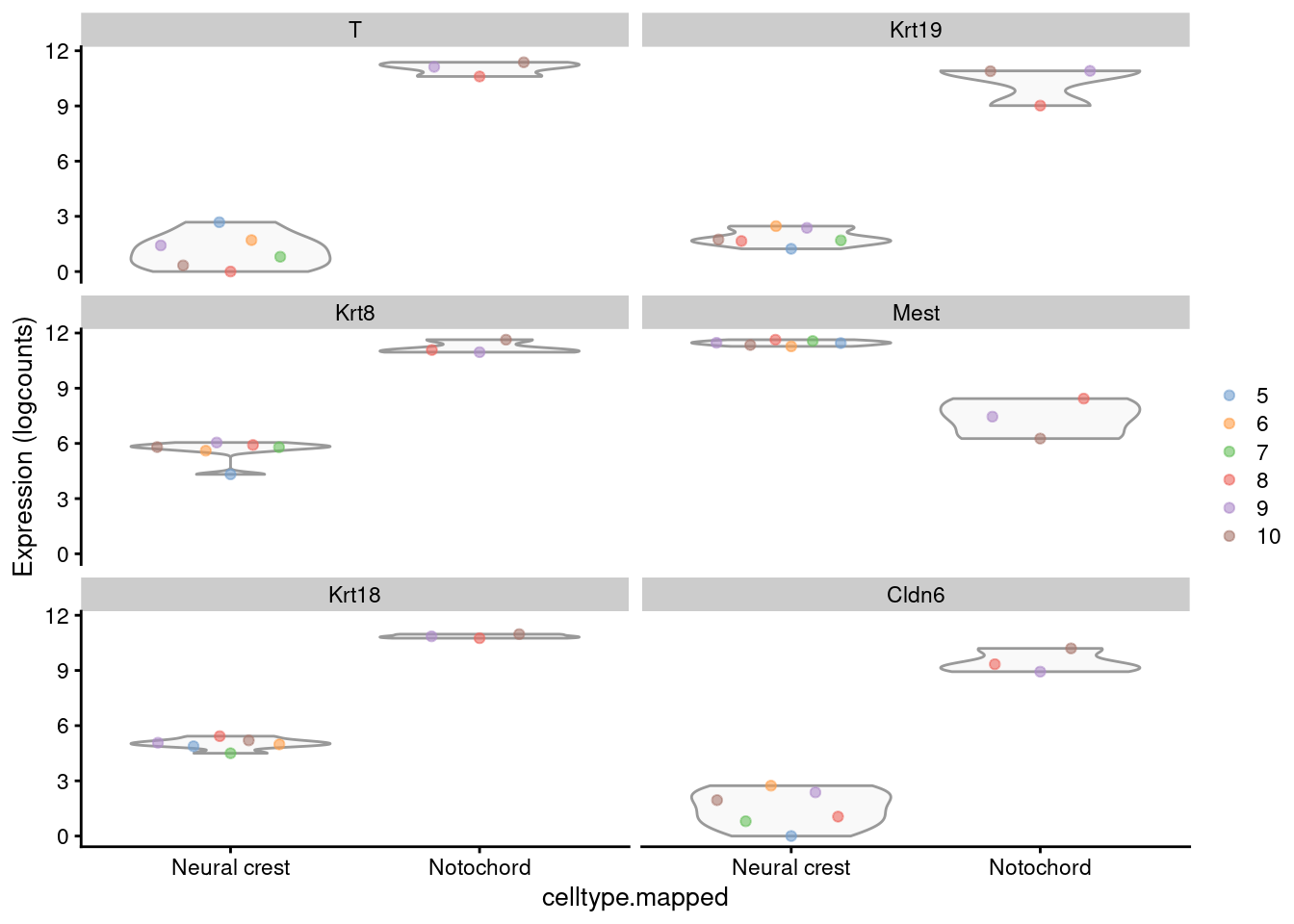
Figure 4.10: Distribution of the log-expression values for the top DEGs between the neural crest and notochord. Each point represents a pseudo-bulk profile and is colored by the sample of origin.
Whether or not this is a scientifically meaningful comparison depends on the nature of the labels. These particular labels were defined by clustering, which means that the presence of DEGs is a foregone conclusion (Advanced Section 6.4). Nonetheless, it may have some utility for applications where the labels are defined using independent information, e.g., from FACS.
The same approach can also be used to test whether the log-fold changes between two labels are significantly different between conditions.
This is equivalent to testing for a significant interaction between each cell’s label and the condition of its sample of origin.
The \(p\)-values are likely to be more sensible here; any artificial differences induced by clustering should cancel out between conditions, leaving behind real (and interesting) differences.
Some extra effort is usually required to obtain a full-rank design matrix -
this is demonstrated below to test for a significant interaction between the notochord/neural crest separation and injection status (tomato).
inter.res <- pseudoBulkDGE(summed.sub,
    label=rep("dummy", ncol(summed.sub)),
    design=function(df) {
        combined <- with(df, paste0(tomato, ".", celltype.mapped))
        combined <- make.names(combined)
        design <- model.matrix(~0 + factor(sample) + combined, df)
        design[,!grepl("Notochord", colnames(design))]
    },
    coef="combinedTRUE.Neural.crest"
)[[1]]

table(Sig=inter.res$FDR <= 0.05, Sign=sign(inter.res$logFC))
## Sign
## Sig -1 0 1
## FALSE 1443 12 3305## DataFrame with 14699 rows and 5 columns
## logFC logCPM F PValue FDR
## <numeric> <numeric> <numeric> <numeric> <numeric>
## Cyb561 -10.46015 5.21092 12.9380 0.000330620 0.870112
## Efhc1 -9.29150 3.52921 12.5622 0.000395525 0.870112
## Epha2 -8.87723 4.24164 11.8490 0.000690709 0.870112
## Spaca9 -6.32026 4.13089 10.7170 0.001138839 0.870112
## Foxj1 -10.99035 6.66323 10.4632 0.001310048 0.870112
## ... ... ... ... ... ...
## Ccl27a_ENSMUSG00000095247 NA NA NA NA NA
## CR974586.5 NA NA NA NA NA
## AC132444.6 NA NA NA NA NA
## Vmn2r122 NA NA NA NA NA
## CAAA01147332.1 NA NA NA NA NASession Info
R version 4.1.0 (2021-05-18)
Platform: x86_64-pc-linux-gnu (64-bit)
Running under: Ubuntu 20.04.2 LTS

Matrix products: default
BLAS:   /home/biocbuild/bbs-3.13-bioc/R/lib/libRblas.so
LAPACK: /home/biocbuild/bbs-3.13-bioc/R/lib/libRlapack.so

locale:
 [1] LC_CTYPE=en_US.UTF-8       LC_NUMERIC=C
 [3] LC_TIME=en_US.UTF-8        LC_COLLATE=C
 [5] LC_MONETARY=en_US.UTF-8    LC_MESSAGES=en_US.UTF-8
 [7] LC_PAPER=en_US.UTF-8       LC_NAME=C
 [9] LC_ADDRESS=C               LC_TELEPHONE=C
[11] LC_MEASUREMENT=en_US.UTF-8 LC_IDENTIFICATION=C

attached base packages:
[1] parallel  stats4    stats     graphics  grDevices utils     datasets
[8] methods   base

other attached packages:
 [1] scran_1.20.0                edgeR_3.34.0
 [3] limma_3.48.0                bluster_1.2.0
 [5] scater_1.20.0               ggplot2_3.3.3
 [7] scuttle_1.2.0               BiocSingular_1.8.0
 [9] SingleCellExperiment_1.14.0 SummarizedExperiment_1.22.0
[11] Biobase_2.52.0              GenomicRanges_1.44.0
[13] GenomeInfoDb_1.28.0         IRanges_2.26.0
[15] S4Vectors_0.30.0            BiocGenerics_0.38.0
[17] MatrixGenerics_1.4.0        matrixStats_0.58.0
[19] BiocStyle_2.20.0            rebook_1.2.0

loaded via a namespace (and not attached):
 [1] bitops_1.0-7              RColorBrewer_1.1-2
 [3] filelock_1.0.2            tools_4.1.0
 [5] bslib_0.2.5.1             utf8_1.2.1
 [7] R6_2.5.0                  irlba_2.3.3
 [9] vipor_0.4.5               DBI_1.1.1
[11] colorspace_2.0-1          withr_2.4.2
[13] tidyselect_1.1.1          gridExtra_2.3
[15] compiler_4.1.0            graph_1.70.0
[17] BiocNeighbors_1.10.0      DelayedArray_0.18.0
[19] labeling_0.4.2            bookdown_0.22
[21] sass_0.4.0                scales_1.1.1
[23] stringr_1.4.0             digest_0.6.27
[25] rmarkdown_2.8             XVector_0.32.0
[27] pkgconfig_2.0.3           htmltools_0.5.1.1
[29] sparseMatrixStats_1.4.0   highr_0.9
[31] rlang_0.4.11              DelayedMatrixStats_1.14.0
[33] farver_2.1.0              jquerylib_0.1.4
[35] generics_0.1.0            jsonlite_1.7.2
[37] BiocParallel_1.26.0       dplyr_1.0.6
[39] RCurl_1.98-1.3            magrittr_2.0.1
[41] GenomeInfoDbData_1.2.6    Matrix_1.3-3
[43] Rcpp_1.0.6                ggbeeswarm_0.6.0
[45] munsell_0.5.0             fansi_0.4.2
[47] viridis_0.6.1             lifecycle_1.0.0
[49] stringi_1.6.2             yaml_2.2.1
[51] zlibbioc_1.38.0           grid_4.1.0
[53] dqrng_0.3.0               crayon_1.4.1
[55] dir.expiry_1.0.0          lattice_0.20-44
[57] splines_4.1.0             cowplot_1.1.1
[59] beachmat_2.8.0            locfit_1.5-9.4
[61] CodeDepends_0.6.5         metapod_1.0.0
[63] knitr_1.33                pillar_1.6.1
[65] igraph_1.2.6              codetools_0.2-18
[67] ScaledMatrix_1.0.0        XML_3.99-0.6
[69] glue_1.4.2                evaluate_0.14
[71] BiocManager_1.30.15       vctrs_0.3.8
[73] gtable_0.3.0              purrr_0.3.4
[75] assertthat_0.2.1          xfun_0.23
[77] rsvd_1.0.5                viridisLite_0.4.0
[79] pheatmap_1.0.12           tibble_3.1.2
[81] beeswarm_0.3.1            cluster_2.1.2
[83] statmod_1.4.36            ellipsis_0.3.2
References
Chen, Y., A. T. Lun, and G. K. Smyth. 2016. “From reads to genes to pathways: differential expression analysis of RNA-Seq experiments using Rsubread and the edgeR quasi-likelihood pipeline.” F1000Res 5: 1438.
Crowell, H. L., C. Soneson, P.-L. Germain, D. Calini, L. Collin, C. Raposo, D. Malhotra, and M. D. Robinson. 2019. “On the Discovery of Population-Specific State Transitions from Multi-Sample Multi-Condition Single-Cell Rna Sequencing Data.” bioRxiv. https://doi.org/10.1101/713412.
Lun, A. T. L., and J. C. Marioni. 2017. “Overcoming confounding plate effects in differential expression analyses of single-cell RNA-seq data.” Biostatistics 18 (3): 451–64.
Phipson, B., S. Lee, I. J. Majewski, W. S. Alexander, and G. K. Smyth. 2016. “Robust Hyperparameter Estimation Protects Against Hypervariable Genes and Improves Power to Detect Differential Expression.” Ann. Appl. Stat. 10 (2): 946–63.
Pijuan-Sala, B., J. A. Griffiths, C. Guibentif, T. W. Hiscock, W. Jawaid, F. J. Calero-Nieto, C. Mulas, et al. 2019. “A Single-Cell Molecular Map of Mouse Gastrulation and Early Organogenesis.” Nature 566 (7745): 490–95.
Richard, A. C., A. T. L. Lun, W. W. Y. Lau, B. Gottgens, J. C. Marioni, and G. M. Griffiths. 2018. “T cell cytolytic capacity is independent of initial stimulation strength.” Nat. Immunol. 19 (8): 849–58.
Robinson, M. D., D. J. McCarthy, and G. K. Smyth. 2010. “edgeR: a Bioconductor package for differential expression analysis of digital gene expression data.” Bioinformatics 26 (1): 139–40.
Robinson, M. D., and A. Oshlack. 2010. “A scaling normalization method for differential expression analysis of RNA-seq data.” Genome Biol. 11 (3): R25.
Scialdone, A., Y. Tanaka, W. Jawaid, V. Moignard, N. K. Wilson, I. C. Macaulay, J. C. Marioni, and B. Gottgens. 2016. “Resolving early mesoderm diversification through single-cell expression profiling.” Nature 535 (7611): 289–93.
Tung, P. Y., J. D. Blischak, C. J. Hsiao, D. A. Knowles, J. E. Burnett, J. K. Pritchard, and Y. Gilad. 2017. “Batch effects and the effective design of single-cell gene expression studies.” Sci. Rep. 7 (January): 39921.
Zheng, G. X., J. M. Terry, P. Belgrader, P. Ryvkin, Z. W. Bent, R. Wilson, S. B. Ziraldo, et al. 2017. “Massively parallel digital transcriptional profiling of single cells.” Nat Commun 8 (January): 14049.