Chapter 4 Dimensionality reduction
4.1 Overview
Many scRNA-seq analysis procedures involve comparing cells based on their expression values across multiple genes. For example, clustering aims to identify cells with similar transcriptomic profiles by computing Euclidean distances across genes. In these applications, each individual gene represents a dimension of the data. More intuitively, if we had a scRNA-seq data set with two genes, we could make a two-dimensional plot where each axis represents the expression of one gene and each point in the plot represents a cell. This concept can be extended to data sets with thousands of genes where each cell’s expression profile defines its location in the high-dimensional expression space.
As the name suggests, dimensionality reduction aims to reduce the number of separate dimensions in the data. This is possible because different genes are correlated if they are affected by the same biological process. Thus, we do not need to store separate information for individual genes, but can instead compress multiple features into a single dimension, e.g., an “eigengene” (Langfelder and Horvath 2007). This reduces computational work in downstream analyses like clustering, as calculations only need to be performed for a few dimensions rather than thousands of genes; reduces noise by averaging across multiple genes to obtain a more precise representation of the patterns in the data; and enables effective plotting of the data, for those of us who are not capable of visualizing more than 3 dimensions.
We will use the Zeisel et al. (2015) dataset to demonstrate the applications of various dimensionality reduction methods in this chapter.
#--- loading ---#
library(scRNAseq)
sce.zeisel <- ZeiselBrainData()

library(scater)
sce.zeisel <- aggregateAcrossFeatures(sce.zeisel,
    id=sub("_loc[0-9]+$", "", rownames(sce.zeisel)))

#--- gene-annotation ---#
library(org.Mm.eg.db)
rowData(sce.zeisel)$Ensembl <- mapIds(org.Mm.eg.db,
    keys=rownames(sce.zeisel), keytype="SYMBOL", column="ENSEMBL")

#--- quality-control ---#
stats <- perCellQCMetrics(sce.zeisel, subsets=list(
    Mt=rowData(sce.zeisel)$featureType=="mito"))
qc <- quickPerCellQC(stats, percent_subsets=c("altexps_ERCC_percent",
    "subsets_Mt_percent"))
sce.zeisel <- sce.zeisel[,!qc$discard]

#--- normalization ---#
library(scran)
set.seed(1000)
clusters <- quickCluster(sce.zeisel)
sce.zeisel <- computeSumFactors(sce.zeisel, cluster=clusters)
sce.zeisel <- logNormCounts(sce.zeisel)

#--- variance-modelling ---#
dec.zeisel <- modelGeneVarWithSpikes(sce.zeisel, "ERCC")
top.hvgs <- getTopHVGs(dec.zeisel, prop=0.1)## class: SingleCellExperiment
## dim: 19839 2816
## metadata(0):
## assays(2): counts logcounts
## rownames(19839): 0610005C13Rik 0610007N19Rik ... mt-Tw mt-Ty
## rowData names(2): featureType Ensembl
## colnames(2816): 1772071015_C02 1772071017_G12 ... 1772063068_D01
## 1772066098_A12
## colData names(11): tissue group # ... level2class sizeFactor
## reducedDimNames(0):
## mainExpName: endogenous
## altExpNames(2): ERCC repeat4.2 Principal components analysis
Principal components analysis (PCA) discovers axes in high-dimensional space that capture the largest amount of variation. This is best understood by imagining each axis as a line. Say we draw a line anywhere, and we move each cell in our data set onto the closest position on the line. The variance captured by this axis is defined as the variance in the positions of cells along that line. In PCA, the first axis (or “principal component”, PC) is chosen such that it maximizes this variance. The next PC is chosen such that it is orthogonal to the first and captures the greatest remaining amount of variation, and so on.
By definition, the top PCs capture the dominant factors of heterogeneity in the data set. In the context of scRNA-seq, our assumption is that biological processes affect multiple genes in a coordinated manner. This means that the earlier PCs are likely to represent biological structure as more variation can be captured by considering the correlated behavior of many genes. By comparison, random technical or biological noise is expected to affect each gene independently. There is unlikely to be an axis that can capture random variation across many genes, meaning that noise should mostly be concentrated in the later PCs. This motivates the use of the earlier PCs in our downstream analyses, which concentrates the biological signal to simultaneously reduce computational work and remove noise.
The use of the earlier PCs for denoising and data compaction is a strategy that is simple, highly effective and widely used in a variety of fields. It takes advantage of the well-studied theoretical properties of the PCA - namely, that a low-rank approximation formed from the top PCs is the optimal approximation of the original data for a given matrix rank. Indeed, the Euclidean distances between cells in PC space can be treated as an approximation of the same distances in the original dataset The literature for PCA also provides us with a range of fast implementations for scalable and efficient data analysis.
We perform a PCA on the log-normalized expression values using the fixedPCA() function from scran.
By default, fixedPCA() will compute the first 50 PCs and store them in the reducedDims() of the output SingleCellExperiment object, as shown below.
Here, we use only the top 2000 genes with the largest biological components to reduce both computational work and high-dimensional random noise.
In particular, while PCA is robust to random noise, an excess of it may cause the earlier PCs to capture noise instead of biological structure (Johnstone and Lu 2009).
This effect can be mitigated by restricting the PCA to a subset of HVGs, for which we can use any of the strategies described in Chapter 3.
library(scran)
top.zeisel <- getTopHVGs(dec.zeisel, n=2000)

set.seed(100) # See below.
sce.zeisel <- fixedPCA(sce.zeisel, subset.row=top.zeisel)
reducedDimNames(sce.zeisel)
## [1] "PCA"## [1] 2816 50For large data sets, greater efficiency is obtained by using approximate SVD algorithms that only compute the top PCs.
By default, most PCA-related functions in scater and scran will use methods from the irlba or rsvd packages to perform the SVD.
We can explicitly specify the SVD algorithm to use by passing an BiocSingularParam object to the BSPARAM= argument (see Advanced Section 14.2.2 for more details).
Many of these approximate algorithms are based on randomization and thus require set.seed() to obtain reproducible results.
library(BiocSingular)
set.seed(1000)
sce.zeisel <- fixedPCA(sce.zeisel, subset.row=top.zeisel,
    BSPARAM=RandomParam(), name="randomized")
reducedDimNames(sce.zeisel)
## [1] "PCA" "randomized"4.3 Choosing the number of PCs
How many of the top PCs should we retain for downstream analyses? The choice of the number of PCs \(d\) is a decision that is analogous to the choice of the number of HVGs to use. Using more PCs will retain more biological signal at the cost of including more noise that might mask said signal. On the other hand, using fewer PCs will introduce competition between different factors of variation, where weaker (but still interesting) factors may be pushed down into lower PCs and inadvertently discarded from downtream analyses.
Much like the choice of the number of HVGs, it is hard to determine whether an “optimal” choice exists for the number of PCs. Certainly, we could attempt to remove the technical variation that is almost always uninteresting. However, even if we were only left with biological variation, there is no straightforward way to automatically determine which aspects of this variation are relevant. One analyst’s biological signal may be irrelevant noise to another analyst with a different scientific question. For example, heterogeneity within a population might be interesting when studying continuous processes like metabolic flux or differentiation potential, but is comparable to noise in applications that only aim to distinguish between distinct cell types.
Most practitioners will simply set \(d\) to a “reasonable” but arbitrary value, typically ranging from 10 to 50. This is often satisfactory as the later PCs explain so little variance that their inclusion or omission has no major effect. For example, in the Zeisel dataset, few PCs explain more than 1% of the variance in the entire dataset (Figure 4.1) and choosing between, say, 20 and 40 PCs would not even amount to four percentage points’ worth of difference in variance. In fact, the main consequence of using more PCs is simply that downstream calculations take longer as they need to compute over more dimensions, but most PC-related calculations are fast enough that this is not a practical concern.
percent.var <- attr(reducedDim(sce.zeisel), "percentVar")
plot(percent.var, log="y", xlab="PC", ylab="Variance explained (%)")
Figure 4.1: Percentage of variance explained by successive PCs in the Zeisel dataset, shown on a log-scale for visualization purposes.
Nonetheless, Advanced Section 4.2 describes some more data-driven strategies to guide a suitable choice of \(d\). These automated choices are best treated as guidelines as they make assumptions about what variation is “interesting”. Indeed, the concepts in Advanced Section 4.2.3 could even be used to provide some justification for an arbitrarily chosen \(d\). More diligent readers may consider repeating the analysis with a variety of choices of \(d\) to explore other perspectives of the dataset at a different bias-variance trade-off, though this tends to be unnecessary work in most applications.
4.4 Visualizing the PCs
Algorithms are more than happy to operate on 10-50 PCs, but these are still too many dimensions for human comprehension. To visualize the data, we could take the top 2 PCs for plotting (Figure 4.2).
Figure 4.2: PCA plot of the first two PCs in the Zeisel brain data. Each point is a cell, coloured according to the annotation provided by the original authors.
The problem is that PCA is a linear technique, i.e., only variation along a line in high-dimensional space is captured by each PC. As such, it cannot efficiently pack differences in \(d\) dimensions into the first 2 PCs. This is demonstrated in Figure 4.2 where the top two PCs fail to resolve some subpopulations identified by Zeisel et al. (2015). If the first PC is devoted to resolving the biggest difference between subpopulations, and the second PC is devoted to resolving the next biggest difference, then the remaining differences will not be visible in the plot.
One workaround is to plot several of the top PCs against each other in pairwise plots (Figure 4.3). However, it is difficult to interpret multiple plots simultaneously, and even this approach is not sufficient to separate some of the annotated subpopulations.
Figure 4.3: PCA plot of the first two PCs in the Zeisel brain data. Each point is a cell, coloured according to the annotation provided by the original authors.
Thus, plotting the top few PCs is not satisfactory for visualization of complex populations. That said, the PCA itself is still of great value in visualization as it compacts and denoises the data prior to downstream steps. The top PCs are often used as input to more sophisticated (and computationally intensive) algorithms for dimensionality reduction.
4.5 Non-linear methods for visualization
4.5.1 \(t\)-stochastic neighbor embedding
The de facto standard for visualization of scRNA-seq data is the \(t\)-stochastic neighbor embedding (\(t\)-SNE) method (Van der Maaten and Hinton 2008). This attempts to find a low-dimensional representation of the data that preserves the distances between each point and its neighbors in the high-dimensional space. Unlike PCA, it is not restricted to linear transformations, nor is it obliged to accurately represent distances between distant populations. This means that it has much more freedom in how it arranges cells in low-dimensional space, enabling it to separate many distinct clusters in a complex population (Figure 4.4).
set.seed(00101001101)

# runTSNE() stores the t-SNE coordinates in the reducedDims
# for re-use across multiple plotReducedDim() calls.
sce.zeisel <- runTSNE(sce.zeisel, dimred="PCA")
plotReducedDim(sce.zeisel, dimred="TSNE", colour_by="level1class")
Figure 4.4: \(t\)-SNE plots constructed from the top PCs in the Zeisel brain dataset. Each point represents a cell, coloured according to the published annotation.
One of the main disadvantages of \(t\)-SNE is that it is much more computationally intensive than other visualization methods.
We mitigate this effect by setting dimred="PCA" in runTSNE(), which instructs the function to perform the \(t\)-SNE calculations on the top PCs in sce.zeisel.
This exploits the data compaction and noise removal of the PCA for faster and cleaner results in the \(t\)-SNE.
It is also possible to run \(t\)-SNE on the original expression matrix but this is less efficient.
Another issue with \(t\)-SNE is that it requires the user to be aware of additional parameters (discussed here in some depth). It involves a random initialization so we need to set the seed to ensure that the chosen results are reproducible. We may also wish to repeat the visualization several times to ensure that the results are representative.
The “perplexity” is another important parameter that determines the granularity of the visualization (Figure 4.5). Low perplexities will favor resolution of finer structure, possibly to the point that the visualization is compromised by random noise. Thus, it is advisable to test different perplexity values to ensure that the choice of perplexity does not drive the interpretation of the plot.
set.seed(100)
sce.zeisel <- runTSNE(sce.zeisel, dimred="PCA", perplexity=5)
out5 <- plotReducedDim(sce.zeisel, dimred="TSNE",
    colour_by="level1class") + ggtitle("perplexity = 5")

set.seed(100)
sce.zeisel <- runTSNE(sce.zeisel, dimred="PCA", perplexity=20)
out20 <- plotReducedDim(sce.zeisel, dimred="TSNE",
    colour_by="level1class") + ggtitle("perplexity = 20")

set.seed(100)
sce.zeisel <- runTSNE(sce.zeisel, dimred="PCA", perplexity=80)
out80 <- plotReducedDim(sce.zeisel, dimred="TSNE",
    colour_by="level1class") + ggtitle("perplexity = 80")

gridExtra::grid.arrange(out5, out20, out80, ncol=3)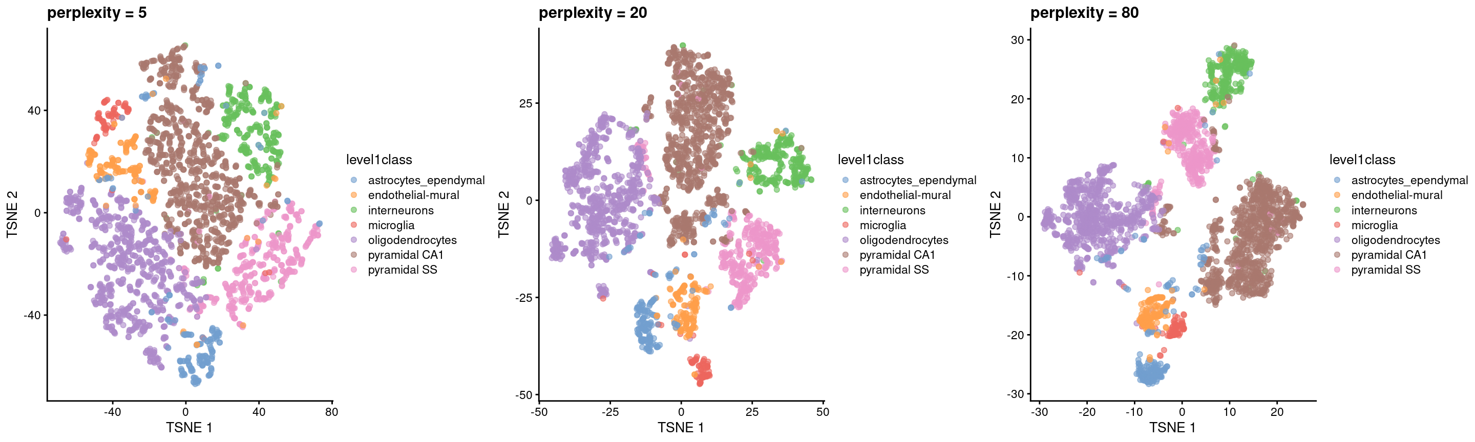
Figure 4.5: \(t\)-SNE plots constructed from the top PCs in the Zeisel brain dataset, using a range of perplexity values. Each point represents a cell, coloured according to its annotation.
Finally, it is unwise to read too much into the relative sizes and positions of the visual clusters. \(t\)-SNE will inflate dense clusters and compress sparse ones, such that we cannot use the size as a measure of subpopulation heterogeneity. In addition, \(t\)-SNE is not obliged to preserve the relative locations of non-neighboring clusters, such that we cannot use their positions to determine relationships between distant clusters.
Despite its shortcomings, \(t\)-SNE is proven tool for general-purpose visualization of scRNA-seq data and remains a popular choice in many analysis pipelines. In particular, this author enjoys looking at \(t\)-SNEs as they remind him of histology slides, which allows him to pretend that he is looking at real data.
4.5.2 Uniform manifold approximation and projection
The uniform manifold approximation and projection (UMAP) method (McInnes, Healy, and Melville 2018) is an alternative to \(t\)-SNE for non-linear dimensionality reduction. It is roughly similar to \(t\)-SNE in that it also tries to find a low-dimensional representation that preserves relationships between neighbors in high-dimensional space. However, the two methods are based on different theory, represented by differences in the various graph weighting equations. This manifests as a different visualization as shown in Figure 4.6.
set.seed(1100101001)
sce.zeisel <- runUMAP(sce.zeisel, dimred="PCA")
plotReducedDim(sce.zeisel, dimred="UMAP", colour_by="level1class")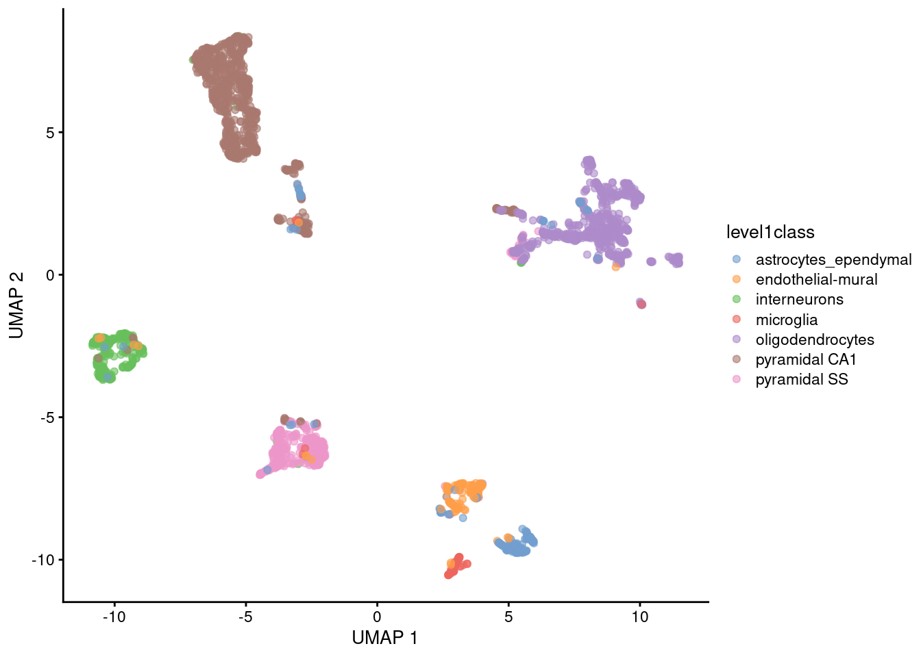
Figure 4.6: UMAP plots constructed from the top PCs in the Zeisel brain dataset. Each point represents a cell, coloured according to the published annotation.
Compared to \(t\)-SNE, the UMAP visualization tends to have more compact visual clusters with more empty space between them. It also attempts to preserve more of the global structure than \(t\)-SNE. From a practical perspective, UMAP is much faster than \(t\)-SNE, which may be an important consideration for large datasets. (Nonetheless, we have still run UMAP on the top PCs here for consistency.) UMAP also involves a series of randomization steps so setting the seed is critical.
Like \(t\)-SNE, UMAP has its own suite of hyperparameters that affect the visualization (see the documentation here).
Of these, the number of neighbors (n_neighbors) and the minimum distance between embedded points (min_dist) have the greatest effect on the granularity of the output.
If these values are too low, random noise will be incorrectly treated as high-resolution structure, while values that are too high will discard fine structure altogether in favor of obtaining an accurate overview of the entire dataset.
Again, it is a good idea to test a range of values for these parameters to ensure that they do not compromise any conclusions drawn from a UMAP plot.
It is arguable whether the UMAP or \(t\)-SNE visualizations are more useful or aesthetically pleasing. UMAP aims to preserve more global structure but this necessarily reduces resolution within each visual cluster. However, UMAP is unarguably much faster, and for that reason alone, it is increasingly displacing \(t\)-SNE as the method of choice for visualizing large scRNA-seq data sets.
4.5.3 Interpreting the plots
Dimensionality reduction for visualization necessarily involves discarding information and distorting the distances between cells to fit high-dimensional data into a 2-dimensional space. One might wonder whether the results of such extreme data compression can be trusted. Indeed, some of our more quantitative colleagues consider such visualizations to be more artistic than scientific, fit for little but impressing collaborators and reviewers! Perhaps this perspective is not entirely invalid, but we suggest that there is some value to be extracted from them provided that they are accompanied by an analysis of a higher-rank representation.
As a general rule, focusing on local neighborhoods provides the safest interpretation of \(t\)-SNE and UMAP plots. These methods spend considerable effort to ensure that each cell’s nearest neighbors in the input high-dimensional space are still its neighbors in the output two-dimensional embedding. Thus, if we see multiple cell types or clusters in a single unbroken “island” in the embedding, we could infer that those populations were also close neighbors in higher-dimensional space. However, less can be said about the distances between non-neighboring cells; there is no guarantee that large distances are faithfully recapitulated in the embedding, given the distortions necessary for this type of dimensionality reduction. It would be courageous to use the distances between islands (seen to be measured, on occasion, with a ruler!) to make statements about the relative similarity of distinct cell types.
On a related note, we prefer to restrict the \(t\)-SNE/UMAP coordinates for visualization and use the higher-rank representation for any quantitative analyses. To illustrate, consider the interaction between clustering and \(t\)-SNE. We do not perform clustering on the \(t\)-SNE coordinates, but rather, we cluster on the first 10-50 PCs (Chapter (clustering)) and then visualize the cluster identities on \(t\)-SNE plots like that in Figure 4.4. This ensures that clustering makes use of the information that was lost during compression into two dimensions for visualization. The plot can then be used for a diagnostic inspection of the clustering output, e.g., to check which clusters are close neighbors or whether a cluster can be split into further subclusters; this follows the aforementioned theme of focusing on local structure.
From a naive perspective, using the \(t\)-SNE coordinates directly for clustering is tempting as it ensures that any results are immediately consistent with the visualization. Given that clustering is rather arbitrary anyway, there is nothing inherently wrong with this strategy - in fact, it can be treated as a rather circuitous implementation of graph-based clustering (Section 5.2). However, the enforced consistency can actually be considered a disservice as it masks the ambiguity of the conclusions, either due to the loss of information from dimensionality reduction or the uncertainty of the clustering. Rather than being errors, major discrepancies can instead be useful for motivating further investigation into the less obvious aspects of the dataset; conversely, the lack of discrepancies increases trust in the conclusions.
Session Info
R version 4.1.0 (2021-05-18)
Platform: x86_64-pc-linux-gnu (64-bit)
Running under: Ubuntu 20.04.2 LTS

Matrix products: default
BLAS:   /home/biocbuild/bbs-3.13-bioc/R/lib/libRblas.so
LAPACK: /home/biocbuild/bbs-3.13-bioc/R/lib/libRlapack.so

locale:
 [1] LC_CTYPE=en_US.UTF-8       LC_NUMERIC=C
 [3] LC_TIME=en_US.UTF-8        LC_COLLATE=C
 [5] LC_MONETARY=en_US.UTF-8    LC_MESSAGES=en_US.UTF-8
 [7] LC_PAPER=en_US.UTF-8       LC_NAME=C
 [9] LC_ADDRESS=C               LC_TELEPHONE=C
[11] LC_MEASUREMENT=en_US.UTF-8 LC_IDENTIFICATION=C

attached base packages:
[1] parallel  stats4    stats     graphics  grDevices utils     datasets
[8] methods   base

other attached packages:
 [1] scater_1.20.0               ggplot2_3.3.3
 [3] BiocSingular_1.8.0          scran_1.20.0
 [5] scuttle_1.2.0               SingleCellExperiment_1.14.0
 [7] SummarizedExperiment_1.22.0 Biobase_2.52.0
 [9] GenomicRanges_1.44.0        GenomeInfoDb_1.28.0
[11] IRanges_2.26.0              S4Vectors_0.30.0
[13] BiocGenerics_0.38.0         MatrixGenerics_1.4.0
[15] matrixStats_0.58.0          BiocStyle_2.20.0
[17] rebook_1.2.0

loaded via a namespace (and not attached):
 [1] bitops_1.0-7              filelock_1.0.2
 [3] tools_4.1.0               bslib_0.2.5.1
 [5] utf8_1.2.1                R6_2.5.0
 [7] irlba_2.3.3               vipor_0.4.5
 [9] uwot_0.1.10               DBI_1.1.1
[11] colorspace_2.0-1          withr_2.4.2
[13] gridExtra_2.3             tidyselect_1.1.1
[15] compiler_4.1.0            graph_1.70.0
[17] BiocNeighbors_1.10.0      DelayedArray_0.18.0
[19] labeling_0.4.2            bookdown_0.22
[21] sass_0.4.0                scales_1.1.1
[23] rappdirs_0.3.3            stringr_1.4.0
[25] digest_0.6.27             rmarkdown_2.8
[27] XVector_0.32.0            pkgconfig_2.0.3
[29] htmltools_0.5.1.1         sparseMatrixStats_1.4.0
[31] limma_3.48.0              highr_0.9
[33] rlang_0.4.11              FNN_1.1.3
[35] DelayedMatrixStats_1.14.0 farver_2.1.0
[37] jquerylib_0.1.4           generics_0.1.0
[39] jsonlite_1.7.2            BiocParallel_1.26.0
[41] dplyr_1.0.6               RCurl_1.98-1.3
[43] magrittr_2.0.1            GenomeInfoDbData_1.2.6
[45] Matrix_1.3-3              ggbeeswarm_0.6.0
[47] Rcpp_1.0.6                munsell_0.5.0
[49] fansi_0.4.2               viridis_0.6.1
[51] lifecycle_1.0.0           stringi_1.6.2
[53] yaml_2.2.1                edgeR_3.34.0
[55] zlibbioc_1.38.0           Rtsne_0.15
[57] grid_4.1.0                dqrng_0.3.0
[59] crayon_1.4.1              dir.expiry_1.0.0
[61] lattice_0.20-44           cowplot_1.1.1
[63] beachmat_2.8.0            locfit_1.5-9.4
[65] CodeDepends_0.6.5         metapod_1.0.0
[67] knitr_1.33                pillar_1.6.1
[69] igraph_1.2.6              codetools_0.2-18
[71] ScaledMatrix_1.0.0        XML_3.99-0.6
[73] glue_1.4.2                evaluate_0.14
[75] BiocManager_1.30.15       vctrs_0.3.8
[77] gtable_0.3.0              purrr_0.3.4
[79] assertthat_0.2.1          xfun_0.23
[81] rsvd_1.0.5                RSpectra_0.16-0
[83] viridisLite_0.4.0         tibble_3.1.2
[85] beeswarm_0.3.1            cluster_2.1.2
[87] bluster_1.2.0             statmod_1.4.36
[89] ellipsis_0.3.2
References
Johnstone, I. M., and A. Y. Lu. 2009. “On Consistency and Sparsity for Principal Components Analysis in High Dimensions.” J Am Stat Assoc 104 (486): 682–93.
Langfelder, P., and S. Horvath. 2007. “Eigengene networks for studying the relationships between co-expression modules.” BMC Syst Biol 1 (November): 54.
McInnes, Leland, John Healy, and James Melville. 2018. “UMAP: Uniform Manifold Approximation and Projection for Dimension Reduction.” arXiv E-Prints, February, arXiv:1802.03426. http://arxiv.org/abs/1802.03426.
Van der Maaten, L., and G. Hinton. 2008. “Visualizing Data Using T-SNE.” J. Mach. Learn. Res. 9 (2579-2605): 85.
Zeisel, A., A. B. Munoz-Manchado, S. Codeluppi, P. Lonnerberg, G. La Manno, A. Jureus, S. Marques, et al. 2015. “Brain structure. Cell types in the mouse cortex and hippocampus revealed by single-cell RNA-seq.” Science 347 (6226): 1138–42.