Chapter 6 Marker gene detection
6.1 Motivation
To interpret our clustering results from Chapter 5, we identify the genes that drive separation between clusters. These marker genes allow us to assign biological meaning to each cluster based on their functional annotation. In the simplest case, we have a priori knowledge of the marker genes associated with particular cell types, allowing us to treat the clustering as a proxy for cell type identity. The same principle can be applied to discover more subtle differences between clusters (e.g., changes in activation or differentiation state) based on the behavior of genes in the affected pathways.
The most straightforward approach to marker gene detection involves testing for differential expression between clusters. If a gene is strongly DE between clusters, it is likely to have driven the separation of cells in the clustering algorithm. Several methods are available to quantify the differences in expression profiles between clusters and obtain a single ranking of genes for each cluster. We will demonstrate some of these choices in this chapter using the 10X PBMC dataset:
#--- loading ---#
library(DropletTestFiles)
raw.path <- getTestFile("tenx-2.1.0-pbmc4k/1.0.0/raw.tar.gz")
out.path <- file.path(tempdir(), "pbmc4k")
untar(raw.path, exdir=out.path)

library(DropletUtils)
fname <- file.path(out.path, "raw_gene_bc_matrices/GRCh38")
sce.pbmc <- read10xCounts(fname, col.names=TRUE)

#--- gene-annotation ---#
library(scater)
rownames(sce.pbmc) <- uniquifyFeatureNames(
    rowData(sce.pbmc)$ID, rowData(sce.pbmc)$Symbol)

library(EnsDb.Hsapiens.v86)
location <- mapIds(EnsDb.Hsapiens.v86, keys=rowData(sce.pbmc)$ID,
    column="SEQNAME", keytype="GENEID")

#--- cell-detection ---#
set.seed(100)
e.out <- emptyDrops(counts(sce.pbmc))
sce.pbmc <- sce.pbmc[,which(e.out$FDR <= 0.001)]

#--- quality-control ---#
stats <- perCellQCMetrics(sce.pbmc, subsets=list(Mito=which(location=="MT")))
high.mito <- isOutlier(stats$subsets_Mito_percent, type="higher")
sce.pbmc <- sce.pbmc[,!high.mito]

#--- normalization ---#
library(scran)
set.seed(1000)
clusters <- quickCluster(sce.pbmc)
sce.pbmc <- computeSumFactors(sce.pbmc, cluster=clusters)
sce.pbmc <- logNormCounts(sce.pbmc)

#--- variance-modelling ---#
set.seed(1001)
dec.pbmc <- modelGeneVarByPoisson(sce.pbmc)
top.pbmc <- getTopHVGs(dec.pbmc, prop=0.1)

#--- dimensionality-reduction ---#
set.seed(10000)
sce.pbmc <- denoisePCA(sce.pbmc, subset.row=top.pbmc, technical=dec.pbmc)

set.seed(100000)
sce.pbmc <- runTSNE(sce.pbmc, dimred="PCA")

set.seed(1000000)
sce.pbmc <- runUMAP(sce.pbmc, dimred="PCA")

#--- clustering ---#
g <- buildSNNGraph(sce.pbmc, k=10, use.dimred = 'PCA')
clust <- igraph::cluster_walktrap(g)$membership
colLabels(sce.pbmc) <- factor(clust)## class: SingleCellExperiment
## dim: 33694 3985
## metadata(1): Samples
## assays(2): counts logcounts
## rownames(33694): RP11-34P13.3 FAM138A ... AC213203.1 FAM231B
## rowData names(2): ID Symbol
## colnames(3985): AAACCTGAGAAGGCCT-1 AAACCTGAGACAGACC-1 ...
## TTTGTCAGTTAAGACA-1 TTTGTCATCCCAAGAT-1
## colData names(4): Sample Barcode sizeFactor label
## reducedDimNames(3): PCA TSNE UMAP
## mainExpName: NULL
## altExpNames(0):6.2 Scoring markers by pairwise comparisons
Our general strategy is to compare each pair of clusters and compute scores quantifying the differences in the expression distributions between clusters.
The scores for all pairwise comparisons involving a particular cluster are then consolidated into a single DataFrame for that cluster.
The scoreMarkers() function from scran returns a list of DataFrames where each DataFrame corresponds to a cluster and each row of the DataFrame corresponds to a gene.
In the DataFrame for cluster \(X\), the columns contain the self.average, the mean log-expression in \(X\);
other.average, the grand mean across all other clusters;
self.detected, the proportion of cells with detected expression in \(X\);
other.detected, the mean detected proportion across all other clusters;
and finally, a variety of effect size summaries generated from all pairwise comparisons involving \(X\).
## List of length 16
## names(16): 1 2 3 4 5 6 7 8 9 10 11 12 13 14 15 16## [1] "self.average" "other.average" "self.detected"
## [4] "other.detected" "mean.logFC.cohen" "min.logFC.cohen"
## [7] "median.logFC.cohen" "max.logFC.cohen" "rank.logFC.cohen"
## [10] "mean.AUC" "min.AUC" "median.AUC"
## [13] "max.AUC" "rank.AUC" "mean.logFC.detected"
## [16] "min.logFC.detected" "median.logFC.detected" "max.logFC.detected"
## [19] "rank.logFC.detected"For each cluster, we can then rank candidate markers based on one of these effect size summaries. We demonstrate below with the mean AUC for cluster 1, which probably contains NK cells based on the top genes in Figure 6.1 (and no CD3E expression). The next section will go into more detail on the differences between the various columns.
chosen <- marker.info[["1"]]
ordered <- chosen[order(chosen$mean.AUC, decreasing=TRUE),]
head(ordered[,1:4]) # showing basic stats only, for brevity.
## DataFrame with 6 rows and 4 columns
## self.average other.average self.detected other.detected
## <numeric> <numeric> <numeric> <numeric>
## NKG7 4.39503 0.7486412 0.985366 0.3768438
## GNLY 4.40275 0.3489056 0.956098 0.2010344
## CTSW 2.60281 0.4618797 0.960976 0.2898534
## HOPX 1.99060 0.1607469 0.907317 0.1160658
## PRF1 2.22297 0.1659853 0.887805 0.1263180
## KLRF1 1.60598 0.0379703 0.858537 0.0346691library(scater)
plotExpression(sce.pbmc, features=head(rownames(ordered)),
x="label", colour_by="label")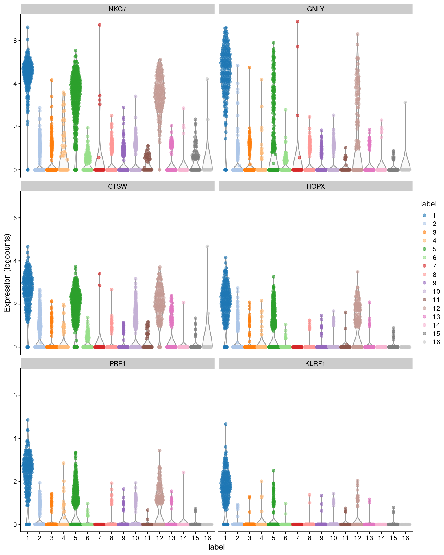
Figure 6.1: Distribution of expression values across clusters for the top potential marker genes (as determined by the mean AUC) for cluster 1 in the PBMC dataset.
We deliberately use pairwise comparisons rather than comparing each cluster to the average of all other cells. The latter approach is sensitive to the population composition, which introduces an element of unpredictability to the marker sets due to variation in cell type abundances. (In the worst case, the presence of one subpopulation containing a majority of the cells will drive the selection of top markers for every other cluster, pushing out useful genes that can distinguish between the smaller subpopulations.) Moreover, pairwise comparisons naturally provide more information to interpret of the utility of a marker, e.g., by providing log-fold changes to indicate which clusters are distinguished by each gene (Section 6.5).
Previous editions of this chapter used \(p\)-values from the tests corresponding to each effect size, e.g., Welch’s \(t\)-test, the Wilcoxon ranked sum test.
While this is fine for ranking genes, the \(p\)-values themselves are statistically flawed and are of little use for inference -
see Advanced Section 6.4 for more details.
The scoreMarkers() function simplifies the marker detection procedure by omitting the \(p\)-values altogether, instead focusing on the underlying effect sizes.
6.3 Effect sizes for pairwise comparisons
In the context of marker detection, the area under the curve (AUC) quantifies our ability to distinguish between two distributions in a pairwise comparison. The AUC represents the probability that a randomly chosen observation from our cluster of interest is greater than a randomly chosen observation from the other cluster. A value of 1 corresponds to upregulation, where all values of our cluster of interest are greater than any value from the other cluster; a value of 0.5 means that there is no net difference in the location of the distributions; and a value of 0 corresponds to downregulation. The AUC is closely related to the \(U\) statistic in the Wilcoxon ranked sum test (a.k.a., Mann-Whitney U-test).
auc.only <- chosen[,grepl("AUC", colnames(chosen))]
auc.only[order(auc.only$mean.AUC,decreasing=TRUE),]
## DataFrame with 33694 rows and 5 columns
## mean.AUC min.AUC median.AUC max.AUC rank.AUC
## <numeric> <numeric> <numeric> <numeric> <integer>
## NKG7 0.963726 0.805885 0.988947 0.991803 1
## GNLY 0.958868 0.877404 0.973347 0.974913 2
## CTSW 0.932352 0.709079 0.966638 0.978873 2
## HOPX 0.928138 0.780016 0.949129 0.953659 3
## PRF1 0.924690 0.837420 0.940300 0.943902 5
## ... ... ... ... ... ...
## RPS13 0.174413 0.00684690 0.0806435 0.695732 426
## RPL26 0.170493 0.01334117 0.0724876 0.813720 104
## RPL18A 0.169516 0.01090122 0.0760620 0.749735 264
## RPL39 0.152346 0.00405525 0.0626341 0.774848 185
## FTH1 0.147289 0.00121951 0.0639979 0.645732 766Cohen’s \(d\) is a standardized log-fold change where the difference in the mean log-expression between groups is scaled by the average standard deviation across groups. In other words, it is the number of standard deviations that separate the means of the two groups. The interpretation is similar to the log-fold change; positive values indicate that the gene is upregulated in our cluster of interest, negative values indicate downregulation and values close to zero indicate that there is little difference. Cohen’s \(d\) is roughly analogous to the \(t\)-statistic in various two-sample \(t\)-tests.
cohen.only <- chosen[,grepl("logFC.cohen", colnames(chosen))]
cohen.only[order(cohen.only$mean.logFC.cohen,decreasing=TRUE),]
## DataFrame with 33694 rows and 5 columns
## mean.logFC.cohen min.logFC.cohen median.logFC.cohen max.logFC.cohen
## <numeric> <numeric> <numeric> <numeric>
## NKG7 4.84346 1.025337 5.84606 6.30987
## GNLY 3.71574 1.793853 4.04410 4.36929
## CTSW 2.96940 0.699433 3.19968 3.96973
## GZMA 2.69683 0.399487 3.18392 3.44040
## HOPX 2.67330 1.108548 2.92242 3.06690
## ... ... ... ... ...
## FTH1 -2.28562 -5.19176 -2.533685 0.2995322
## HLA-DRA -2.39933 -7.13493 -2.032812 0.0146072
## FTL -2.40544 -5.82525 -1.285601 0.2569453
## CST3 -2.56767 -7.92584 -0.950339 0.0336350
## LYZ -2.84045 -9.00815 -0.341198 -0.1797338
## rank.logFC.cohen
## <integer>
## NKG7 1
## GNLY 1
## CTSW 3
## GZMA 2
## HOPX 4
## ... ...
## FTH1 4362
## HLA-DRA 6202
## FTL 5319
## CST3 5608
## LYZ 30966Finally, we also compute the log-fold change in the proportion of cells with detected expression between clusters. This ignores any information about the magnitude of expression, only considering whether any expression is detected at all. Again, positive values indicate that a greater proportion of cells express the gene in our cluster of interest compared to the other cluster. Note that a pseudo-count is added to avoid undefined log-fold changes when no cells express the gene in either group.
detect.only <- chosen[,grepl("logFC.detected", colnames(chosen))]
detect.only[order(detect.only$mean.logFC.detected,decreasing=TRUE),]
## DataFrame with 33694 rows and 5 columns
## mean.logFC.detected min.logFC.detected median.logFC.detected
## <numeric> <numeric> <numeric>
## KLRF1 4.80539 2.532196 5.33959
## PRSS23 4.43836 2.354538 4.57967
## XCL1 4.42946 1.398559 4.91134
## XCL2 4.42099 1.304208 4.87151
## SH2D1B 4.17329 0.804099 4.54737
## ... ... ... ...
## MARCKS -3.14645 -6.96050 -2.00000
## RAB31 -3.23328 -6.63557 -2.58496
## SLC7A7 -3.28244 -6.95262 -2.64295
## RAB32 -3.42074 -6.72160 -3.32193
## NCF2 -3.76139 -7.00693 -3.38863
## max.logFC.detected rank.logFC.detected
## <numeric> <integer>
## KLRF1 6.50482 1
## PRSS23 5.98530 2
## XCL1 6.16993 1
## XCL2 6.21524 1
## SH2D1B 5.85007 3
## ... ... ...
## MARCKS 0 11805
## RAB31 -1 31423
## SLC7A7 0 11796
## RAB32 0 11805
## NCF2 0 11805The AUC or Cohen’s \(d\) is usually the best choice for general purpose marker detection, as they are effective regardless of the magnitude of the expression values. The log-fold change in the detected proportion is specifically useful for identifying binary changes in expression. See Advanced Section 6.2 for more information about the practical differences between the effect sizes.
6.4 Summarizing pairwise effects
In a dataset with \(N\) clusters, each cluster is associated with \(N-1\) values for each type of effect size described in the previous section. To simplify interpretation, we summarize the effects for each cluster into some key statistics such as the mean and median. Each summary statistic has a different interpretation when used for ranking:
- The most obvious summary statistic is the mean. For cluster \(X\), a large mean effect size (>0 for the log-fold changes, >0.5 for the AUCs) indicates that the gene is upregulated in \(X\) compared to the average of the other groups.
- Another summary statistic is the median, where a large value indicates that the gene is upregulated in \(X\) compared to most (>50%) other clusters. The median provides greater robustness to outliers than the mean, which may or may not be desirable. On one hand, the median avoids an inflated effect size if only a minority of comparisons have large effects; on the other hand, it will also overstate the effect size by ignoring a minority of comparisons that have opposing effects.
- The minimum value (
min.*) is the most stringent summary for identifying upregulated genes, as a large value indicates that the gene is upregulated in \(X\) compared to all other clusters. Conversely, if the minimum is small (<0 for the log-fold changes, <0.5 for the AUCs), we can conclude that the gene is downregulated in \(X\) compared to at least one other cluster. - The maximum value (
max.*) is the least stringent summary for identifying upregulated genes, as a large value can be obtained if there is strong upregulation in \(X\) compared to any other cluster. Conversely, if the maximum is small, we can conclude that the gene is downregulated in \(X\) compared to all other clusters. - The minimum rank, a.k.a., “min-rank” (
rank.*) is the smallest rank of each gene across all pairwise comparisons. Specifically, genes are ranked within each pairwise comparison based on decreasing effect size, and then the smallest rank across all comparisons is reported for each gene. If a gene has a small min-rank, we can conclude that it is one of the top upregulated genes in at least one comparison of \(X\) to another cluster.
Each of these summaries is computed for each effect size, for each gene, and for each cluster.
Our next step is to choose one of these summary statistics for one of the effect sizes and to use it to rank the rows of the DataFrame.
The choice of summary determines the stringency of the marker selection strategy, i.e., how many other clusters must we differ from?
For identifying upregulated genes, ranking by the minimum is the most stringent and the maximum is the least stringent;
the mean and median fall somewhere in between and are reasonable defaults for most applications.
The example below uses the median Cohen’s \(d\) to obtain a ranking of upregulated markers for cluster 4 (Figure 6.2), which probably contains monocytes.
chosen <- marker.info[["4"]] # using another cluster, for some variety.
ordered <- chosen[order(chosen$median.logFC.cohen,decreasing=TRUE),]
head(ordered[,1:4]) # showing basic stats only, for brevity.
## DataFrame with 6 rows and 4 columns
## self.average other.average self.detected other.detected
## <numeric> <numeric> <numeric> <numeric>
## LYZ 4.97589 2.188256 1.000000 0.657832
## S100A9 4.94461 2.059524 1.000000 0.705775
## FTL 5.58358 4.140706 1.000000 0.961428
## S100A8 4.61729 1.834030 1.000000 0.639031
## CTSS 3.28383 1.568992 1.000000 0.630574
## CSTA 1.76876 0.685007 0.982143 0.337978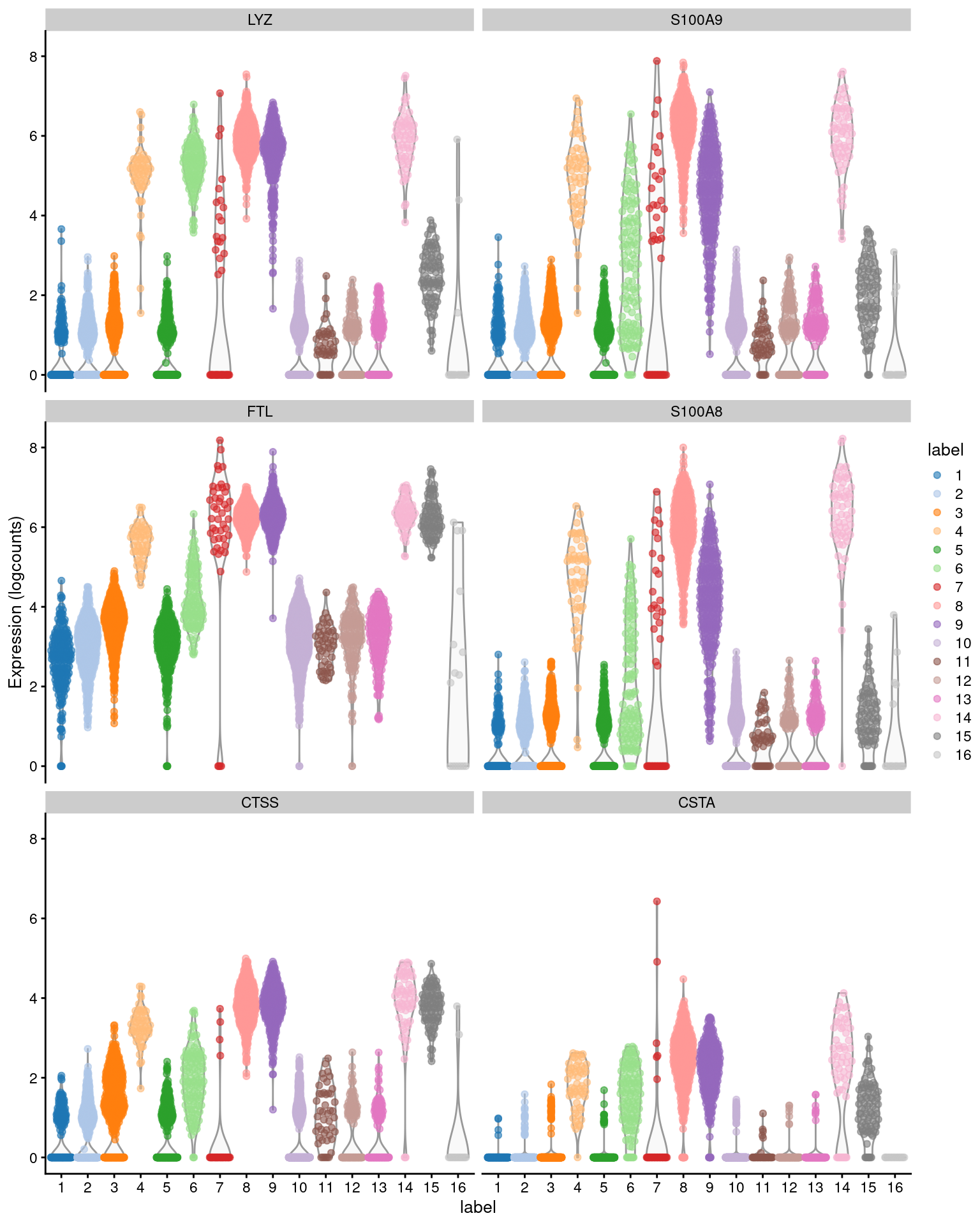
Figure 6.2: Distribution of expression values across clusters for the top potential marker genes (as determined by the median Cohen’s \(d\)) for cluster 4 in the PBMC dataset.
On some occasions, ranking by the minimum can be highly effective as it yields a concise set of highly cluster-specific markers. However, any gene that is expressed at the same level in two or more clusters will simply not be detected. This is likely to discard many interesting genes, especially if the clusters are finely resolved with weak separation. To give a concrete example, consider a mixed population of CD4+-only, CD8+-only, double-positive and double-negative T cells. Neither Cd4 or Cd8 would be detected as subpopulation-specific markers because each gene is expressed in two subpopulations such that the minimum effect would be small. In practice, the minimum and maximum are most helpful for diagnosing discrepancies between the mean and median, rather than being used directly for ranking.
Ranking genes by the min-rank is similiar in stringency to ranking by the maximum effect size, in that both will respond to strong DE in a single comparison. However, the min-rank is more useful as it ensures that a single comparison to another cluster with consistently large effects does not dominate the ranking. If we select all genes with min-ranks less than or equal to \(T\), the resulting set is the union of the top \(T\) genes from all pairwise comparisons. This guarantees that our set contains at least \(T\) genes that can distinguish our cluster of interest from any other cluster, which permits a comprehensive determination of a cluster’s identity. We demonstrate below for cluster 4, taking the top \(T=5\) genes with the largest Cohen’s \(d\) from each comparison to display in Figure 6.3.
ordered <- chosen[order(chosen$rank.logFC.cohen),]
top.ranked <- ordered[ordered$rank.logFC.cohen <= 5,]
rownames(top.ranked)
## [1] "S100A8" "S100A4" "RPS27" "MALAT1"
## [5] "LYZ" "TYROBP" "CTSS" "RPL31"
## [9] "EEF1B2" "LTB" "RPS21" "FTL"
## [13] "S100A9" "RPSA" "GPX1" "RPS29"
## [17] "RPLP1" "RPL17" "CST3" "S100A11"
## [21] "RPS27A" "RPS15A" "MT-ND2" "FCER1G"
## [25] "RPS12" "RPL36A" "RP11-1143G9.4" "IL32"
## [29] "RPL23A"plotGroupedHeatmap(sce.pbmc, features=rownames(top.ranked), group="label",
center=TRUE, zlim=c(-3, 3))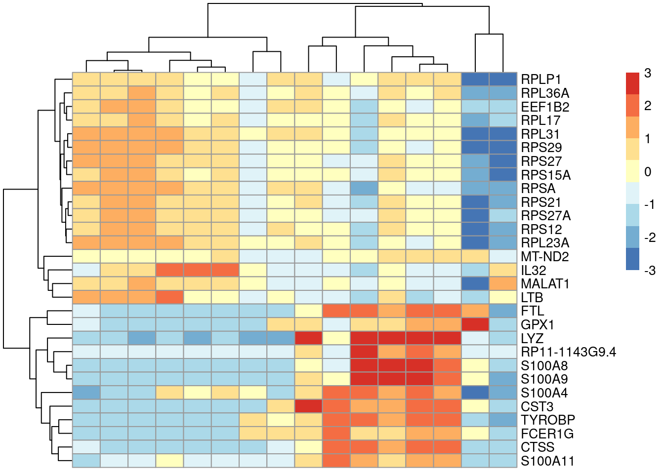
Figure 6.3: Heatmap of the centered average log-expression values for the top potential marker genes for cluster 4 in the PBMC dataset. The set of markers was selected as those genes with Cohen’s \(d\)-derived min-ranks less than or equal to 5.
Our discussion above has focused mainly on potential markers that are upregulated in our cluster of interest, as these are the easiest to interpret and experimentally validate. However, it also means that any cluster defined by downregulation of a marker will not contain that gene among the top features. This is occasionally relevant for subtypes or other states that are defined by low expression of particular genes. In such cases, focusing on upregulation may yield a disappointing set of markers, and it may be worth examining some of the lowest-ranked genes to see if there is any consistent downregulation compared to other clusters.
# Omitting the decreasing=TRUE to focus on negative effects.
ordered <- chosen[order(chosen$median.logFC.cohen),1:4]
head(ordered)
## DataFrame with 6 rows and 4 columns
## self.average other.average self.detected other.detected
## <numeric> <numeric> <numeric> <numeric>
## HLA-B 4.013806 4.438053 1.000000 0.971760
## HLA-E 1.789158 2.093695 0.982143 0.871183
## RPSA 2.685950 2.563913 1.000000 0.829648
## HLA-C 3.116699 3.527693 1.000000 0.934941
## BIN2 0.410471 0.667019 0.464286 0.456757
## RAC2 0.823508 0.982662 0.714286 0.6303896.5 Obtaining the full effects
For more complex questions, we may need to interrogate effect sizes from specific comparisons of interest.
To do so, we set full.stats=TRUE to obtain the effect sizes for all pairwise comparisons involving a particular cluster.
This is returned in the form of a nested DataFrame for each effect size type -
in the example below, full.AUC contains the AUCs for the comparisons between cluster 4 and every other cluster.
marker.info <- scoreMarkers(sce.pbmc, colLabels(sce.pbmc), full.stats=TRUE)
chosen <- marker.info[["4"]]
chosen$full.AUC
## DataFrame with 33694 rows and 15 columns
## 1 2 3 5 6 7
## <numeric> <numeric> <numeric> <numeric> <numeric> <numeric>
## RP11-34P13.3 0.5 0.500000 0.500000 0.500000 0.5 0.5
## FAM138A 0.5 0.500000 0.500000 0.500000 0.5 0.5
## OR4F5 0.5 0.500000 0.500000 0.500000 0.5 0.5
## RP11-34P13.7 0.5 0.499016 0.499076 0.497326 0.5 0.5
## RP11-34P13.8 0.5 0.500000 0.500000 0.500000 0.5 0.5
## ... ... ... ... ... ... ...
## AC233755.2 0.500000 0.500000 0.500000 0.500000 0.500 0.5
## AC233755.1 0.500000 0.500000 0.500000 0.500000 0.500 0.5
## AC240274.1 0.492683 0.496063 0.494455 0.495989 0.496 0.5
## AC213203.1 0.500000 0.500000 0.500000 0.500000 0.500 0.5
## FAM231B 0.500000 0.500000 0.500000 0.500000 0.500 0.5
## 8 9 10 11 12 13
## <numeric> <numeric> <numeric> <numeric> <numeric> <numeric>
## RP11-34P13.3 0.500000 0.500000 0.5 0.500000 0.5 0.5
## FAM138A 0.500000 0.500000 0.5 0.500000 0.5 0.5
## OR4F5 0.500000 0.500000 0.5 0.500000 0.5 0.5
## RP11-34P13.7 0.498843 0.495033 0.5 0.489362 0.5 0.5
## RP11-34P13.8 0.498843 0.498344 0.5 0.500000 0.5 0.5
## ... ... ... ... ... ... ...
## AC233755.2 0.500000 0.500000 0.500000 0.500000 0.500000 0.500000
## AC233755.1 0.500000 0.500000 0.500000 0.500000 0.500000 0.500000
## AC240274.1 0.496528 0.496689 0.494233 0.489362 0.496774 0.496988
## AC213203.1 0.500000 0.500000 0.500000 0.500000 0.500000 0.500000
## FAM231B 0.500000 0.500000 0.500000 0.500000 0.500000 0.500000
## 14 15 16
## <numeric> <numeric> <numeric>
## RP11-34P13.3 0.5 0.5 0.5
## FAM138A 0.5 0.5 0.5
## OR4F5 0.5 0.5 0.5
## RP11-34P13.7 0.5 0.5 0.5
## RP11-34P13.8 0.5 0.5 0.5
## ... ... ... ...
## AC233755.2 0.5 0.500000 0.5
## AC233755.1 0.5 0.500000 0.5
## AC240274.1 0.5 0.482143 0.5
## AC213203.1 0.5 0.500000 0.5
## FAM231B 0.5 0.500000 0.5Say we want to identify the genes that distinguish cluster 4 from other clusters with high LYZ expression.
We subset full.AUC to the relevant comparisons and sort on our summary statistic of choice to obtain a ranking of markers within this subset.
This allows us to easily characterize subtle differences between closely related clusters.
To illustrate, we use the smallest rank from computeMinRank() to identify the top DE genes in cluster 4 compared to the other LYZ-high clusters (Figure 6.4).
lyz.high <- c("4", "6", "8", "9", "14") # based on inspection of the previous Figure.
subset <- chosen$full.AUC[,colnames(chosen$full.AUC) %in% lyz.high]
to.show <- subset[computeMinRank(subset) <= 10,]
to.show
## DataFrame with 27 rows and 4 columns
## 6 8 9 14
## <numeric> <numeric> <numeric> <numeric>
## CTSS 0.942286 0.195230 0.203288 0.208138
## S100A12 0.885571 0.204034 0.605428 0.287178
## S100A8 0.898143 0.156457 0.639368 0.112705
## RPS27 0.906286 0.943576 0.905866 0.949063
## RPS27A 0.810000 0.862021 0.832663 0.932084
## ... ... ... ... ...
## FTL 0.941857 0.115369 0.118023 0.0954333
## RPL13A 0.637143 0.858466 0.813683 0.9396956
## RPL3 0.383143 0.819651 0.764250 0.8934426
## MT-ND2 0.922143 0.576100 0.536128 0.7391686
## MT-ND3 0.906857 0.432746 0.514487 0.5386417plotGroupedHeatmap(sce.pbmc[,colLabels(sce.pbmc) %in% lyz.high],
features=rownames(to.show), group="label", center=TRUE, zlim=c(-3, 3))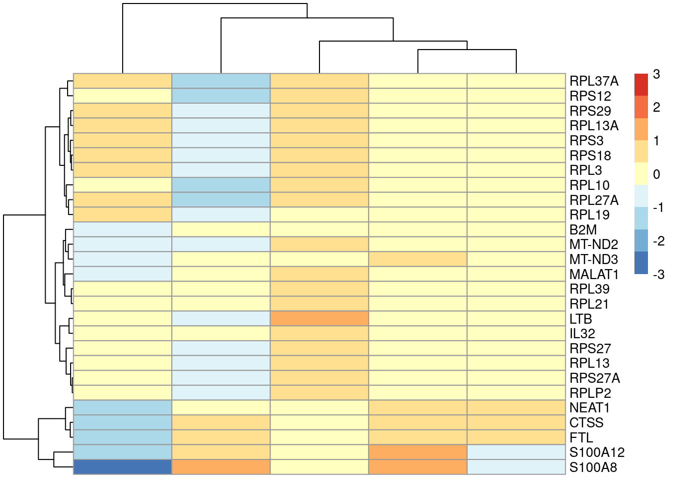
Figure 6.4: Heatmap of the centered average log-expression values for the top potential marker genes for cluster 4 relative to other LYZ-high clusters in the PBMC dataset. The set of markers was selected as those genes with AUC-derived min-ranks less than or equal to 10.
Similarly, we can use the full set of effect sizes to define our own summary statistic if the precomputed measures are too coarse. For example, we may be interested in markers that are upregulated against some percentage - say, 80% - of other clusters. This improves the cluster specificity of the ranking by being more stringent than the median yet not as strigent as the minimum. We achieve this by computing and sorting on the 20th percentile of effect sizes, as shown below.
stat <- rowQuantiles(as.matrix(chosen$full.AUC), p=0.2)
chosen[order(stat, decreasing=TRUE), 1:4] # just showing the basic stats for brevity.
## DataFrame with 33694 rows and 4 columns
## self.average other.average self.detected other.detected
## <numeric> <numeric> <numeric> <numeric>
## S100A12 1.94300 0.609079 0.928571 0.263675
## JUND 1.42774 0.619368 0.910714 0.442422
## S100A9 4.94461 2.059524 1.000000 0.705775
## VCAN 1.63794 0.436597 0.875000 0.222359
## S100A8 4.61729 1.834030 1.000000 0.639031
## ... ... ... ... ...
## RPL23A 3.96991 3.74428 1 0.905175
## RPSA 2.68595 2.56391 1 0.829648
## HLA-C 3.11670 3.52769 1 0.934941
## RPS29 4.57983 4.27407 1 0.919797
## HLA-B 4.01381 4.43805 1 0.9717606.6 Using a log-fold change threshold
The Cohen’s \(d\) and AUC calculations consider both the magnitude of the difference between clusters as well as the variability within each cluster. If the variability is lower, it is possible for a gene to have a large effect size even if the magnitude of the difference is small. These genes tend to be somewhat uninformative for cell type identification despite their strong differential expression (e.g., ribosomal protein genes). We would prefer genes with larger log-fold changes between clusters, even if they have higher variability.
To favor the detection of such genes, we can compute the effect sizes relative to a log-fold change threshold by setting lfc= in scoreMarkers().
The definition of Cohen’s \(d\) is generalized to the standardized difference between the observed log-fold change and the specified lfc threshold.
Similarly, the AUC is redefined as the probability of randomly picking an expression value from one cluster that is greater than a random value from the other cluster plus lfc.
A large positive Cohen’s \(d\) and an AUC above 0.5 can only be obtained if the observed log-fold change between clusters is significantly greater than lfc.
We demonstrate below by obtaining the top markers for cluster 5 in the PBMC dataset with lfc=2 (Figure 6.5).
marker.info.lfc <- scoreMarkers(sce.pbmc, colLabels(sce.pbmc), lfc=2)
chosen2 <- marker.info.lfc[["5"]] # another cluster for some variety.
chosen2 <- chosen2[order(chosen2$mean.AUC, decreasing=TRUE),]
chosen2[,c("self.average", "other.average", "mean.AUC")]
## DataFrame with 33694 rows and 3 columns
## self.average other.average mean.AUC
## <numeric> <numeric> <numeric>
## CCL5 3.81358 1.047986 0.747609
## NKG7 3.17038 0.830285 0.654736
## IL32 3.29770 1.076383 0.633969
## GZMA 1.92877 0.426848 0.454187
## TRAC 2.25881 0.848025 0.434530
## ... ... ... ...
## AC233755.2 0.00000000 0.00000000 0
## AC233755.1 0.00000000 0.00000000 0
## AC240274.1 0.00942441 0.00800457 0
## AC213203.1 0.00000000 0.00000000 0
## FAM231B 0.00000000 0.00000000 0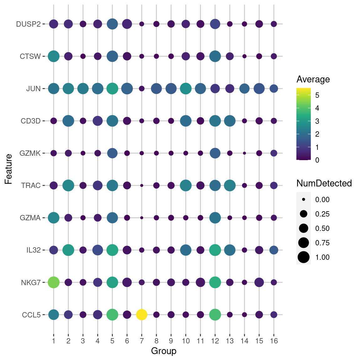
Figure 6.5: Dot plot of the top potential marker genes (as determined by the mean AUC) for cluster 5 in the PBMC dataset. Each row corrresponds to a marker gene and each column corresponds to a cluster. The size of each dot represents the proportion of cells with detected expression of the gene in the cluster, while the color is proportional to the average expression across all cells in that cluster.
Note that the interpretation of the AUC and Cohen’s \(d\) becomes slightly more complicated when lfc is non-zero.
If lfc is positive, a positive Cohen’s \(d\) and an AUC above 0.5 represents upregulation.
However, a negative Cohen’s \(d\) or AUC below 0.5 may not represent downregulation; it may just indicate that the observed log-fold change is less than the specified lfc.
The converse applies when lfc is negative, where the only conclusive interpretation occurs for downregulated genes.
For the most part, this complication is not too problematic for routine marker detection, as we are mostly interested in upregulated genes with large positive Cohen’s \(d\) and AUCs above 0.5.
6.7 Handling blocking factors
Large studies may contain factors of variation that are known and not interesting (e.g., batch effects, sex differences).
If these are not modelled, they can interfere with marker gene detection - most obviously by inflating the variance within each cluster, but also by distorting the log-fold changes if the cluster composition varies across levels of the blocking factor.
To avoid these issues, we specify the blocking factor via the block= argument, as demonstrated below for the 416B data set.
#--- loading ---#
library(scRNAseq)
sce.416b <- LunSpikeInData(which="416b")
sce.416b$block <- factor(sce.416b$block)

#--- gene-annotation ---#
library(AnnotationHub)
ens.mm.v97 <- AnnotationHub()[["AH73905"]]
rowData(sce.416b)$ENSEMBL <- rownames(sce.416b)
rowData(sce.416b)$SYMBOL <- mapIds(ens.mm.v97, keys=rownames(sce.416b),
    keytype="GENEID", column="SYMBOL")
rowData(sce.416b)$SEQNAME <- mapIds(ens.mm.v97, keys=rownames(sce.416b),
    keytype="GENEID", column="SEQNAME")

library(scater)
rownames(sce.416b) <- uniquifyFeatureNames(rowData(sce.416b)$ENSEMBL,
    rowData(sce.416b)$SYMBOL)

#--- quality-control ---#
mito <- which(rowData(sce.416b)$SEQNAME=="MT")
stats <- perCellQCMetrics(sce.416b, subsets=list(Mt=mito))
qc <- quickPerCellQC(stats, percent_subsets=c("subsets_Mt_percent",
    "altexps_ERCC_percent"), batch=sce.416b$block)
sce.416b <- sce.416b[,!qc$discard]

#--- normalization ---#
library(scran)
sce.416b <- computeSumFactors(sce.416b)
sce.416b <- logNormCounts(sce.416b)

#--- variance-modelling ---#
dec.416b <- modelGeneVarWithSpikes(sce.416b, "ERCC", block=sce.416b$block)
chosen.hvgs <- getTopHVGs(dec.416b, prop=0.1)

#--- batch-correction ---#
library(limma)
assay(sce.416b, "corrected") <- removeBatchEffect(logcounts(sce.416b),
    design=model.matrix(~sce.416b$phenotype), batch=sce.416b$block)

#--- dimensionality-reduction ---#
sce.416b <- runPCA(sce.416b, ncomponents=10, subset_row=chosen.hvgs,
    exprs_values="corrected", BSPARAM=BiocSingular::ExactParam())

set.seed(1010)
sce.416b <- runTSNE(sce.416b, dimred="PCA", perplexity=10)

#--- clustering ---#
my.dist <- dist(reducedDim(sce.416b, "PCA"))
my.tree <- hclust(my.dist, method="ward.D2")

library(dynamicTreeCut)
my.clusters <- unname(cutreeDynamic(my.tree, distM=as.matrix(my.dist),
    minClusterSize=10, verbose=0))
colLabels(sce.416b) <- factor(my.clusters)For each gene, each pairwise comparison between clusters is performed separately in each level of the blocking factor - in this case, the plate of origin. By comparing within each batch, we cancel out any batch effects so that they are not conflated with the biological differences between subpopulations. The effect sizes are then averaged across batches to obtain a single value per comparison, using a weighted mean that accounts for the number of cells involved in the comparison in each batch. A similar correction is applied to the mean log-expression and proportion of detected cells inside and outside each cluster.
demo <- m.out[["1"]]
ordered <- demo[order(demo$median.logFC.cohen, decreasing=TRUE),]
ordered[,1:4]
## DataFrame with 46604 rows and 4 columns
## self.average other.average self.detected other.detected
## <numeric> <numeric> <numeric> <numeric>
## Myh11 4.03436 0.861019 0.988132 0.303097
## Cd200r3 7.97667 3.524762 0.977675 0.624507
## Pi16 6.27654 2.644421 0.957126 0.530395
## Actb 15.48533 14.808584 1.000000 1.000000
## Ctsd 11.61247 9.130141 1.000000 1.000000
## ... ... ... ... ...
## Spc24 0.4772577 5.03548 0.222281 0.862153
## Ska1 0.0787421 4.43426 0.118743 0.773950
## Pimreg 0.5263611 5.35494 0.258150 0.910706
## Birc5 1.5580536 7.07230 0.698746 0.976929
## Ccna2 0.9664521 6.55243 0.554104 0.948520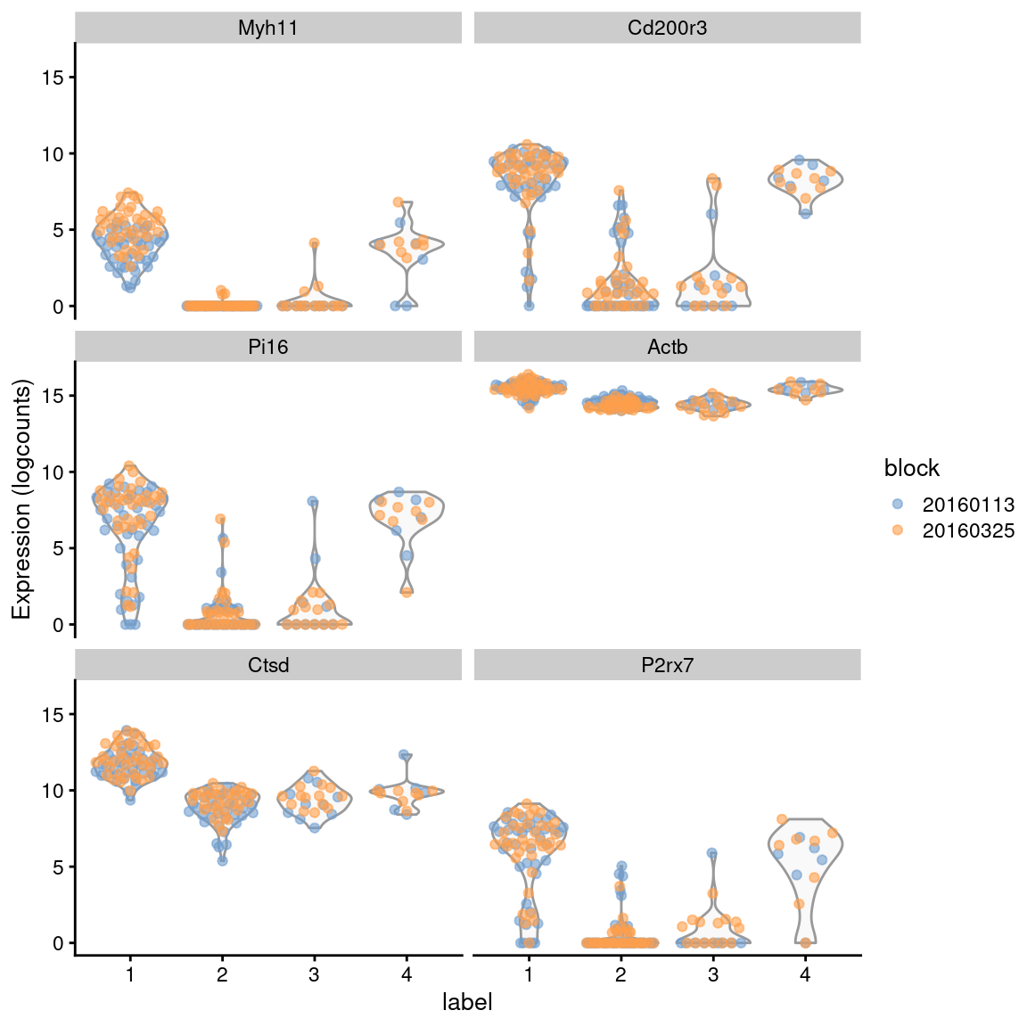
Figure 6.6: Distribution of expression values across clusters for the top potential marker genes from cluster 1 in the 416B dataset. Each point represents a cell and is colored by the batch of origin.
The block= argument works for all effect sizes shown above and is robust to differences in the log-fold changes or variance between batches.
However, it assumes that each pair of clusters is present in at least one batch.
In scenarios where cells from two clusters never co-occur in the same batch, the associated pairwise comparison will be impossible and is ignored during calculation of summary statistics.
Session Info
R version 4.3.0 RC (2023-04-13 r84269)
Platform: x86_64-pc-linux-gnu (64-bit)
Running under: Ubuntu 22.04.2 LTS

Matrix products: default
BLAS:   /home/biocbuild/bbs-3.17-bioc/R/lib/libRblas.so
LAPACK: /usr/lib/x86_64-linux-gnu/lapack/liblapack.so.3.10.0

locale:
 [1] LC_CTYPE=en_US.UTF-8       LC_NUMERIC=C
 [3] LC_TIME=en_GB              LC_COLLATE=C
 [5] LC_MONETARY=en_US.UTF-8    LC_MESSAGES=en_US.UTF-8
 [7] LC_PAPER=en_US.UTF-8       LC_NAME=C
 [9] LC_ADDRESS=C               LC_TELEPHONE=C
[11] LC_MEASUREMENT=en_US.UTF-8 LC_IDENTIFICATION=C

time zone: America/New_York
tzcode source: system (glibc)

attached base packages:
[1] stats4    stats     graphics  grDevices utils     datasets  methods
[8] base

other attached packages:
 [1] scater_1.28.0               ggplot2_3.4.2
 [3] scran_1.28.0                scuttle_1.10.0
 [5] SingleCellExperiment_1.22.0 SummarizedExperiment_1.30.0
 [7] Biobase_2.60.0              GenomicRanges_1.52.0
 [9] GenomeInfoDb_1.36.0         IRanges_2.34.0
[11] S4Vectors_0.38.0            BiocGenerics_0.46.0
[13] MatrixGenerics_1.12.0       matrixStats_0.63.0
[15] BiocStyle_2.28.0            rebook_1.10.0

loaded via a namespace (and not attached):
 [1] bitops_1.0-7              gridExtra_2.3
 [3] CodeDepends_0.6.5         rlang_1.1.0
 [5] magrittr_2.0.3            compiler_4.3.0
 [7] dir.expiry_1.8.0          DelayedMatrixStats_1.22.0
 [9] vctrs_0.6.2               pkgconfig_2.0.3
[11] fastmap_1.1.1             XVector_0.40.0
[13] labeling_0.4.2            utf8_1.2.3
[15] rmarkdown_2.21            graph_1.78.0
[17] ggbeeswarm_0.7.1          xfun_0.39
[19] bluster_1.10.0            zlibbioc_1.46.0
[21] cachem_1.0.7              beachmat_2.16.0
[23] jsonlite_1.8.4            highr_0.10
[25] DelayedArray_0.26.0       BiocParallel_1.34.0
[27] irlba_2.3.5.1             parallel_4.3.0
[29] cluster_2.1.4             R6_2.5.1
[31] bslib_0.4.2               RColorBrewer_1.1-3
[33] limma_3.56.0              jquerylib_0.1.4
[35] Rcpp_1.0.10               bookdown_0.33
[37] knitr_1.42                Matrix_1.5-4
[39] igraph_1.4.2              tidyselect_1.2.0
[41] yaml_2.3.7                viridis_0.6.2
[43] codetools_0.2-19          lattice_0.21-8
[45] tibble_3.2.1              withr_2.5.0
[47] evaluate_0.20             pillar_1.9.0
[49] BiocManager_1.30.20       filelock_1.0.2
[51] generics_0.1.3            RCurl_1.98-1.12
[53] sparseMatrixStats_1.12.0  munsell_0.5.0
[55] scales_1.2.1              glue_1.6.2
[57] metapod_1.8.0             pheatmap_1.0.12
[59] tools_4.3.0               BiocNeighbors_1.18.0
[61] ScaledMatrix_1.8.0        locfit_1.5-9.7
[63] XML_3.99-0.14             cowplot_1.1.1
[65] grid_4.3.0                edgeR_3.42.0
[67] colorspace_2.1-0          GenomeInfoDbData_1.2.10
[69] beeswarm_0.4.0            BiocSingular_1.16.0
[71] vipor_0.4.5               cli_3.6.1
[73] rsvd_1.0.5                rappdirs_0.3.3
[75] fansi_1.0.4               viridisLite_0.4.1
[77] dplyr_1.1.2               gtable_0.3.3
[79] sass_0.4.5                digest_0.6.31
[81] ggrepel_0.9.3             dqrng_0.3.0
[83] farver_2.1.1              htmltools_0.5.5
[85] lifecycle_1.0.3           statmod_1.5.0