Chapter 10 Trajectory Analysis
10.1 Overview
Many biological processes manifest as a continuum of dynamic changes in the cellular state. The most obvious example is that of differentiation into increasingly specialized cell subtypes, but we might also consider phenomena like the cell cycle or immune cell activation that are accompanied by gradual changes in the cell’s transcriptome. We characterize these processes from single-cell expression data by identifying a “trajectory”, i.e., a path through the high-dimensional expression space that traverses the various cellular states associated with a continuous process like differentiation. In the simplest case, a trajectory will be a simple path from one point to another, but we can also observe more complex trajectories that branch to multiple endpoints.
The “pseudotime” is defined as the positioning of cells along the trajectory that quantifies the relative activity or progression of the underlying biological process. For example, the pseudotime for a differentiation trajectory might represent the degree of differentiation from a pluripotent cell to a terminal state where cells with larger pseudotime values are more differentiated. This metric allows us to tackle questions related to the global population structure in a more quantitative manner. The most common application is to fit models to gene expression against the pseudotime to identify the genes responsible for generating the trajectory in the first place, especially around interesting branch events.
In this section, we will demonstrate several different approaches to trajectory analysis using the haematopoietic stem cell (HSC) dataset from Nestorowa et al. (2016).
#--- data-loading ---#
library(scRNAseq)
sce.nest <- NestorowaHSCData()

#--- gene-annotation ---#
library(AnnotationHub)
ens.mm.v97 <- AnnotationHub()[["AH73905"]]
anno <- select(ens.mm.v97, keys=rownames(sce.nest),
    keytype="GENEID", columns=c("SYMBOL", "SEQNAME"))
rowData(sce.nest) <- anno[match(rownames(sce.nest), anno$GENEID),]

#--- quality-control ---#
library(scater)
stats <- perCellQCMetrics(sce.nest)
qc <- quickPerCellQC(stats, percent_subsets="altexps_ERCC_percent")
sce.nest <- sce.nest[,!qc$discard]

#--- normalization ---#
library(scran)
set.seed(101000110)
clusters <- quickCluster(sce.nest)
sce.nest <- computeSumFactors(sce.nest, clusters=clusters)
sce.nest <- logNormCounts(sce.nest)

#--- variance-modelling ---#
set.seed(00010101)
dec.nest <- modelGeneVarWithSpikes(sce.nest, "ERCC")
top.nest <- getTopHVGs(dec.nest, prop=0.1)

#--- dimensionality-reduction ---#
set.seed(101010011)
sce.nest <- denoisePCA(sce.nest, technical=dec.nest, subset.row=top.nest)
sce.nest <- runTSNE(sce.nest, dimred="PCA")

#--- clustering ---#
snn.gr <- buildSNNGraph(sce.nest, use.dimred="PCA")
colLabels(sce.nest) <- factor(igraph::cluster_walktrap(snn.gr)$membership)## class: SingleCellExperiment
## dim: 46078 1656
## metadata(0):
## assays(2): counts logcounts
## rownames(46078): ENSMUSG00000000001 ENSMUSG00000000003 ...
## ENSMUSG00000107391 ENSMUSG00000107392
## rowData names(3): GENEID SYMBOL SEQNAME
## colnames(1656): HSPC_025 HSPC_031 ... Prog_852 Prog_810
## colData names(4): cell.type FACS sizeFactor label
## reducedDimNames(3): diffusion PCA TSNE
## mainExpName: endogenous
## altExpNames(1): ERCC10.2 Obtaining pseudotime orderings
10.2.1 Overview
The pseudotime is simply a number describing the relative position of a cell in the trajectory, where cells with larger values are consider to be “after” their counterparts with smaller values. Branched trajectories will typically be associated with multiple pseudotimes, one per path through the trajectory; these values are not usually comparable across paths. It is worth noting that “pseudotime” is a rather unfortunate term as it may not have much to do with real-life time. For example, one can imagine a continuum of stress states where cells move in either direction (or not) over time but the pseudotime simply describes the transition from one end of the continuum to the other. In trajectories describing time-dependent processes like differentiation, a cell’s pseudotime value may be used as a proxy for its relative age, but only if directionality can be inferred (see Section 10.4).
The big question is how to identify the trajectory from high-dimensional expression data and map individual cells onto it. A massive variety of different algorithms are available for doing so (Saelens et al. 2019), and while we will demonstrate only a few specific methods below, many of the concepts apply generally to all trajectory inference strategies. A more philosophical question is whether a trajectory even exists in the dataset. One can interpret a continuum of states as a series of closely related (but distinct) subpopulations, or two well-separated clusters as the endpoints of a trajectory with rare intermediates. The choice between these two perspectives is left to the analyst based on which is more useful, convenient or biologically sensible.
10.2.2 Cluster-based minimum spanning tree
10.2.2.1 Basic steps
The TSCAN algorithm uses a simple yet effective approach to trajectory reconstruction. It uses the clustering to summarize the data into a smaller set of discrete units, computes cluster centroids by averaging the coordinates of its member cells, and then forms the minimum spanning tree (MST) across those centroids. The MST is simply an undirected acyclic graph that passes through each centroid exactly once and is thus the most parsimonious structure that captures the transitions between clusters. We demonstrate below on the Nestorowa et al. (2016) dataset, computing the cluster centroids in the low-dimensional PC space to take advantage of data compaction and denoising (Basic Chapter 4).
library(scater)
by.cluster <- aggregateAcrossCells(sce.nest, ids=colLabels(sce.nest))
centroids <- reducedDim(by.cluster, "PCA")

# Set clusters=NULL as we have already aggregated above.
library(TSCAN)
mst <- createClusterMST(centroids, clusters=NULL)
mst
## IGRAPH ceda802 UNW- 9 8 --
## + attr: name (v/c), coordinates (v/x), weight (e/n), gain (e/n)
## + edges from ceda802 (vertex names):
## [1] 1--3 1--9 2--3 2--6 3--4 5--8 5--9 6--7For reference, we can draw the same lines between the centroids in a \(t\)-SNE plot (Figure 10.1).
This allows us to identify interesting clusters such as those at bifurcations or endpoints.
Note that the MST in mst was generated from distances in the PC space and is merely being visualized here in the \(t\)-SNE space,
for the same reasons as discussed in Basic Section 4.5.3.
This may occasionally result in some visually unappealing plots if the original ordering of clusters in the PC space is not preserved in the \(t\)-SNE space.
line.data <- reportEdges(by.cluster, mst=mst, clusters=NULL, use.dimred="TSNE")

plotTSNE(sce.nest, colour_by="label") +
    geom_line(data=line.data, mapping=aes(x=dim1, y=dim2, group=edge))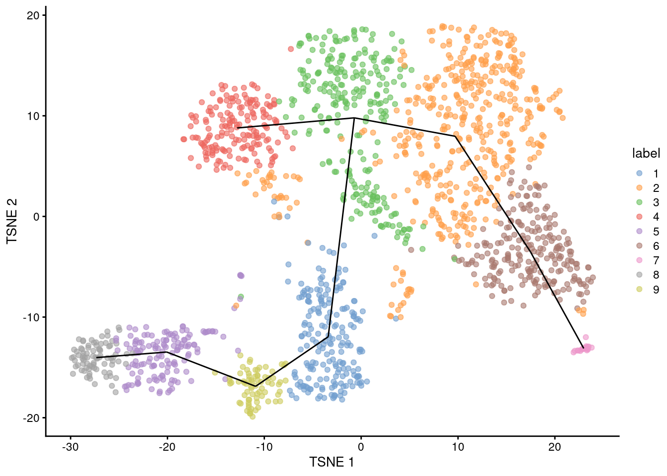
Figure 10.1: \(t\)-SNE plot of the Nestorowa HSC dataset, where each point is a cell and is colored according to its cluster assignment. The MST obtained using a TSCAN-like algorithm is overlaid on top.
We obtain a pseudotime ordering by projecting the cells onto the MST with mapCellsToEdges().
More specifically, we move each cell onto the closest edge of the MST;
the pseudotime is then calculated as the distance along the MST to this new position from a “root node” with orderCells().
For our purposes, we will arbitrarily pick one of the endpoint nodes as the root,
though a more careful choice based on the biological annotation of each node may yield more relevant orderings
(e.g., picking a node corresponding to a more pluripotent state).
map.tscan <- mapCellsToEdges(sce.nest, mst=mst, use.dimred="PCA")
tscan.pseudo <- orderCells(map.tscan, mst)
head(tscan.pseudo)
## class: PseudotimeOrdering
## dim: 6 2
## metadata(1): start
## pathStats(1): ''
## cellnames(6): HSPC_025 HSPC_031 ... HSPC_014 HSPC_020
## cellData names(4): left.cluster right.cluster left.distance
## right.distance
## pathnames(2): 7 8
## pathData names(0):Here, multiple sets of pseudotimes are reported for a branched trajectory.
Each column contains one pseudotime ordering and corresponds to one path from the root node to one of the terminal nodes - the name of the terminal node that defines this path is recorded in the column names of tscan.pseudo.
Some cells may be shared across multiple paths, in which case they will have the same pseudotime in those paths.
We can then examine the pseudotime ordering on our desired visualization as shown in Figure 10.2.
common.pseudo <- averagePseudotime(tscan.pseudo)
plotTSNE(sce.nest, colour_by=I(common.pseudo),
text_by="label", text_colour="red") +
geom_line(data=line.data, mapping=aes(x=dim1, y=dim2, group=edge))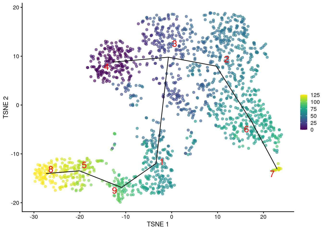
Figure 10.2: \(t\)-SNE plot of the Nestorowa HSC dataset, where each point is a cell and is colored according to its pseudotime value. The MST obtained using TSCAN is overlaid on top.
Alternatively, this entire series of calculations can be conveniently performed with the quickPseudotime() wrapper.
This executes all steps from aggregateAcrossCells() to orderCells() and returns a list with the output from each step.
## class: PseudotimeOrdering
## dim: 6 2
## metadata(1): start
## pathStats(1): ''
## cellnames(6): HSPC_025 HSPC_031 ... HSPC_014 HSPC_020
## cellData names(4): left.cluster right.cluster left.distance
##   right.distance
## pathnames(2): 7 8
## pathData names(0):10.2.2.2 Tweaking the MST
The MST can be constructed with an “outgroup” to avoid connecting unrelated populations in the dataset.
Based on the OMEGA cluster concept from Street et al. (2018),
the outgroup is an artificial cluster that is equidistant from all real clusters at some threshold value.
If the original MST sans the outgroup contains an edge that is longer than twice the threshold,
the addition of the outgroup will cause the MST to instead be routed through the outgroup.
We can subsequently break up the MST into subcomponents (i.e., a minimum spanning forest) by removing the outgroup.
We set outgroup=TRUE to introduce an outgroup with an automatically determined threshold distance,
which breaks up our previous MST into two components (Figure 10.3).
pseudo.og <- quickPseudotime(sce.nest, use.dimred="PCA", outgroup=TRUE)
set.seed(10101)
plot(pseudo.og$mst)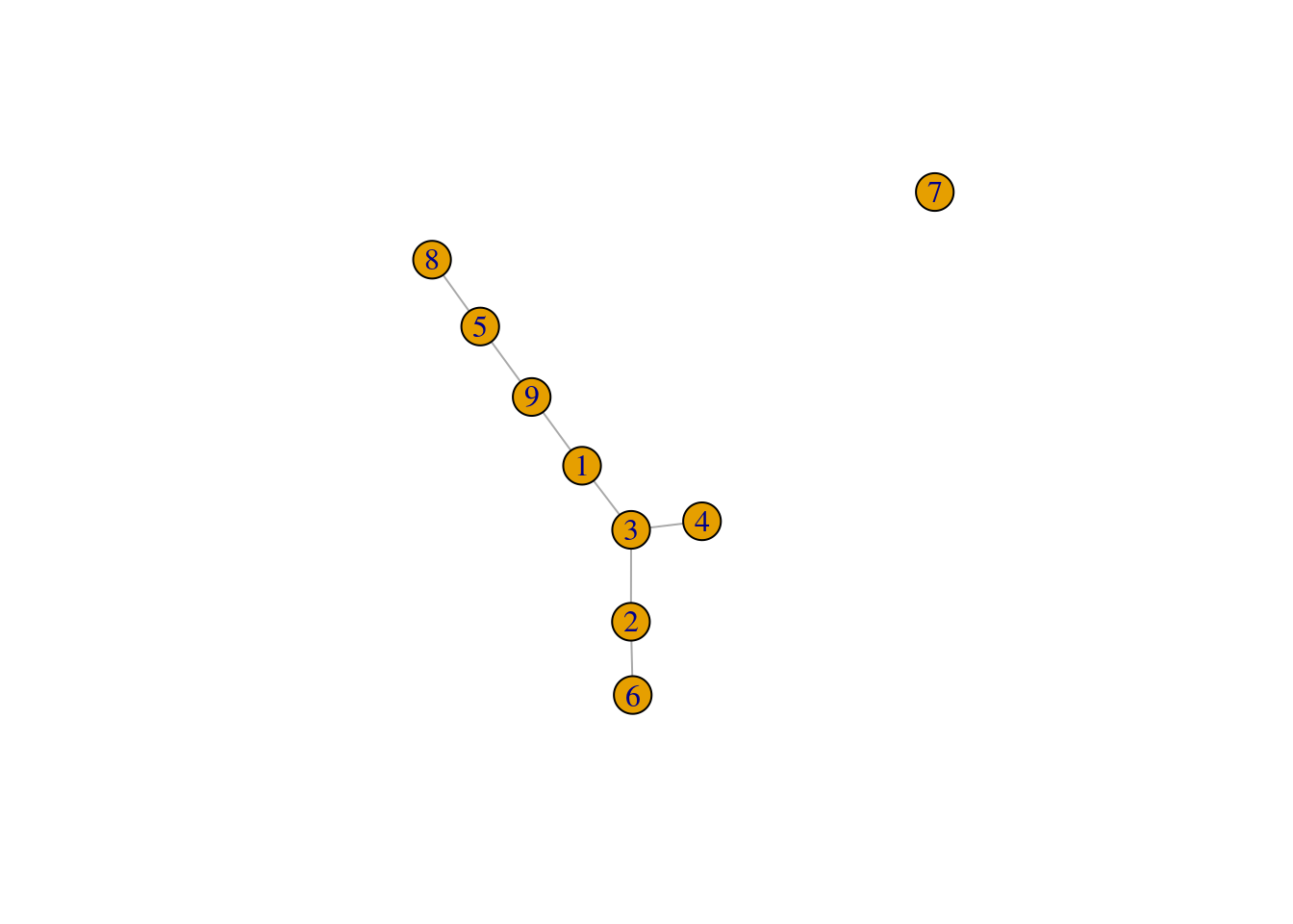
Figure 10.3: Minimum spanning tree of the Nestorowa clusters after introducing an outgroup.
Another option is to construct the MST based on distances between mutual nearest neighbor (MNN) pairs between clusters (Multi-sample Section 1.6). This exploits the fact that MNN pairs occur at the boundaries of two clusters, with short distances between paired cells meaning that the clusters are “touching”. In this mode, the MST focuses on the connectivity between clusters, which can be different from the shortest distance between centroids (Figure 10.4). Consider, for example, a pair of elongated clusters that are immediately adjacent to each other. A large distance between their centroids precludes the formation of the obvious edge with the default MST construction; in contrast, the MNN distance is very low and encourages the MST to create a connection between the two clusters.
pseudo.mnn <- quickPseudotime(sce.nest, use.dimred="PCA", with.mnn=TRUE)
mnn.pseudo <- averagePseudotime(pseudo.mnn$ordering)
plotTSNE(sce.nest, colour_by=I(mnn.pseudo), text_by="label", text_colour="red") +
    geom_line(data=pseudo.mnn$connected$TSNE, mapping=aes(x=dim1, y=dim2, group=edge))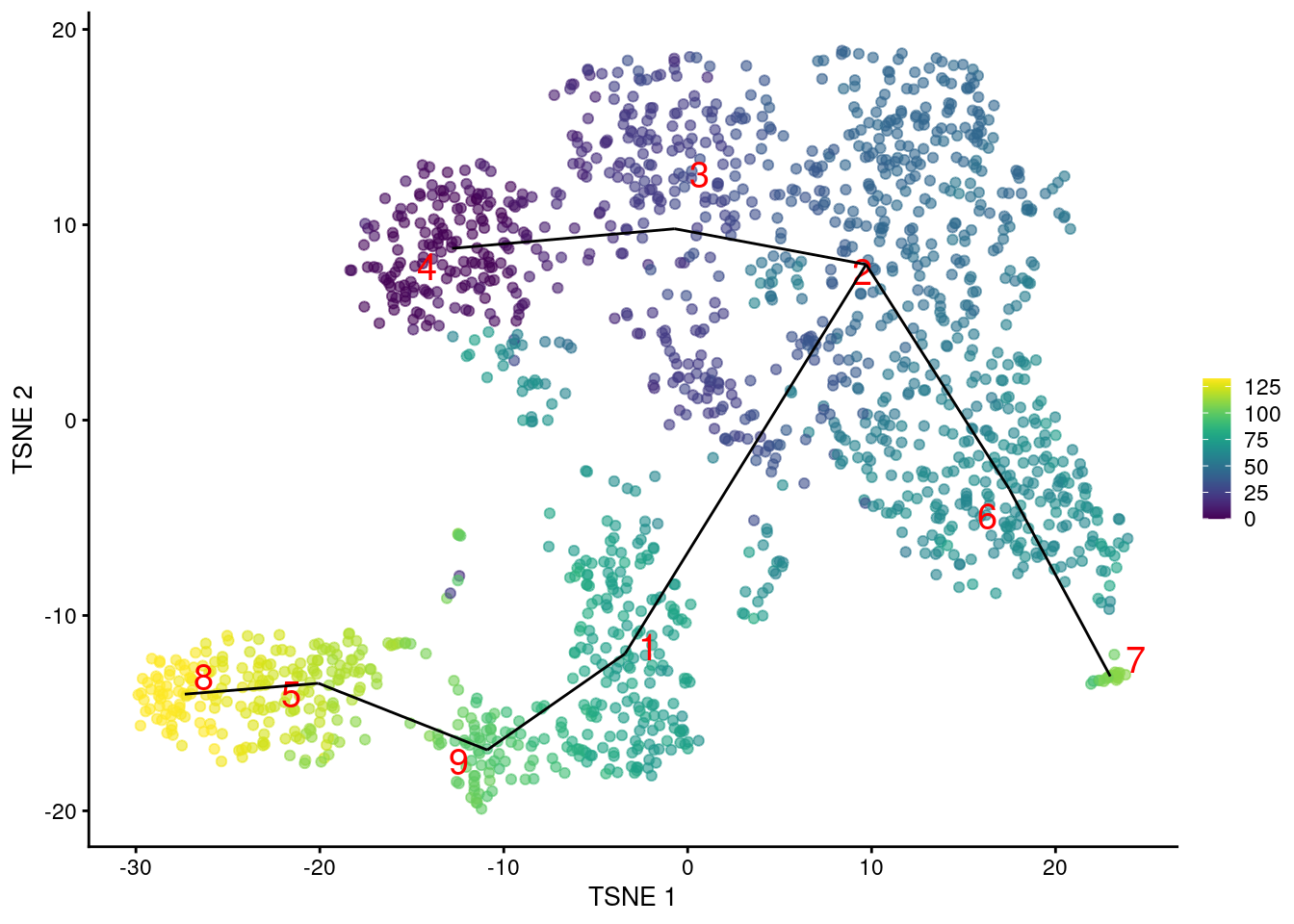
Figure 10.4: \(t\)-SNE plot of the Nestorowa HSC dataset, where each point is a cell and is colored according to its pseudotime value. The MST obtained using TSCAN with MNN distances is overlaid on top.
10.2.2.3 Further comments
The TSCAN approach derives several advantages from using clusters to form the MST. The most obvious is that of computational speed as calculations are performed over clusters rather than cells. The relative coarseness of clusters protects against the per-cell noise that would otherwise reduce the stability of the MST. The interpretation of the MST is also straightforward as it uses the same clusters as the rest of the analysis, allowing us to recycle previous knowledge about the biological annotations assigned to each cluster.
However, the reliance on clustering is a double-edged sword. If the clusters are not sufficiently granular, it is possible for TSCAN to overlook variation that occurs inside a single cluster. The MST is obliged to pass through each cluster exactly once, which can lead to excessively circuitous paths in overclustered datasets as well as the formation of irrelevant paths between distinct cell subpopulations if the outgroup threshold is too high. The MST also fails to handle more complex events such as “bubbles” (i.e., a bifurcation and then a merging) or cycles.
10.2.3 Principal curves
To identify a trajectory, one might imagine simply “fitting” a one-dimensional curve so that it passes through the cloud of cells in the high-dimensional expression space. This is the idea behind principal curves (Hastie and Stuetzle 1989), effectively a non-linear generalization of PCA where the axes of most variation are allowed to bend. We use the slingshot package (Street et al. 2018) to fit a single principal curve to the Nestorowa dataset, again using the low-dimensional PC coordinates for denoising and speed. This yields a pseudotime ordering of cells based on their relative positions when projected onto the curve.
library(slingshot)
sce.sling <- slingshot(sce.nest, reducedDim='PCA')
head(sce.sling$slingPseudotime_1)
## [1] 59.17 45.31 57.40 46.40 51.89 41.44We can then visualize the path taken by the fitted curve in any desired space with embedCurves().
For example, Figure 10.5 shows the behavior of the principle curve on the \(t\)-SNE plot.
Again, users should note that this may not always yield aesthetically pleasing plots if the \(t\)-SNE algorithm decides to arrange clusters so that they no longer match the ordering of the pseudotimes.
embedded <- embedCurves(sce.sling, "TSNE")
embedded <- slingCurves(embedded)[[1]] # only 1 path.
embedded <- data.frame(embedded$s[embedded$ord,])

plotTSNE(sce.sling, colour_by="slingPseudotime_1") +
    geom_path(data=embedded, aes(x=Dim.1, y=Dim.2), size=1.2)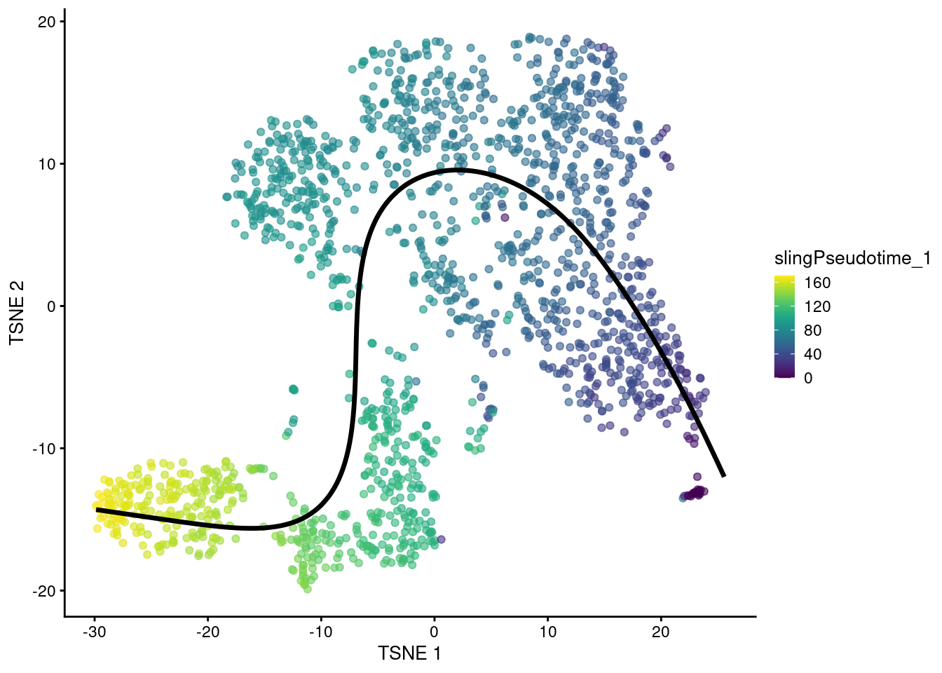
Figure 10.5: \(t\)-SNE plot of the Nestorowa HSC dataset where each point is a cell and is colored by the slingshot pseudotime ordering. The fitted principal curve is shown in black.
The previous call to slingshot() assumed that all cells in the dataset were part of a single curve.
To accommodate more complex events like bifurcations, we use our previously computed cluster assignments to build a rough sketch for the global structure in the form of a MST across the cluster centroids.
Each path through the MST from a designated root node is treated as a lineage that contains cells from the associated clusters.
Principal curves are then simultaneously fitted to all lineages with some averaging across curves to encourage consistency in shared clusters across lineages.
This process yields a matrix of pseudotimes where each column corresponds to a lineage and contains the pseudotimes of all cells assigned to that lineage.
sce.sling2 <- slingshot(sce.nest, cluster=colLabels(sce.nest), reducedDim='PCA')
pseudo.paths <- slingPseudotime(sce.sling2)
head(pseudo.paths)
## Lineage1 Lineage2 Lineage3
## HSPC_025 107.06 NA NA
## HSPC_031 95.11 101.5 117.1
## HSPC_037 103.29 103.8 109.2
## HSPC_008 99.23 115.5 103.8
## HSPC_014 103.29 111.0 105.5
## HSPC_020 NA 123.6 NABy using the MST as a scaffold for the global structure, slingshot() can accommodate branching events based on divergence in the principal curves (Figure 10.6).
However, unlike TSCAN, the MST here is only used as a rough guide and does not define the final pseudotime.
sce.nest <- runUMAP(sce.nest, dimred="PCA")
reducedDim(sce.sling2, "UMAP") <- reducedDim(sce.nest, "UMAP")

# Taking the rowMeans just gives us a single pseudo-time for all cells. Cells
# in segments that are shared across paths have similar pseudo-time values in
# all paths anyway, so taking the rowMeans is not particularly controversial.
shared.pseudo <- rowMeans(pseudo.paths, na.rm=TRUE)

# Need to loop over the paths and add each one separately.
gg <- plotUMAP(sce.sling2, colour_by=I(shared.pseudo))
embedded <- embedCurves(sce.sling2, "UMAP")
embedded <- slingCurves(embedded)
for (path in embedded) {
    embedded <- data.frame(path$s[path$ord,])
    gg <- gg + geom_path(data=embedded, aes(x=Dim.1, y=Dim.2), size=1.2)
}

gg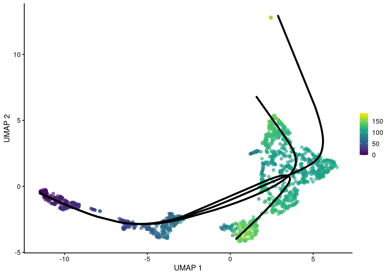
Figure 10.6: UMAP plot of the Nestorowa HSC dataset where each point is a cell and is colored by the average slingshot pseudotime across paths. The principal curves fitted to each lineage are shown in black.
We can use slingshotBranchID() to determine whether a particular cell is shared across multiple curves or is unique to a subset of curves (i.e., is located “after” branching).
In this case, we can see that most cells jump directly from a global common segment (1,2,3) to one of the curves (1, 2, 3) without any further hierarchy, i.e., no noticeable internal branch points.
## curve.assignments
##     1   1,2 1,2,3   1,3     2   2,3     3
##   435     6   892     2   222    38    61
For larger datasets, we can speed up the algorithm by approximating each principal curve with a fixed number of points.
By default, slingshot() uses one point per cell to define the curve, which is unnecessarily precise when the number of cells is large.
Applying an approximation with approx_points= reduces computational work without any major loss of precision in the pseudotime estimates.
sce.sling3 <- slingshot(sce.nest, cluster=colLabels(sce.nest),
    reducedDim='PCA', approx_points=100)
pseudo.paths3 <- slingPseudotime(sce.sling3)
head(pseudo.paths3)
## Lineage1 Lineage2 Lineage3
## HSPC_025 106.85 NA NA
## HSPC_031 95.38 101.8 117.1
## HSPC_037 103.08 104.1 109.0
## HSPC_008 98.72 115.5 103.7
## HSPC_014 103.08 110.9 105.3
## HSPC_020 NA 123.5 NAThe MST can also be constructed with an OMEGA cluster to avoid connecting unrelated trajectories. This operates in the same manner as (and was the inspiration for) the outgroup for TSCAN’s MST. Principal curves are fitted through each component individually, manifesting in the pseudotime matrix as paths that do not share any cells.
sce.sling4 <- slingshot(sce.nest, cluster=colLabels(sce.nest),
    reducedDim='PCA', approx_points=100, omega=TRUE)
pseudo.paths4 <- slingPseudotime(sce.sling4)
head(pseudo.paths4)
## Lineage1 Lineage2 Lineage3
## HSPC_025 111.83 NA NA
## HSPC_031 96.16 99.78 NA
## HSPC_037 105.49 105.08 NA
## HSPC_008 102.00 117.28 NA
## HSPC_014 105.49 112.70 NA
## HSPC_020 NA 126.08 NAshared.pseudo <- rowMeans(pseudo.paths, na.rm=TRUE)
gg <- plotUMAP(sce.sling4, colour_by=I(shared.pseudo))
embedded <- embedCurves(sce.sling4, "UMAP")
embedded <- slingCurves(embedded)
for (path in embedded) {
embedded <- data.frame(path$s[path$ord,])
gg <- gg + geom_path(data=embedded, aes(x=Dim.1, y=Dim.2), size=1.2)
}
gg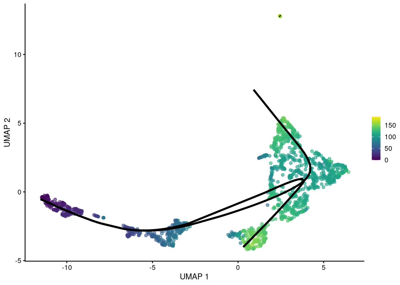
Figure 10.7: UMAP plot of the Nestorowa HSC dataset where each point is a cell and is colored by the average slingshot pseudotime across paths. The principal curves (black lines) were constructed with an OMEGA cluster.
The use of principal curves adds an extra layer of sophistication that complements the deficiencies of the cluster-based MST. The principal curve has the opportunity to model variation within clusters that would otherwise be overlooked; for example, slingshot could build a trajectory out of one cluster while TSCAN cannot. Conversely, the principal curves can “smooth out” circuitous paths in the MST for overclustered data, ignoring small differences between fine clusters that are unlikely to be relevant to the overall trajectory.
That said, the structure of the initial MST is still fundamentally dependent on the resolution of the clusters. One can arbitrarily change the number of branches from slingshot by tuning the cluster granularity, making it difficult to use the output as evidence for the presence/absence of subtle branch events. If the variation within clusters is uninteresting, the greater sensitivity of the curve fitting to such variation may yield irrelevant trajectories where the differences between clusters are masked. Moreover, slingshot is no longer obliged to separate clusters in pseudotime, which may complicate intepretation of the trajectory with respect to existing cluster annotations.
10.3 Characterizing trajectories
10.3.1 Overview
Once we have constructed a trajectory, the next step is to characterize the underlying biology based on its DE genes. The aim here is to find the genes that exhibit significant changes in expression across pseudotime, as these are the most likely to have driven the formation of the trajectory in the first place. The overall strategy is to fit a model to the per-gene expression with respect to pseudotime, allowing us to obtain inferences about the significance of any association. We can then prioritize interesting genes as those with low \(p\)-values for further investigation. A wide range of options are available for model fitting but we will focus on the simplest approach of fitting a linear model to the log-expression values with respect to the pseudotime; we will discuss some of the more advanced models later.
10.3.2 Changes along a trajectory
To demonstrate, we will identify genes with significant changes with respect to one of the TSCAN pseudotimes in the Nestorowa data.
We use the testPseudotime() utility to fit a natural spline to the expression of each gene,
allowing us to model a range of non-linear relationships in the data.
We then perform an analysis of variance (ANOVA) to determine if any of the spline coefficients are significantly non-zero,
i.e., there is some significant trend with respect to pseudotime.
library(TSCAN)
pseudo <- testPseudotime(sce.nest, pseudotime=tscan.pseudo[,1])[[1]]
pseudo$SYMBOL <- rowData(sce.nest)$SYMBOL
pseudo[order(pseudo$p.value),]
## DataFrame with 46078 rows and 4 columns
## logFC p.value FDR SYMBOL
## <numeric> <numeric> <numeric> <character>
## ENSMUSG00000029322 -0.0872517 0.00000e+00 0.00000e+00 Plac8
## ENSMUSG00000105231 0.0158450 0.00000e+00 0.00000e+00 Iglj3
## ENSMUSG00000076608 0.0118768 2.66618e-310 3.78002e-306 Igkj5
## ENSMUSG00000106668 0.0153919 2.54019e-300 2.70105e-296 Iglj1
## ENSMUSG00000022496 0.0229337 4.84822e-297 4.12418e-293 Tnfrsf17
## ... ... ... ... ...
## ENSMUSG00000107367 0 NaN NaN Mir192
## ENSMUSG00000107372 0 NaN NaN NA
## ENSMUSG00000107381 0 NaN NaN NA
## ENSMUSG00000107382 0 NaN NaN Gm37714
## ENSMUSG00000107391 0 NaN NaN RianIn practice, it is helpful to pair the spline-based ANOVA results with a fit from a much simpler model
where we assume that there exists a linear relationship between expression and the pseudotime.
This yields an interpretable summary of the overall direction of change in the logFC field above,
complementing the more poweful spline-based model used to populate the p.value field.
In contrast, the magnitude and sign of the spline coefficients cannot be easily interpreted.
To simplify the results, we will repeat our DE analysis after filtering out cluster 7. This cluster seems to contain a set of B cell precursors that are located at one end of the trajectory, causing immunoglobulins to dominate the set of DE genes and mask other interesting effects. Incidentally, this is the same cluster that was split into a separate component in the outgroup-based MST.
# Making a copy of our SCE and including the pseudotimes in the colData.
sce.nest2 <- sce.nest
sce.nest2$TSCAN.first <- pathStat(tscan.pseudo)[,1]
sce.nest2$TSCAN.second <- pathStat(tscan.pseudo)[,2]

# Discarding the offending cluster.
discard <- "7"
keep <- colLabels(sce.nest)!=discard
sce.nest2 <- sce.nest2[,keep]

# Testing against the first path again.
pseudo <- testPseudotime(sce.nest2, pseudotime=sce.nest2$TSCAN.first)
pseudo$SYMBOL <- rowData(sce.nest2)$SYMBOL
sorted <- pseudo[order(pseudo$p.value),]
Examination of the top downregulated genes suggests that this pseudotime represents a transition away from myeloid identity, based on the decrease in expression of genes such as Mpo and Plac8 (Figure 10.8).
## DataFrame with 10 rows and 4 columns
##                         logFC      p.value          FDR      SYMBOL
##                     <numeric>    <numeric>    <numeric> <character>
## ENSMUSG00000029322 -0.0951619  0.00000e+00  0.00000e+00       Plac8
## ENSMUSG00000009350 -0.1230460 6.07026e-245 1.28963e-240         Mpo
## ENSMUSG00000040314 -0.1247572 5.29679e-231 7.50202e-227        Ctsg
## ENSMUSG00000031722 -0.0772702 3.46925e-217 3.68521e-213          Hp
## ENSMUSG00000020125 -0.1055643 2.21357e-211 1.88109e-207       Elane
## ENSMUSG00000015937 -0.0439171 8.35182e-204 5.91448e-200       H2afy
## ENSMUSG00000035004 -0.0770322 8.34215e-201 5.06369e-197       Igsf6
## ENSMUSG00000045799 -0.0270218 8.85762e-197 4.70450e-193      Gm9800
## ENSMUSG00000026238 -0.0255206 1.31491e-194 6.20783e-191        Ptma
## ENSMUSG00000096544 -0.0264184 3.73314e-177 1.58621e-173      Gm4617
best <- head(up.left$SYMBOL, 10)
plotExpression(sce.nest2, features=best, swap_rownames="SYMBOL",
x="TSCAN.first", colour_by="label")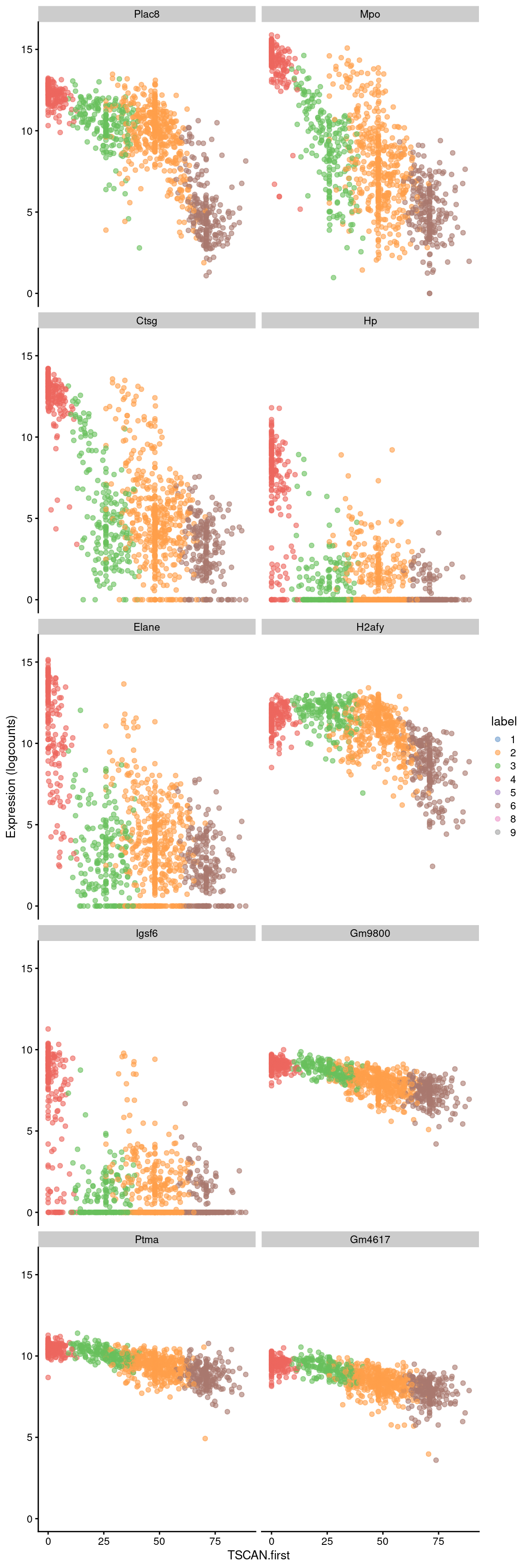
Figure 10.8: Expression of the top 10 genes that decrease in expression with increasing pseudotime along the first path in the MST of the Nestorowa dataset. Each point represents a cell that is mapped to this path and is colored by the assigned cluster.
Conversely, the later parts of the pseudotime may correspond to a more stem-like state based on upregulation of genes like Hlf. There is also increased expression of genes associated with the lymphoid lineage (e.g., Ltb), consistent with reduced commitment to the myeloid lineage at earlier pseudotime values.
## DataFrame with 10 rows and 4 columns
##                        logFC      p.value          FDR      SYMBOL
##                    <numeric>    <numeric>    <numeric> <character>
## ENSMUSG00000047867 0.0869463 1.06721e-173 4.12235e-170      Gimap6
## ENSMUSG00000028716 0.1023233 4.76874e-172 1.68853e-168    Pdzk1ip1
## ENSMUSG00000086567 0.0294706 9.89947e-165 2.62893e-161      Gm2830
## ENSMUSG00000027562 0.0646994 5.91659e-156 1.04748e-152        Car2
## ENSMUSG00000006389 0.1096438 4.69440e-151 7.67174e-148         Mpl
## ENSMUSG00000037820 0.0702660 1.80467e-135 1.78327e-132        Tgm2
## ENSMUSG00000003949 0.0934931 3.07633e-126 2.37661e-123         Hlf
## ENSMUSG00000061232 0.0191498 1.24511e-125 9.44725e-123       H2-K1
## ENSMUSG00000044258 0.0557909 3.49882e-121 2.28715e-118      Ctla2a
## ENSMUSG00000024399 0.0998322 5.53699e-116 3.17928e-113         Ltb
best <- head(up.right$SYMBOL, 10)
plotExpression(sce.nest2, features=best, swap_rownames="SYMBOL",
x="TSCAN.first", colour_by="label")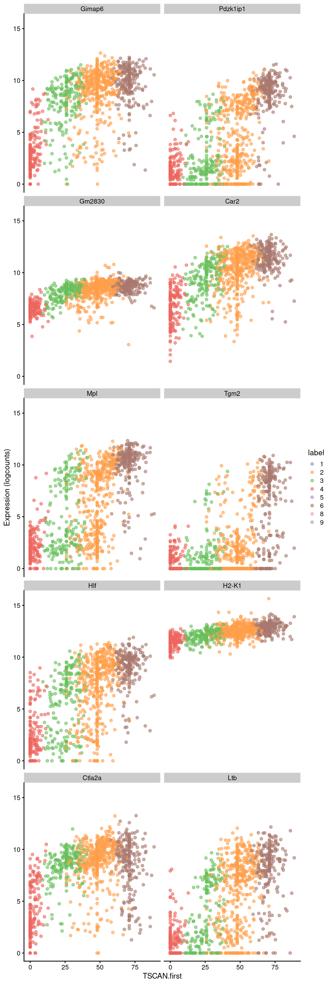
Figure 10.9: Expression of the top 10 genes that increase in expression with increasing pseudotime along the first path in the MST of the Nestorowa dataset. Each point represents a cell that is mapped to this path and is colored by the assigned cluster.
Alternatively, a heatmap can be used to provide a more compact visualization (Figure 10.10).
on.first.path <- !is.na(sce.nest2$TSCAN.first)
plotHeatmap(sce.nest2[,on.first.path], order_columns_by="TSCAN.first",
    colour_columns_by="label", features=head(up.right$SYMBOL, 50),
    center=TRUE, swap_rownames="SYMBOL")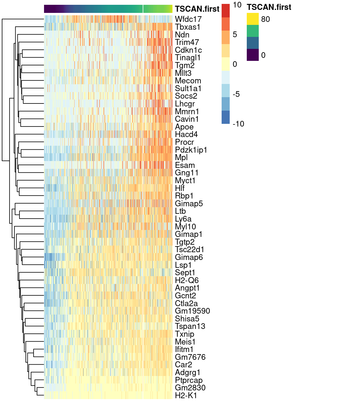
Figure 10.10: Heatmap of the expression of the top 50 genes that increase in expression with increasing pseudotime along the first path in the MST of the Nestorowa HSC dataset. Each column represents a cell that is mapped to this path and is ordered by its pseudotime value.
10.3.3 Changes between paths
A more advanced analysis involves looking for differences in expression between paths of a branched trajectory. This is most interesting for cells close to the branch point between two or more paths where the differential expression analysis may highlight genes is responsible for the branching event. The general strategy here is to fit one trend to the unique part of each path immediately following the branch point, followed by a comparison of the fits between paths.
To this end, a particularly tempting approach is to perform another ANOVA with our spline-based model and test for significant differences in the spline parameters between paths.
While this can be done with testPseudotime(), the magnitude of the pseudotime has little comparability across paths.
A pseudotime value in one path of the MST does not, in general, have any relation to the same value in another path; the pseudotime can be arbitrarily “stretched” by factors such as the magnitude of DE or the density of cells, depending on the algorithm.
This compromises any comparison of trends as we cannot reliably say that they are being fitted to comparable \(x\)-axes.
Rather, we employ the much simpler ad hoc approach of fitting a spline to each trajectory and comparing the sets of DE genes. To demonstrate, we focus on the cluster containing the branch point in the Nestorowa-derived MST (Figure 10.2). We recompute the pseudotimes so that the root lies at the cluster center, allowing us to detect genes that are associated with the divergence of the branches.
We visualize the reordered pseudotimes using only the cells in our branch point cluster (Figure 10.11), which allows us to see the correspondence between each pseudotime to the projected edges of the MST.
A more precise determination of the identity of each pseudotime can be achieved by examining the column names of tscan.pseudo2, which contains the name of the terminal node for the path of the MST corresponding to each column.
# Making a copy and giving the paths more friendly names.
sub.nest <- sce.nest
sub.nest$TSCAN.first <- pathStat(tscan.pseudo2)[,1]
sub.nest$TSCAN.second <- pathStat(tscan.pseudo2)[,2]
sub.nest$TSCAN.third <- pathStat(tscan.pseudo2)[,3]

# Subsetting to the desired cluster containing the branch point.
keep <- colLabels(sce.nest) == starter
sub.nest <- sub.nest[,keep]

# Showing only the lines to/from our cluster of interest.
line.data.sub <- line.data[grepl("^3--", line.data$edge) | grepl("--3$", line.data$edge),]
ggline <- geom_line(data=line.data.sub, mapping=aes(x=dim1, y=dim2, group=edge))

gridExtra::grid.arrange(
    plotTSNE(sub.nest, colour_by="TSCAN.first") + ggline,
    plotTSNE(sub.nest, colour_by="TSCAN.second") + ggline,
    plotTSNE(sub.nest, colour_by="TSCAN.third") + ggline,
    ncol=3
)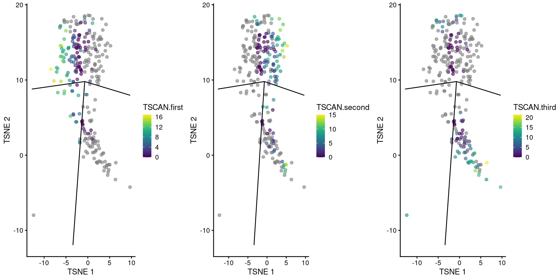
Figure 10.11: TSCAN-derived pseudotimes around cluster 3 in the Nestorowa HSC dataset. Each point is a cell in this cluster and is colored by its pseudotime value along the path to which it was assigned. The overlaid lines represent the relevant edges of the MST.
We then apply testPseudotime() to each path involving cluster 3.
Because we are operating over a relatively short pseudotime interval, we do not expect complex trends and so we set df=1 (i.e., a linear trend) to avoid problems from overfitting.
pseudo1 <- testPseudotime(sub.nest, df=1, pseudotime=sub.nest$TSCAN.first)
pseudo1$SYMBOL <- rowData(sce.nest)$SYMBOL
pseudo1[order(pseudo1$p.value),]
## DataFrame with 46078 rows and 5 columns
## logFC logFC.1 p.value FDR SYMBOL
## <numeric> <numeric> <numeric> <numeric> <character>
## ENSMUSG00000009350 0.332855 0.332855 2.67471e-18 9.59018e-14 Mpo
## ENSMUSG00000040314 0.475509 0.475509 5.65148e-16 1.01317e-11 Ctsg
## ENSMUSG00000064147 0.449444 0.449444 3.76156e-15 4.49569e-11 Rab44
## ENSMUSG00000026581 0.379946 0.379946 3.86978e-14 3.46877e-10 Sell
## ENSMUSG00000085611 0.266637 0.266637 7.51248e-12 5.38720e-08 Ap3s1-ps1
## ... ... ... ... ... ...
## ENSMUSG00000107380 0 0 NaN NaN Vmn1r-ps6
## ENSMUSG00000107381 0 0 NaN NaN NA
## ENSMUSG00000107382 0 0 NaN NaN Gm37714
## ENSMUSG00000107387 0 0 NaN NaN 5430435K18Rik
## ENSMUSG00000107391 0 0 NaN NaN Rianpseudo2 <- testPseudotime(sub.nest, df=1, pseudotime=sub.nest$TSCAN.second)
pseudo2$SYMBOL <- rowData(sce.nest)$SYMBOL
pseudo2[order(pseudo2$p.value),]## DataFrame with 46078 rows and 5 columns
## logFC logFC.1 p.value FDR SYMBOL
## <numeric> <numeric> <numeric> <numeric> <character>
## ENSMUSG00000027342 -0.1265815 -0.1265815 1.14035e-11 4.01425e-07 Pcna
## ENSMUSG00000025747 -0.3693852 -0.3693852 5.06241e-09 6.43725e-05 Tyms
## ENSMUSG00000020358 -0.1001289 -0.1001289 6.95055e-09 6.43725e-05 Hnrnpab
## ENSMUSG00000035198 -0.4166721 -0.4166721 7.31465e-09 6.43725e-05 Tubg1
## ENSMUSG00000045799 -0.0452833 -0.0452833 5.43487e-08 3.19298e-04 Gm9800
## ... ... ... ... ... ...
## ENSMUSG00000107380 0 0 NaN NaN Vmn1r-ps6
## ENSMUSG00000107381 0 0 NaN NaN NA
## ENSMUSG00000107382 0 0 NaN NaN Gm37714
## ENSMUSG00000107386 0 0 NaN NaN Gm42800
## ENSMUSG00000107391 0 0 NaN NaN Rianpseudo3 <- testPseudotime(sub.nest, df=1, pseudotime=sub.nest$TSCAN.third)
pseudo3$SYMBOL <- rowData(sce.nest)$SYMBOL
pseudo3[order(pseudo3$p.value),]## DataFrame with 46078 rows and 5 columns
## logFC logFC.1 p.value FDR SYMBOL
## <numeric> <numeric> <numeric> <numeric> <character>
## ENSMUSG00000042817 -0.411375 -0.411375 7.83960e-14 2.00860e-09 Flt3
## ENSMUSG00000015937 -0.163091 -0.163091 1.18901e-13 2.00860e-09 H2afy
## ENSMUSG00000002985 0.351661 0.351661 7.64160e-13 8.60597e-09 Apoe
## ENSMUSG00000053168 -0.398684 -0.398684 8.17626e-12 6.90608e-08 9030619P08Rik
## ENSMUSG00000029247 -0.137079 -0.137079 1.78997e-10 1.06448e-06 Paics
## ... ... ... ... ... ...
## ENSMUSG00000107381 0 0 NaN NaN NA
## ENSMUSG00000107382 0 0 NaN NaN Gm37714
## ENSMUSG00000107384 0 0 NaN NaN Gm42557
## ENSMUSG00000107387 0 0 NaN NaN 5430435K18Rik
## ENSMUSG00000107391 0 0 NaN NaN RianWe want to find genes that are significant in our path of interest (for this demonstration, the third path reported by TSCAN) and are not significant and/or changing in the opposite direction in the other paths. We use the raw \(p\)-values to look for non-significant genes in order to increase the stringency of the definition of unique genes in our path.
only3 <- pseudo3[which(pseudo3$FDR <= 0.05 &
    (pseudo2$p.value >= 0.05 | sign(pseudo1$logFC)!=sign(pseudo3$logFC)) &
    (pseudo2$p.value >= 0.05 | sign(pseudo2$logFC)!=sign(pseudo3$logFC))),]
only3[order(only3$p.value),]
## DataFrame with 64 rows and 5 columns
## logFC logFC.1 p.value FDR SYMBOL
## <numeric> <numeric> <numeric> <numeric> <character>
## ENSMUSG00000042817 -0.411375 -0.411375 7.83960e-14 2.00860e-09 Flt3
## ENSMUSG00000002985 0.351661 0.351661 7.64160e-13 8.60597e-09 Apoe
## ENSMUSG00000016494 -0.248953 -0.248953 1.89039e-10 1.06448e-06 Cd34
## ENSMUSG00000000486 -0.217213 -0.217213 1.24423e-09 5.25468e-06 Sept1
## ENSMUSG00000021728 -0.293032 -0.293032 3.56762e-09 1.20535e-05 Emb
## ... ... ... ... ... ...
## ENSMUSG00000004609 -0.205262 -0.205262 0.000118937 0.0422992 Cd33
## ENSMUSG00000083657 0.100788 0.100788 0.000145710 0.0484448 Gm12245
## ENSMUSG00000023942 -0.144269 -0.144269 0.000146255 0.0484448 Slc29a1
## ENSMUSG00000091408 -0.149411 -0.149411 0.000157634 0.0499154 Gm6728
## ENSMUSG00000053559 0.135833 0.135833 0.000159559 0.0499154 SmagpWe observe upregulation of interesting genes such as Gata2, Cd9 and Apoe in this path, along with downregulation of Flt3 (Figure 10.12). One might speculate that this path leads to a less differentiated HSC state compared to the other directions.
gridExtra::grid.arrange(
    plotTSNE(sub.nest, colour_by="Flt3", swap_rownames="SYMBOL") + ggline,
    plotTSNE(sub.nest, colour_by="Apoe", swap_rownames="SYMBOL") + ggline,
    plotTSNE(sub.nest, colour_by="Gata2", swap_rownames="SYMBOL") + ggline,
    plotTSNE(sub.nest, colour_by="Cd9", swap_rownames="SYMBOL") + ggline
)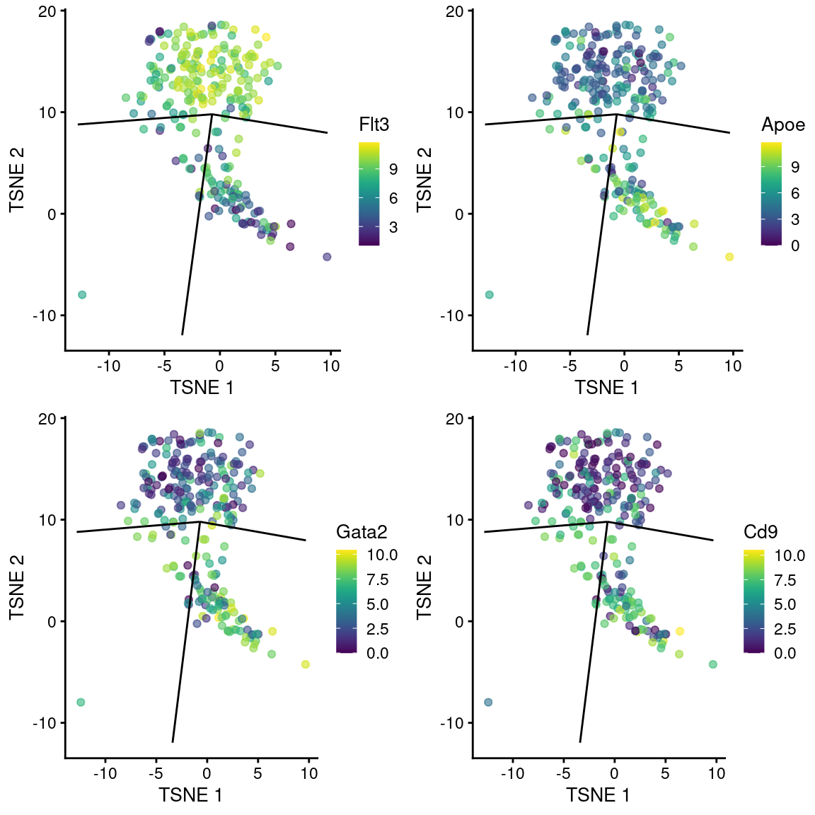
Figure 10.12: \(t\)-SNE plots of cells in the cluster containing the branch point of the MST in the Nestorowa dataset. Each point is a cell colored by the expression of a gene of interest and the relevant edges of the MST are overlaid on top.
While simple and practical, this comparison strategy is even less statistically defensible than usual. The differential testing machinery is not suited to making inferences on the absence of differences, and we should not have used the non-significant genes to draw any conclusions. Another limitation is that this approach cannot detect differences in the magnitude of the gradient of the trend between paths; a gene that is significantly upregulated in each of two paths but with a sharper gradient in one of the paths will not be DE. (Of course, this is only a limitation if the pseudotimes were comparable in the first place.)
10.3.4 Further comments
The magnitudes of the \(p\)-values reported here should be treated with some skepticism. The same fundamental problems discussed in Section 6.4 remain; the \(p\)-values are computed from the same data used to define the trajectory, and there is only a sample size of 1 in this analysis regardless of the number of cells. Nonetheless, the \(p\)-value is still useful for prioritizing interesting genes in the same manner that it is used to identify markers between clusters.
The previous sections have focused on a very simple and efficient - but largely effective - approach to trend fitting.
Alternatively, we can use more complex strategies that involve various generalizations to the concept of linear models.
For example, generalized additive models (GAMs) are quite popular for pseudotime-based DE analyses
as they are able to handle non-normal noise distributions and a greater diversity of non-linear trends.
We demonstrate the use of the GAM implementation from the tradeSeq package on the Nestorowa dataset below.
Specifically, we will take a leap of faith and assume that our pseudotime values are comparable across paths of the MST,
allowing us to use the patternTest() function to test for significant differences in expression between paths.
# Getting rid of the NA's; using the cell weights
# to indicate which cell belongs on which path.
nonna.pseudo <- pathStat(tscan.pseudo)
not.on.path <- is.na(nonna.pseudo)
nonna.pseudo[not.on.path] <- 0
cell.weights <- !not.on.path
storage.mode(cell.weights) <- "numeric"

# Fitting a GAM on the subset of genes for speed.
library(tradeSeq)
fit <- fitGAM(counts(sce.nest)[1:100,],
    pseudotime=nonna.pseudo,
    cellWeights=cell.weights)

res <- patternTest(fit)
res$Symbol <- rowData(sce.nest)[1:100,"SYMBOL"]
res <- res[order(res$pvalue),]
head(res, 10)
## waldStat df pvalue fcMedian Symbol
## ENSMUSG00000000028 274.76 6 0 1.5278 Cdc45
## ENSMUSG00000000058 117.63 6 0 1.1083 Cav2
## ENSMUSG00000000078 190.26 6 0 0.9722 Klf6
## ENSMUSG00000000088 122.35 6 0 0.5412 Cox5a
## ENSMUSG00000000184 213.83 6 0 0.2063 Ccnd2
## ENSMUSG00000000247 108.78 6 0 0.2195 Lhx2
## ENSMUSG00000000248 121.31 6 0 1.1093 Clec2g
## ENSMUSG00000000278 200.69 6 0 1.9958 Scpep1
## ENSMUSG00000000290 92.37 6 0 0.7041 Itgb2
## ENSMUSG00000000303 123.68 6 0 1.0692 Cdh1From a statistical perspective, the GAM is superior to linear models as the former uses the raw counts. This accounts for the idiosyncrasies of the mean-variance relationship for low counts and avoids some problems with spurious trajectories introduced by the log-transformation (Basic Section 2.5). However, this sophistication comes at the cost of increased complexity and compute time, requiring parallelization via BiocParallel even for relatively small datasets.
When a trajectory consists of a series of clusters (as in the Nestorowa dataset), pseudotime-based DE tests can be considered a continuous generalization of cluster-based marker detection. One would expect to identify similar genes by performing an ANOVA on the per-cluster expression values, and indeed, this may be a more interpretable approach as it avoids imposing the assumption that a trajectory exists at all. The main benefit of pseudotime-based tests is that they encourage expression to be a smooth function of pseudotime, assuming that the degrees of freedom in the trend fit prevents overfitting. This smoothness reflects an expectation that changes in expression along a trajectory should be gradual.
10.4 Finding the root
10.4.1 Overview
The pseudotime calculations rely on some specification of the root of the trajectory to define “position zero”. In some cases, this choice has little effect beyond flipping the sign of the gradients of the DE genes. In other cases, this choice may necessarily arbitrary depending on the questions being asked, e.g., what are the genes driving the transition to or from a particular part of the trajectory? However, in situations where the trajectory is associated with a time-dependent biological process, the position on the trajectory corresponding to the earliest timepoint is clearly the best default choice for the root. This simplifies interpretation by allowing the pseudotime to be treated as a proxy for real time.
10.4.2 Entropy-based methods
Trajectories are commonly used to characterize differentiation where branches are interpreted as multiple lineages. In this setting, the root of the trajectory is best set to the “start” of the differentiation process, i.e., the most undifferentiated state that is observed in the dataset. It is usually possible to identify this state based on the genes that are expressed at each point of the trajectory. However, when such prior biological knowledge is not available, we can fall back to the more general concept that undifferentiated cells have more diverse expression profiles (Gulati et al. 2020). The assumption is that terminally differentiated cells have expression profiles that are highly specialized for their function while multipotent cells have no such constraints - and indeed, may need to have active expression programs for many lineages in preparation for commitment to any of them.
We quantify the diversity of expression by computing the entropy of each cell’s expression profile (Grun et al. 2016; Guo et al. 2017; Teschendorff and Enver 2017), with higher entropies representing greater diversity. We demonstrate on the Nestorowa HSC dataset (Figure 10.13) where clusters 5 and 8 have the highest entropies, suggesting that they represent the least differentiated states within the trajectory. It is also reassuring that these two clusters are adjacent on the MST (Figure 10.1), which is consistent with branched differentiation “away” from a single root.
library(TSCAN)
entropy <- perCellEntropy(sce.nest)
ent.data <- data.frame(cluster=colLabels(sce.nest), entropy=entropy)
ggplot(ent.data, aes(x=cluster, y=entropy)) +
    geom_violin() +
    coord_cartesian(ylim=c(7, NA)) +
    stat_summary(fun=median, geom="point")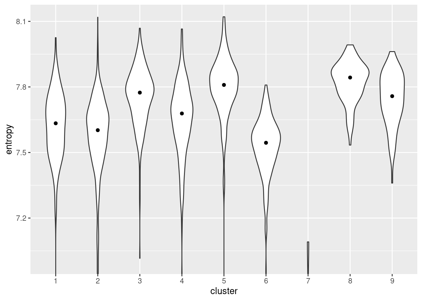
Figure 10.13: Distribution of per-cell entropies for each cluster in the Nestorowa dataset. The median entropy for each cluster is shown as a point in the violin plot.
Of course, this interpretation is fully dependent on whether the underlying assumption is reasonable. While the association between diversity and differentiation potential is likely to be generally applicable, it may not be sufficiently precise to enable claims on the relative potency of closely related subpopulations. Indeed, other processes such as stress or metabolic responses may interfere with the entropy comparisons. Furthermore, at low counts, the magnitude of the entropy is dependent on sequencing depth in a manner that cannot be corrected by scaling normalization. Cells with lower coverage will have lower entropy even if the underlying transcriptional diversity is the same, which may confound the interpretation of entropy as a measure of potency.
10.4.3 RNA velocity
Another strategy is to use the concept of “RNA velocity” to identify the root (La Manno et al. 2018). For a given gene, a high ratio of unspliced to spliced transcripts indicates that that gene is being actively upregulated, under the assumption that the increase in transcription exceeds the capability of the splicing machinery to process the pre-mRNA. Conversely, a low ratio indicates that the gene is being downregulated as the rate of production and processing of pre-mRNAs cannot compensate for the degradation of mature transcripts. Thus, we can infer that cells with high and low ratios are moving towards a high- and low-expression state, respectively, allowing us to assign directionality to any trajectory or even individual cells.
To demonstrate, we will use matrices of spliced and unspliced counts from Hermann et al. (2018).
The unspliced count matrix is most typically generated by counting reads across intronic regions, thus quantifying the abundance of nascent transcripts for each gene in each cell.
The spliced counts are obtained in a more standard manner by counting reads aligned to exonic regions;
however, some extra thought is required to deal with reads spanning exon-intron boundaries, as well as reads mapping to regions that can be either intronic or exonic depending on the isoform (Soneson et al. 2020).
Conveniently, both matrices have the same shape and thus can be stored as separate assays in our usual SingleCellExperiment.
library(scRNAseq)
sce.sperm <- HermannSpermatogenesisData(strip=TRUE, location=TRUE)
assayNames(sce.sperm)
## [1] "spliced" "unspliced"We run through a quick-and-dirty analysis on the spliced counts, which can - by and large - be treated in the same manner as the standard exonic gene counts used in non-velocity-aware analyses. Alternatively, if the standard exonic count matrix was available, we could just use it directly in these steps and restrict the involvement of the spliced/unspliced matrices to the velocity calculations. The latter approach is logistically convenient when adding an RNA velocity section to an existing analysis, such that the prior steps (and the interpretation of their results) do not have to be repeated on the spliced count matrix.
# Quality control:
library(scuttle)
is.mito <- which(seqnames(sce.sperm)=="MT")
sce.sperm <- addPerCellQC(sce.sperm, subsets=list(Mt=is.mito), assay.type="spliced")
qc <- quickPerCellQC(colData(sce.sperm), sub.fields=TRUE)
sce.sperm <- sce.sperm[,!qc$discard]

# Normalization:
set.seed(10000)
library(scran)
sce.sperm <- logNormCounts(sce.sperm, assay.type="spliced")
dec <- modelGeneVarByPoisson(sce.sperm, assay.type="spliced")
hvgs <- getTopHVGs(dec, n=2500)

# Dimensionality reduction:
set.seed(1000101)
library(scater)
sce.sperm <- runPCA(sce.sperm, ncomponents=25, subset_row=hvgs)
sce.sperm <- runTSNE(sce.sperm, dimred="PCA")
We use the velociraptor package to perform the velocity calculations on this dataset via the scvelo Python package (Bergen et al. 2019).
scvelo offers some improvements over the original implementation of RNA velocity by La Manno et al. (2018), most notably eliminating the need for observed subpopulations at steady state (i.e., where the rates of transcription, splicing and degradation are equal).
velociraptor conveniently wraps this functionality by providing a function that accepts a SingleCellExperiment object such as sce.sperm and returns a similar object decorated with the velocity statistics.
library(velociraptor)
velo.out <- scvelo(sce.sperm, assay.X="spliced",
    subset.row=hvgs, use.dimred="PCA")
velo.out
## class: SingleCellExperiment
## dim: 2500 2175
## metadata(4): neighbors velocity_params velocity_graph
## velocity_graph_neg
## assays(6): X spliced ... Mu velocity
## rownames(2500): ENSMUSG00000038015 ENSMUSG00000022501 ...
## ENSMUSG00000095650 ENSMUSG00000002524
## rowData names(3): velocity_gamma velocity_r2 velocity_genes
## colnames(2175): CCCATACTCCGAAGAG AATCCAGTCATCTGCC ... ATCCACCCACCACCAG
## ATTGGTGGTTACCGAT
## colData names(7): velocity_self_transition root_cells ...
## velocity_confidence velocity_confidence_transition
## reducedDimNames(1): X_pca
## mainExpName: NULL
## altExpNames(0):The primary output is the matrix of velocity vectors that describe the direction and magnitude of transcriptional change for each cell. To construct an ordering, we extrapolate from the vector for each cell to determine its future state. Roughly speaking, if a cell’s future state is close to the observed state of another cell, we place the former behind the latter in the ordering. This yields a “velocity pseudotime” that provides directionality without the need to explicitly define a root in our trajectory. We visualize this procedure in Figure 10.14 by embedding the estimated velocities into any low-dimensional representation of the dataset.
sce.sperm$pseudotime <- velo.out$velocity_pseudotime

# Also embedding the velocity vectors, for some verisimilitude.
embedded <- embedVelocity(reducedDim(sce.sperm, "TSNE"), velo.out)
grid.df <- gridVectors(reducedDim(sce.sperm, "TSNE"), embedded, resolution=30)

library(ggplot2)
plotTSNE(sce.sperm, colour_by="pseudotime", point_alpha=0.3) +
    geom_segment(data=grid.df,
        mapping=aes(x=start.1, y=start.2, xend=end.1, yend=end.2),
        arrow=arrow(length=unit(0.05, "inches"), type="closed"))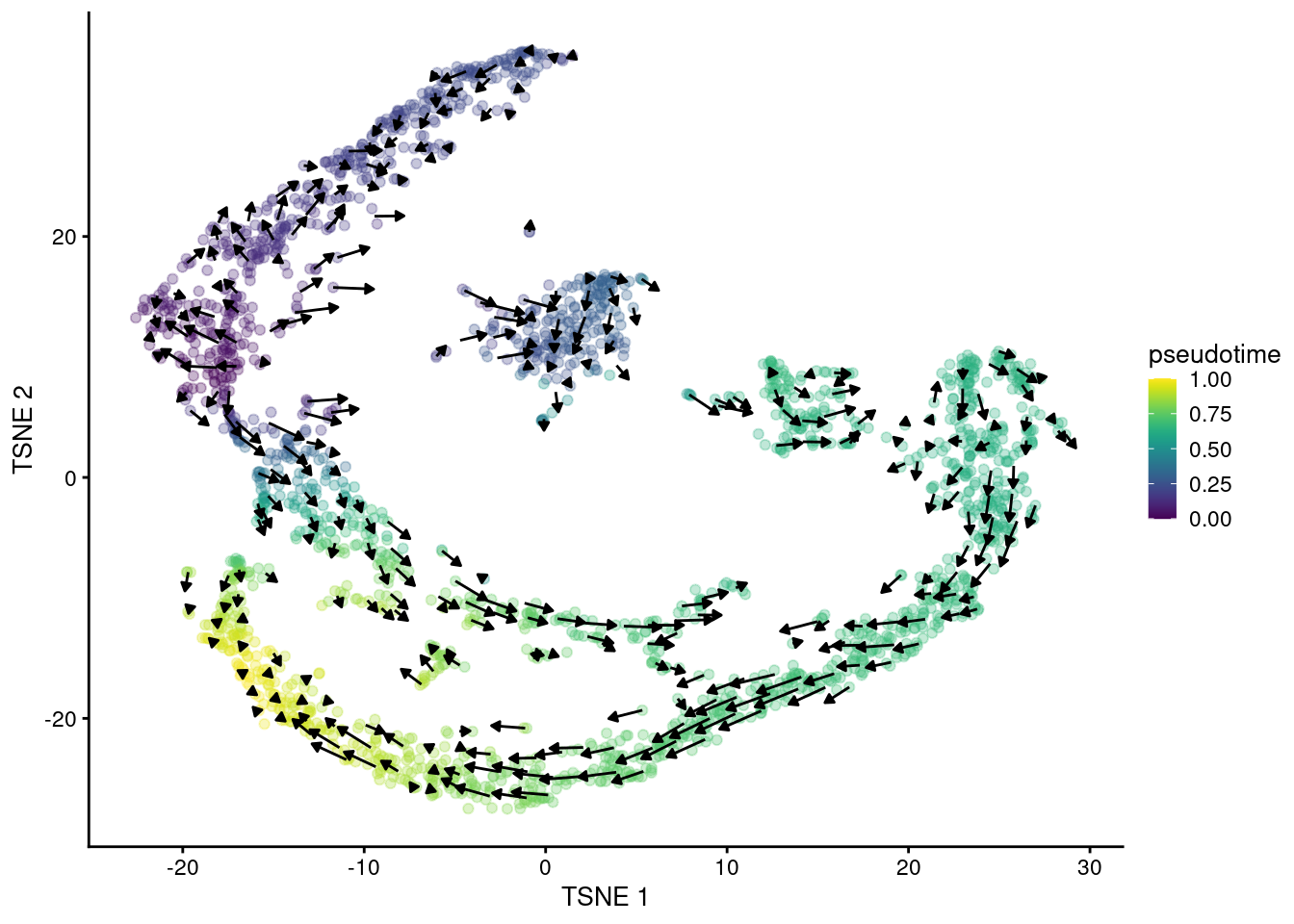
Figure 10.14: \(t\)-SNE plot of the Hermann spermatogenesis dataset, where each point is a cell and is colored by its velocity pseudotime. Arrows indicate the direction and magnitude of the velocity vectors, averaged over nearby cells.
While we could use the velocity pseudotimes directly in our downstream analyses, it is often helpful to pair this information with other trajectory analyses. This is because the velocity calculations are done on a per-cell basis but interpretation is typically performed at a lower granularity, e.g., per cluster or lineage. For example, we can overlay the average velocity pseudotime for each cluster onto our TSCAN-derived MST (Figure 10.15) to identify the likely root clusters. More complex analyses can also be performed (e.g., to identify the likely fate of each cell in the intermediate clusters) but will not be discussed here.
library(bluster)
colLabels(sce.sperm) <- clusterRows(reducedDim(sce.sperm, "PCA"), NNGraphParam())
library(TSCAN)
mst <- TSCAN::createClusterMST(sce.sperm, use.dimred="PCA", outgroup=TRUE)

# Could also use velo.out$root_cell here, for a more direct measure of 'rootness'.
by.cluster <- split(sce.sperm$pseudotime, colLabels(sce.sperm))
mean.by.cluster <- vapply(by.cluster, mean, 0)
mean.by.cluster <- mean.by.cluster[names(igraph::V(mst))]
color.by.cluster <- viridis::viridis(21)[cut(mean.by.cluster, 21)]

set.seed(1001)
plot(mst, vertex.color=color.by.cluster)
Figure 10.15: TSCAN-derived MST created from the Hermann spermatogenesis dataset. Each node is a cluster and is colored by the average velocity pseudotime of all cells in that cluster, from lowest (purple) to highest (yellow).
Needless to say, this lunch is not entirely free. The inferences rely on a sophisticated mathematical model that has a few assumptions, the most obvious of which being that the transcriptional dynamics are the same across subpopulations. The use of unspliced counts increases the sensitivity of the analysis to unannotated transcripts (e.g., microRNAs in the gene body), intron retention events, annotation errors or quantification ambiguities (Soneson et al. 2020) that could interfere with the velocity calculations. There is also the question of whether there is enough intronic coverage to reliably estimate the velocity for the relevant genes for the process of interest, and if not, whether this lack of information may bias the resulting velocity estimates. From a purely practical perspective, the main difficulty with RNA velocity is that the unspliced counts are often unavailable.
10.4.4 Real timepoints
There does, however, exist a gold-standard approach to rooting a trajectory: simply collect multiple real-life timepoints over the course of a biological process and use the population(s) at the earliest time point as the root. This approach experimentally defines a link between pseudotime and real time without requiring any further assumptions. To demonstrate, we will use the activated T cell dataset from Richard et al. (2018) where they collected CD8+ T cells at various time points after ovalbumin stimulation.
library(scRNAseq)
sce.richard <- RichardTCellData()
sce.richard <- sce.richard[,sce.richard$`single cell quality`=="OK"]

# Only using cells treated with the highest affinity peptide
# plus the unstimulated cells as time zero.
sub.richard <- sce.richard[,sce.richard$stimulus %in%
    c("OT-I high affinity peptide N4 (SIINFEKL)", "unstimulated")]
sub.richard$time[is.na(sub.richard$time)] <- 0
table(sub.richard$time)
##
## 0 1 3 6
## 44 51 64 91We run through the standard workflow for single-cell data with spike-ins - see Basic Section 2.4 and Basic Section 3.3 for more details.
library(scran)
sub.richard <- computeSpikeFactors(sub.richard, "ERCC")
sub.richard <- logNormCounts(sub.richard)
dec.richard <- modelGeneVarWithSpikes(sub.richard, "ERCC")
top.hvgs <- getTopHVGs(dec.richard, prop=0.2)
sub.richard <- denoisePCA(sub.richard, technical=dec.richard, subset.row=top.hvgs)
We can then run our trajectory inference method of choice.
As we expecting a fairly simple trajectory, we will keep matters simple and use slingshot() without any clusters.
This yields a pseudotime that is strongly associated with real time (Figure 10.16)
and from which it is straightforward to identify the best location of the root.
The rooted trajectory can then be used to determine the “real time equivalent” of other activation stimuli,
see Richard et al. (2018) for more details.
sub.richard <- slingshot(sub.richard, reducedDim="PCA")
plot(sub.richard$time, sub.richard$slingPseudotime_1,
    xlab="Time (hours)", ylab="Pseudotime")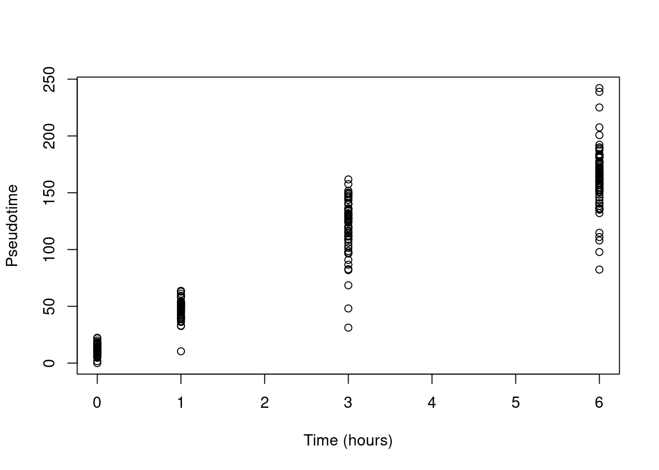
Figure 10.16: Pseudotime as a function of real time in the Richard T cell dataset.
Of course, this strategy relies on careful experimental design to ensure that multiple timepoints are actually collected. This requires more planning and resources (i.e., cost!) and is frequently absent from many scRNA-seq studies that only consider a single “snapshot” of the system. Generation of multiple timepoints also requires an amenable experimental system where the initiation of the process of interest can be tightly controlled. This is often more complex to set up than a strictly observational study, though having causal information arguably makes the data more useful for making inferences.
Session Info
R version 4.2.0 (2022-04-22)
Platform: x86_64-pc-linux-gnu (64-bit)
Running under: Ubuntu 20.04.4 LTS

Matrix products: default
BLAS:   /home/biocbuild/bbs-3.15-bioc/R/lib/libRblas.so
LAPACK: /home/biocbuild/bbs-3.15-bioc/R/lib/libRlapack.so

locale:
 [1] LC_CTYPE=en_US.UTF-8       LC_NUMERIC=C
 [3] LC_TIME=en_GB              LC_COLLATE=C
 [5] LC_MONETARY=en_US.UTF-8    LC_MESSAGES=en_US.UTF-8
 [7] LC_PAPER=en_US.UTF-8       LC_NAME=C
 [9] LC_ADDRESS=C               LC_TELEPHONE=C
[11] LC_MEASUREMENT=en_US.UTF-8 LC_IDENTIFICATION=C

attached base packages:
[1] stats4    stats     graphics  grDevices utils     datasets  methods
[8] base

other attached packages:
 [1] bluster_1.6.0               velociraptor_1.6.0
 [3] scran_1.24.0                ensembldb_2.20.1
 [5] AnnotationFilter_1.20.0     GenomicFeatures_1.48.1
 [7] AnnotationDbi_1.58.0        scRNAseq_2.10.0
 [9] tradeSeq_1.10.0             slingshot_2.4.0
[11] princurve_2.1.6             TSCAN_1.34.0
[13] TrajectoryUtils_1.4.0       scater_1.24.0
[15] ggplot2_3.3.6               scuttle_1.6.2
[17] SingleCellExperiment_1.18.0 SummarizedExperiment_1.26.1
[19] Biobase_2.56.0              GenomicRanges_1.48.0
[21] GenomeInfoDb_1.32.2         IRanges_2.30.0
[23] S4Vectors_0.34.0            BiocGenerics_0.42.0
[25] MatrixGenerics_1.8.0        matrixStats_0.62.0
[27] BiocStyle_2.24.0            rebook_1.6.0

loaded via a namespace (and not attached):
  [1] utf8_1.2.2                    reticulate_1.25
  [3] tidyselect_1.1.2              RSQLite_2.2.14
  [5] grid_4.2.0                    combinat_0.0-8
  [7] BiocParallel_1.30.2           Rtsne_0.16
  [9] zellkonverter_1.6.1           munsell_0.5.0
 [11] ScaledMatrix_1.4.0            codetools_0.2-18
 [13] statmod_1.4.36                withr_2.5.0
 [15] colorspace_2.0-3              fastICA_1.2-3
 [17] filelock_1.0.2                highr_0.9
 [19] knitr_1.39                    labeling_0.4.2
 [21] GenomeInfoDbData_1.2.8        bit64_4.0.5
 [23] farver_2.1.0                  pheatmap_1.0.12
 [25] rprojroot_2.0.3               basilisk_1.8.0
 [27] vctrs_0.4.1                   generics_0.1.2
 [29] xfun_0.31                     BiocFileCache_2.4.0
 [31] R6_2.5.1                      ggbeeswarm_0.6.0
 [33] rsvd_1.0.5                    locfit_1.5-9.5
 [35] bitops_1.0-7                  cachem_1.0.6
 [37] DelayedArray_0.22.0           assertthat_0.2.1
 [39] promises_1.2.0.1              BiocIO_1.6.0
 [41] scales_1.2.0                  beeswarm_0.4.0
 [43] gtable_0.3.0                  beachmat_2.12.0
 [45] rlang_1.0.2                   splines_4.2.0
 [47] rtracklayer_1.56.0            lazyeval_0.2.2
 [49] BiocManager_1.30.18           yaml_2.3.5
 [51] httpuv_1.6.5                  tools_4.2.0
 [53] bookdown_0.26                 ellipsis_0.3.2
 [55] gplots_3.1.3                  jquerylib_0.1.4
 [57] RColorBrewer_1.1-3            Rcpp_1.0.8.3
 [59] plyr_1.8.7                    sparseMatrixStats_1.8.0
 [61] progress_1.2.2                zlibbioc_1.42.0
 [63] purrr_0.3.4                   RCurl_1.98-1.6
 [65] basilisk.utils_1.8.0          prettyunits_1.1.1
 [67] pbapply_1.5-0                 viridis_0.6.2
 [69] cowplot_1.1.1                 ggrepel_0.9.1
 [71] cluster_2.1.3                 here_1.0.1
 [73] magrittr_2.0.3                RSpectra_0.16-1
 [75] ProtGenerics_1.28.0           hms_1.1.1
 [77] mime_0.12                     evaluate_0.15
 [79] xtable_1.8-4                  XML_3.99-0.9
 [81] mclust_5.4.10                 gridExtra_2.3
 [83] compiler_4.2.0                biomaRt_2.52.0
 [85] tibble_3.1.7                  KernSmooth_2.23-20
 [87] crayon_1.5.1                  htmltools_0.5.2
 [89] mgcv_1.8-40                   later_1.3.0
 [91] DBI_1.1.2                     ExperimentHub_2.4.0
 [93] dbplyr_2.1.1                  rappdirs_0.3.3
 [95] Matrix_1.4-1                  cli_3.3.0
 [97] parallel_4.2.0                metapod_1.4.0
 [99] igraph_1.3.1                  pkgconfig_2.0.3
[101] GenomicAlignments_1.32.0      dir.expiry_1.4.0
[103] xml2_1.3.3                    vipor_0.4.5
[105] bslib_0.3.1                   dqrng_0.3.0
[107] XVector_0.36.0                stringr_1.4.0
[109] digest_0.6.29                 graph_1.74.0
[111] Biostrings_2.64.0             rmarkdown_2.14
[113] uwot_0.1.11                   edgeR_3.38.1
[115] DelayedMatrixStats_1.18.0     restfulr_0.0.13
[117] curl_4.3.2                    shiny_1.7.1
[119] Rsamtools_2.12.0              gtools_3.9.2
[121] rjson_0.2.21                  lifecycle_1.0.1
[123] nlme_3.1-157                  jsonlite_1.8.0
[125] BiocNeighbors_1.14.0          CodeDepends_0.6.5
[127] viridisLite_0.4.0             limma_3.52.1
[129] fansi_1.0.3                   pillar_1.7.0
[131] lattice_0.20-45               KEGGREST_1.36.0
[133] fastmap_1.1.0                 httr_1.4.3
[135] interactiveDisplayBase_1.34.0 glue_1.6.2
[137] FNN_1.1.3                     png_0.1-7
[139] BiocVersion_3.15.2            bit_4.0.4
[141] stringi_1.7.6                 sass_0.4.1
[143] blob_1.2.3                    BiocSingular_1.12.0
[145] AnnotationHub_3.4.0           caTools_1.18.2
[147] memoise_2.0.1                 dplyr_1.0.9
[149] irlba_2.3.5
References
Bergen, Volker, Marius Lange, Stefan Peidli, F. Alexander Wolf, and Fabian J. Theis. 2019. “Generalizing Rna Velocity to Transient Cell States Through Dynamical Modeling.” bioRxiv. https://doi.org/10.1101/820936.
Grun, D., M. J. Muraro, J. C. Boisset, K. Wiebrands, A. Lyubimova, G. Dharmadhikari, M. van den Born, et al. 2016. “De Novo Prediction of Stem Cell Identity using Single-Cell Transcriptome Data.” Cell Stem Cell 19 (2): 266–77.
Gulati, G. S., S. S. Sikandar, D. J. Wesche, A. Manjunath, A. Bharadwaj, M. J. Berger, F. Ilagan, et al. 2020. “Single-cell transcriptional diversity is a hallmark of developmental potential.” Science 367 (6476): 405–11.
Guo, M., E. L. Bao, M. Wagner, J. A. Whitsett, and Y. Xu. 2017. “SLICE: determining cell differentiation and lineage based on single cell entropy.” Nucleic Acids Res. 45 (7): e54.
Hastie, T., and W. Stuetzle. 1989. “Principal Curves.” J Am Stat Assoc 84 (406): 502–16.
Hermann, B. P., K. Cheng, A. Singh, L. Roa-De La Cruz, K. N. Mutoji, I. C. Chen, H. Gildersleeve, et al. 2018. “The Mammalian Spermatogenesis Single-Cell Transcriptome, from Spermatogonial Stem Cells to Spermatids.” Cell Rep 25 (6): 1650–67.
La Manno, G., R. Soldatov, A. Zeisel, E. Braun, H. Hochgerner, V. Petukhov, K. Lidschreiber, et al. 2018. “RNA velocity of single cells.” Nature 560 (7719): 494–98.
Nestorowa, S., F. K. Hamey, B. Pijuan Sala, E. Diamanti, M. Shepherd, E. Laurenti, N. K. Wilson, D. G. Kent, and B. Gottgens. 2016. “A single-cell resolution map of mouse hematopoietic stem and progenitor cell differentiation.” Blood 128 (8): 20–31.
Richard, A. C., A. T. L. Lun, W. W. Y. Lau, B. Gottgens, J. C. Marioni, and G. M. Griffiths. 2018. “T cell cytolytic capacity is independent of initial stimulation strength.” Nat. Immunol. 19 (8): 849–58.
Saelens, W., R. Cannoodt, H. Todorov, and Y. Saeys. 2019. “A comparison of single-cell trajectory inference methods.” Nat. Biotechnol. 37 (5): 547–54.
Soneson, C., A. Srivastava, R. Patro, and M. B. Stadler. 2020. “Preprocessing Choices Affect Rna Velocity Results for Droplet scRNA-Seq Data.” bioRxiv. https://doi.org/10.1101/2020.03.13.990069.
Street, K., D. Risso, R. B. Fletcher, D. Das, J. Ngai, N. Yosef, E. Purdom, and S. Dudoit. 2018. “Slingshot: cell lineage and pseudotime inference for single-cell transcriptomics.” BMC Genomics 19 (1): 477.
Teschendorff, A. E., and T. Enver. 2017. “Single-cell entropy for accurate estimation of differentiation potency from a cell’s transcriptome.” Nat Commun 8 (June): 15599.